In La Cañada Flintridge, architects bring an artful restoration to a Spanish Colonial by the overlooked Everett Babcock
- Share via
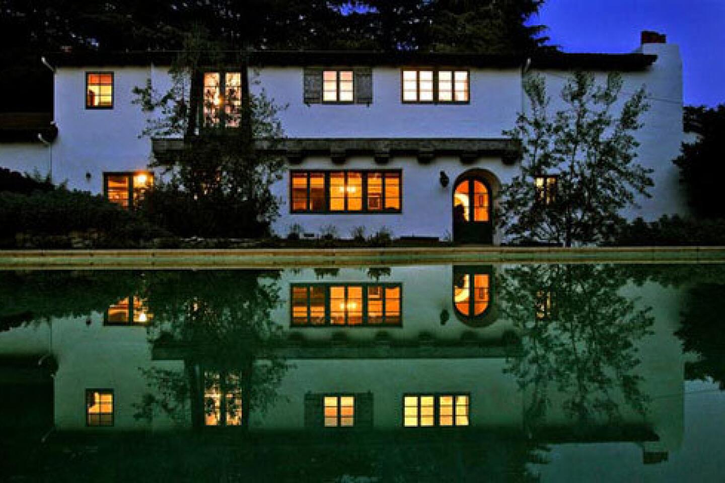
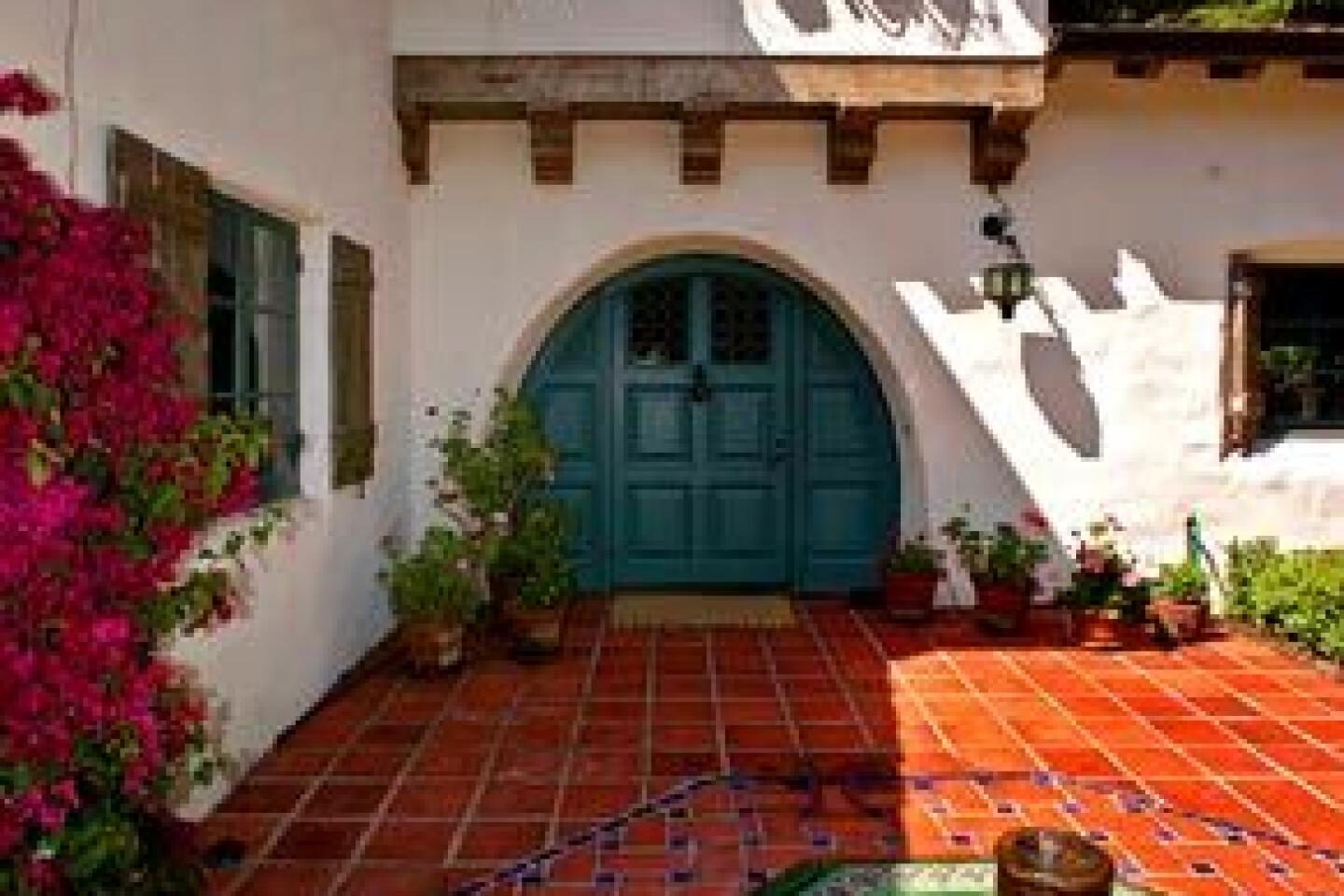
WITH its classic stucco facade, romantic courtyard and North African tile shimmering in the summer sun, the 1925 house in La Cañada Flintridge looks like the pinnacle of Spanish Colonial Revival -- a Wallace Neff, perhaps, or maybe a Gordon Kaufmann or George Washington Smith.
These were architects whom celebrities and society couples sought to create away-from-it-all homes here and in Pasadena, Santa Barbara and Montecito. A century ago, their white-walled, red-tile-roofed villas were among the most fashionable homes in Southern California. This house is no exception, though it’s not a Neff, nor a Kaufmann, nor a Smith. It’s a Babcock.
Everett Babcock (1874-1928) spent two years as staff architect and office manager for Neff, who later described Babcock as his best imitator. It’s unclear whether Neff meant the comment as praise or put-down, but look at Babcock’s work and the question becomes meaningless.
His design in La Cañada evokes the country life and unhurried days of an earlier era -- a feeling of ease crafted with architectural elements borrowed from Southern Spain and its environs.
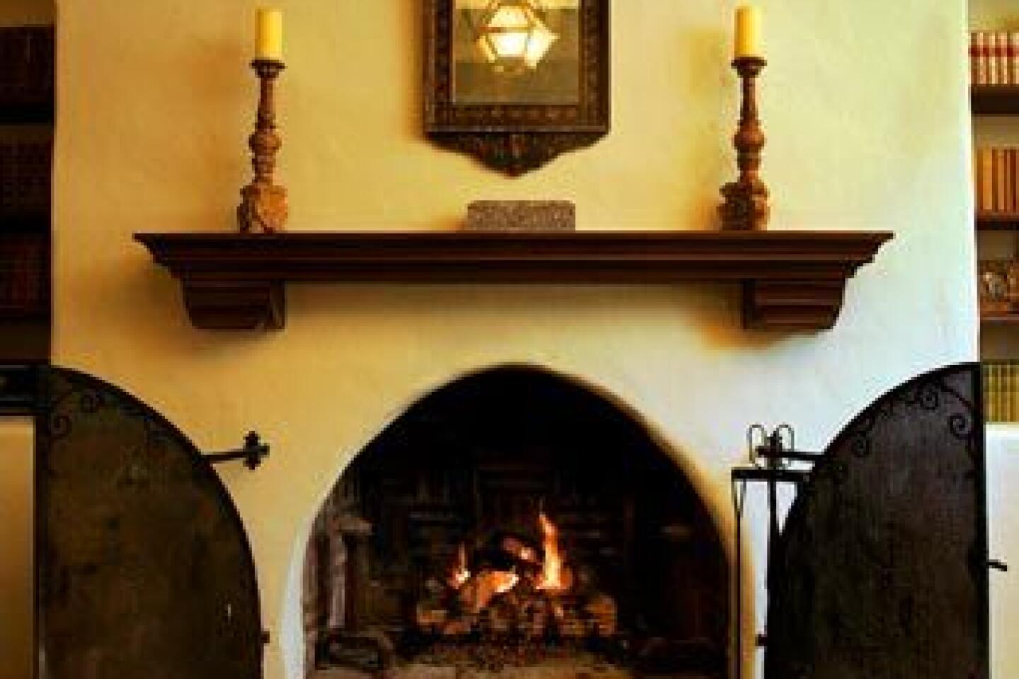
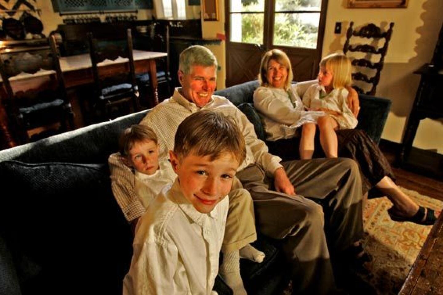
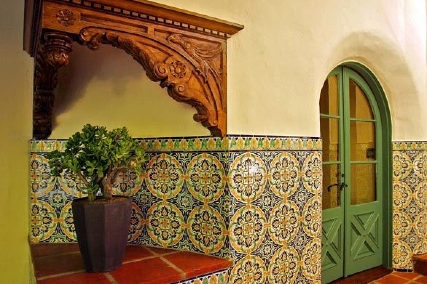
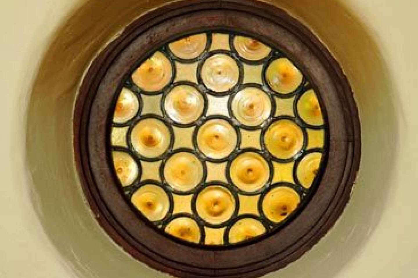
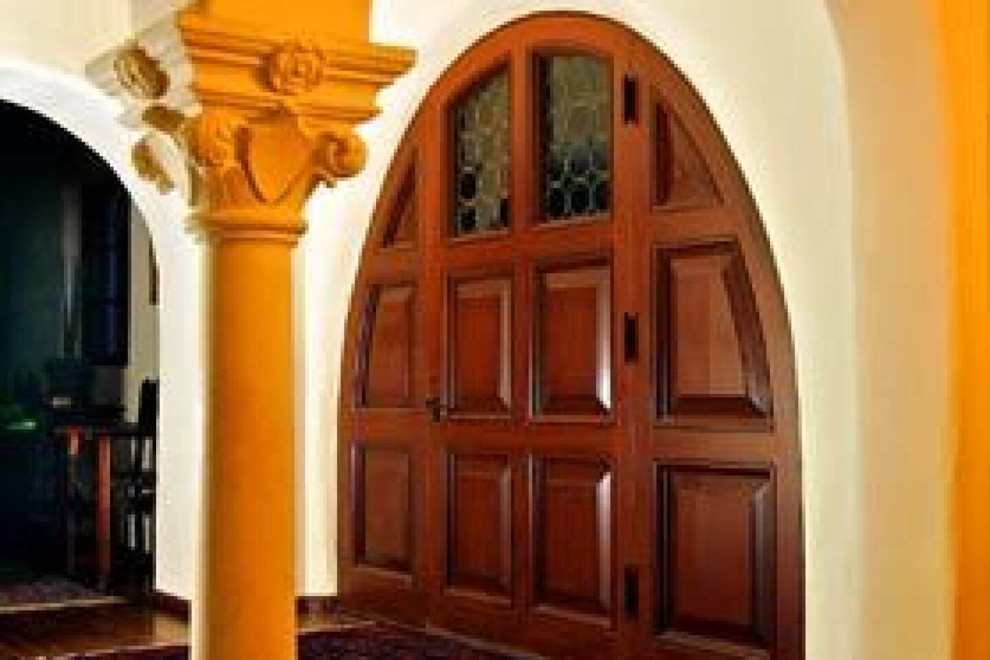
“His work was certainly good enough to be mistaken for a Neff,” says architect Michael Burch, who owns the property with wife Diane Wilk, also an architect. Though Burch trained as a modernist, he now devotes himself to the great Spanish Colonial tradition in Southern California, and he and Wilk recently finished restoring their Babcock in fine style. Their house testifies to the value that the architect placed on craftsmanship in his Spanish Colonials. Attention to detail can be seen in rough-sawn ceiling beams, the wrought-iron railings and the deep wall niches. Walls with textured, hand-troweled stucco break sunlight into a field of highlights and shadows.
Burch attributes Babcock’s relative obscurity here to the fact that he didn’t move from Tacoma, Wash., to Pasadena until 1923, and he died just five years later during a routine tonsillectomy. “He must have been good, because Neff was pretty fussy,” historian Tim Gregory says.
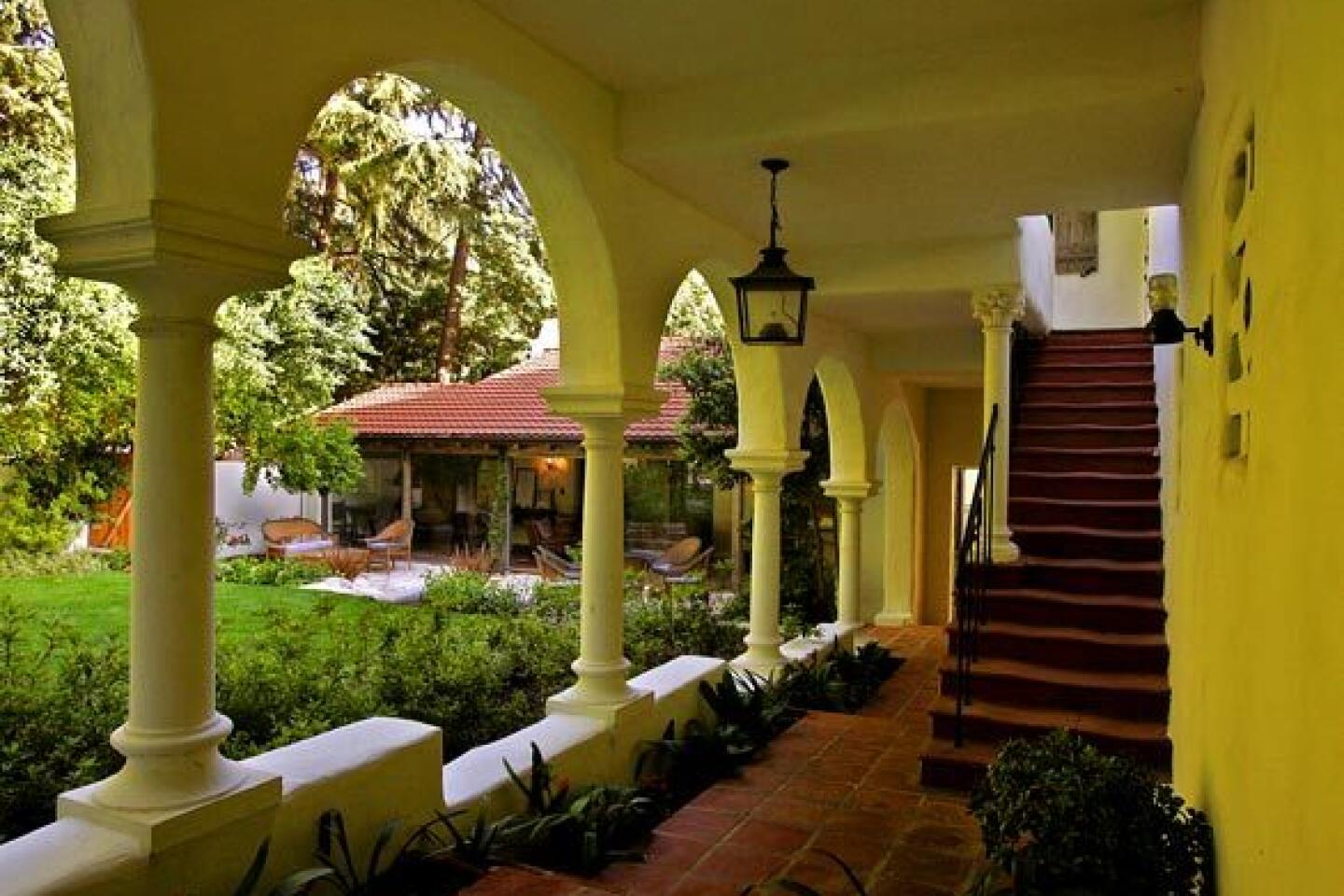
Indeed, though 6,000 square feet, the Burch-Wilk house still feels intimate in scale, its architecture both poetic and pragmatic. Babcock was a traditionalist who was unafraid to buck tradition to achieve certain effects or solve problems. Rather than build the usual square-shaped Spanish Colonial with a courtyard in the center, he constructed an L-shape that wraps a grassy courtyard, visible from most areas of the house.
Marking the other two sides of the courtyard are a veranda and a white colonnade, which adds visual depth and a cloister-like sense of serenity.
This fragmentation serves a purpose, architectural historian Ann Scheid says.
“Babcock was able to open the house to light and air in a way that would not have been possible in a four-sided house,” says Scheid, archivist at USC’s Greene and Greene Archives at the Huntington Library. The result is a style that may appear nostalgic at first, she says, but looks more modern upon further study.
In another unusual decision, the architect placed the colonnade on a gentle slope. To accommodate an architectural feature that usually stands on flat ground, Babcock marched his colonnade up steps -- an effect echoed in the stepped roof line and one more sign of a creative mind able to rethink traditional formulas.
Another Babcock trademark was a love of color, unusual for architects of the 1920s. The Burch-Wilk house, in fact, originally was pink. Burch sounds almost remorseful about painting the exterior white. “I know it’s wrong,” he says. “At least it’s not an irreparable decision.”
Burch and Wilk built a new kitchen and garage, added two bathrooms and finished the basement into a living area. The front door became a side door after developers cut a new road on the eastern side of the house, but otherwise much of the original house has been restored reverently, based on the 1925 design.
The house is decorated with a combination of antiques -- American, Mexican and European -- as well as good reproductions. A particular prize is an antique Spanish headboard in the master bedroom, which could almost be mistaken for the facade of a miniature Renaissance building.
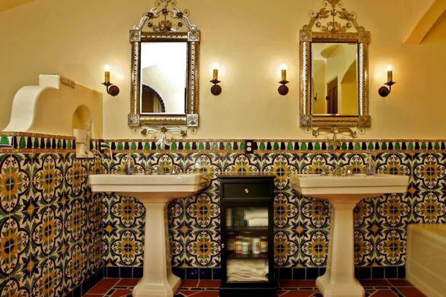
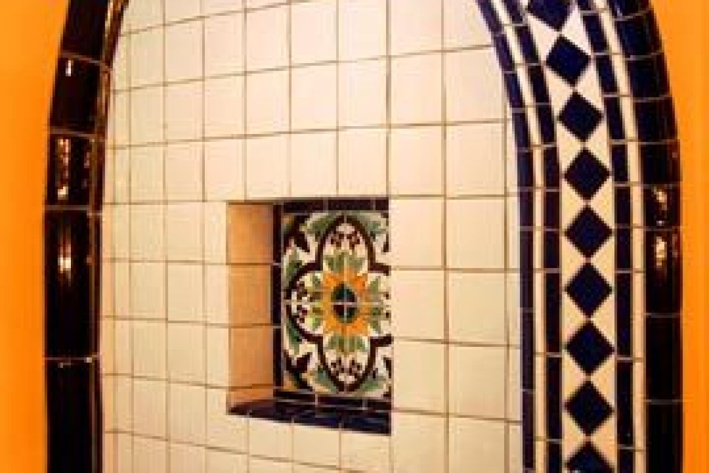
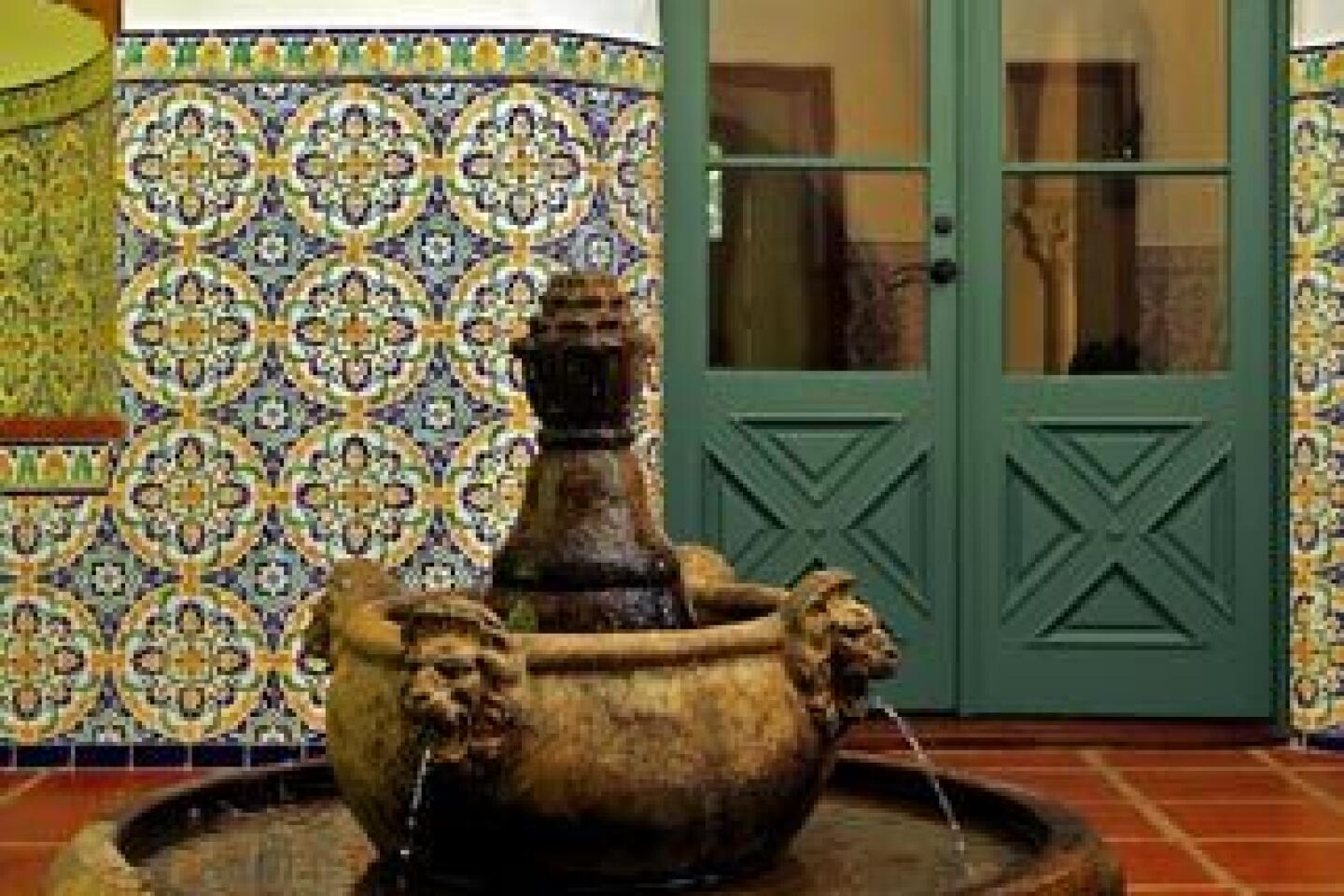
The architects also had enough confidence to add fountains and all the tile on site, including a period-correct Tunisian pattern.
The choice turned out to be uncanny: After installing the tile, Burch discovered that Babcock had used the identical pattern in a Pasadena apartment building. Says Burch: “I guess we were on the right track.”
More to Read
Sign up for The Wild
We’ll help you find the best places to hike, bike and run, as well as the perfect silent spots for meditation and yoga.
You may occasionally receive promotional content from the Los Angeles Times.
