- Share via
There’s a meme that’s been going around, poking lighthearted fun at our ‘Woke’ New World. It depicts a Spandex-wearing mustachioed man in a field of 1980s laser glory, jazz hands up in a gesture of presentation. The top caption reads, “YOU CAN ALWAYS DO AN ITALIAN ACCENT,” and between his palms is the dictum: “IT’S NEVER RACIST.” In terms of vocal performance, I’m inclined to agree, but there is, in our city, a creeping presence of architectural gestures that are an insult not only to taste but to habitability, vision, aesthetic conscience, the storied and innovative lineage of Los Angeles architecture, the nation of Italy and the very idea of the Renaissance.
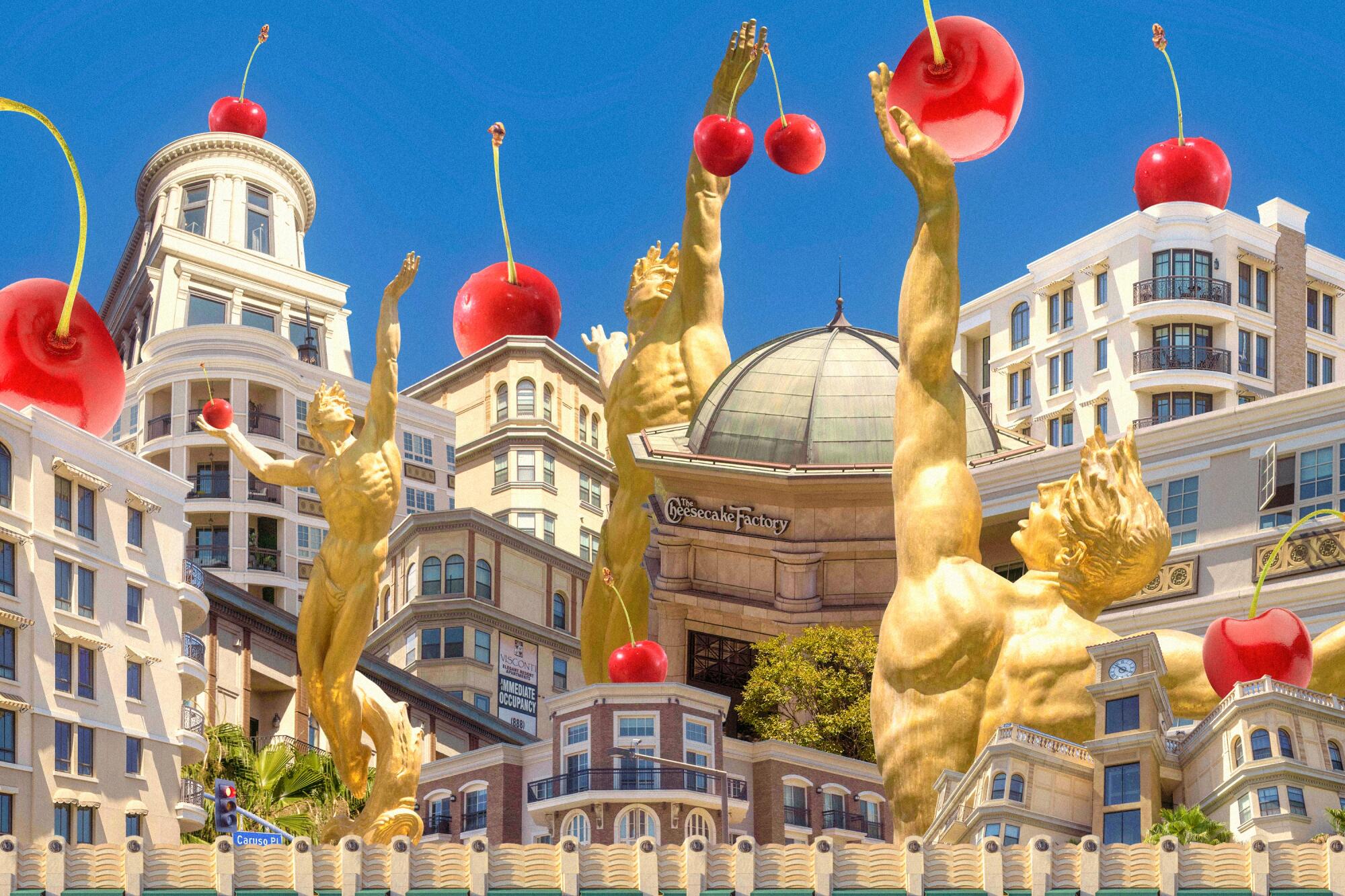
You may already know what I’m talking about. Hidden Valley Renaissance is the ranch dressing of Italian Revival architecture — mostly pabulum, sort of has taste, taken for granted and consumed accordingly. Plus green flecks. The Grove, and its cousin across the street, the Palazzo. The Americana at Brand Luxury Apartments. The Villas at Park La Brea. The suite of projects known as the Orsini, the Da Vinci, the Medici, the Lorenzo, the Ferrante, the Visconti, etc., etc.
The Swiss-French architect Le Corbusier famously decreed that “a house is a machine for living in,” but the developers behind Hidden Valley Renaissance properties envision a house merely as a cake topper for the Cheesecake Factory; an afterthought to a mall. These stores for living are designed from the outside in as lackluster simulacra of Italian palazzos, with some Beaux-Arts doodadery thrown in along with the track lighting and requisite retail footprint. I refrain from using the term “development” with regard to these types of land-use endeavors, because this kind of real estate, on this scale, actually preempts any kind of development beyond itself. These little self-contained cities, these adult playgrounds are strictly zoned for preordained cultural and commercial activities deemed proper for the masses by billionaires like mayoral candidate Rick Caruso, the man behind the Americana at Brand and the Grove. They are designed to choke any possibility for the kind of spontaneous, ad hoc commercial and community happenings that are the lifeblood of urban existence.
The most overlooked letters in the city aren’t on billboards. They are on the sides of the buildings we call home
I know people who live in apartments at the Americana. They’re fine. If you happen to live in one of the units above the Tory Burch store, you can spit directly onto patio patrons of Amici Trattoria. The interiors are decidedly all un-palazzo-like straight lines, optic white walls, steel appliances, beechwood furnishings. The exteriors are a potpourri of international styles — next to the main elevator, which is topped by a rusted iron approximation of the Eiffel Tower, there’s a succession of façades tumbling from tawny brick with bright white window frames to dark taupe with Corinthian column patios to a marshy mustard concrete with Art Deco trim. And yet the eclecticism is less than the sum of its parts, like when you mix all the colors of the rainbow only to end up with a muddy gray. That these places might be perfectly pleasant to live in is ancillary to their main function as signifiers of good living to help fill the void left by yet more and more clusters of chain stores masquerading as communities, where community members are conspicuously hidden.
It’s painfully apparent in L.A. that rented does not necessarily mean occupied. The Alliance of Californians for Community Empowerment Institute’s most recent Vacancy Report indicates that “thousands of luxury units across the city are empty, owned as second homes or pure investments.” The Caruso Co. website says that its Excelsior luxury condo units are “100% occupied,” though on my many evening jaunts to the Americana to dissociate at Sephora, the windows of the vast majority of these domiciles overlooking the gushing musical fountain at the center of the mall remain curiously dark. On a busy Saturday night, I spied exactly one quartet of friends squeezed around a bistro table on one of the Excelsior’s tiny terraces. The sight of actual human bodies gathered way up there only drew more attention to the otherwise uniform emptiness of the apartment façades — no laundry over the banisters, no plants, no weird window treatments, no tiny sparkle of television sets filtering through curtains, nothing to speak of whatever lives are bustling about next to the giant Nordstrom with the big ground-floor bathroom where I empty my DivaCup after fingering the 30%-off titles at Barnes & Noble.
Emptiness is baked into the concept of luxury. It is, by nature, not for everyone. What does it mean to stack luxury apartments atop chain restaurants and fast-fashion stores, as so many of these developments do, and call it a community? Are shoppers being duped on an idea of luxury or are residents being duped on an idea of community? Or both? Or is the purpose of luxury to see how many vectors of income generation can be jammed onto a single property?
This conversation between activist Theo Henderson and scholar Ananya Roy foregrounds the endeavors and collaborations that seek to challenge such erasure.
The Euro-blend style bleeds, of course, into all kinds of real estate holdings, the most aesthetically disastrous of which would have to be Geoffrey Palmer’s House-of-Gucci-esque collection of buildings crawling over downtown. My personal favorite is the Ferrante, which I like to think is named after the pseudonymous Italian novelist but probably was inspired by a dish at Sbarro. This infectious Olive Factory/Cheesecake Garden style has much to do with real estate scions fancying themselves purveyors of a new Renaissance, but the buildings themselves are less inspired by Renaissance principles than vague stabs at worldliness. Some architectural features of Palmer’s real estate holdings include an Egyptian obelisk in the middle of a Roman fountain, environmental design done in iron-wrought Papyrus font and smatterings of ill-placed medieval crests that look like David Cronenberg tried to rebrand Ribet Academy. Like diseases, aesthetics too can get out of hand. The vision of history exemplified by Palmer’s buildings is resolutely out of step with the history of the neighborhoods they occupy. Spiked ledges that disallow sitting — for humans and for birds — and elevated bridges that allow tenants to cross the street without having to go out on the sidewalk mark the residence as more of a fortress.
City blocks are leveled to make room for these cosmic latte compounds, yet most buildings done in this style remain interchangeably vague. (Cosmic Latte is actually the name for the average color of the universe. It’s essentially beige.) They lack the joyful energy of the way, say, Las Vegas appropriates Italian architecture. It’s been said that Los Angeles is a city of surfaces, and it is safe to regard much of our architecture as kitsch, because when a building puts all its cards on the table, a relationship between its environs and inhabitant is free to form and transform.
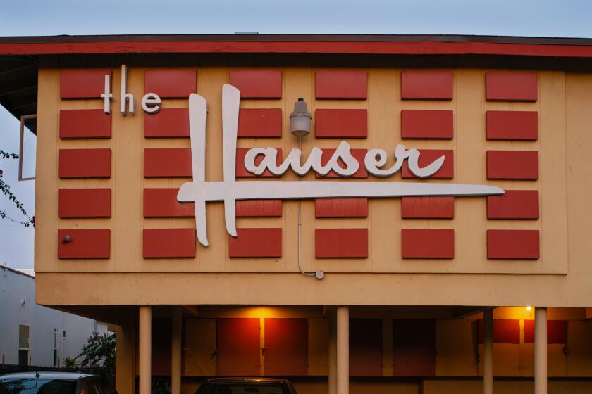
I don’t like snobbery. I do like shopping, and I like weird buildings. Why, then, does the idea of a residence in the direct eyeline of the Sprinkles Cupcake ATM feel uneasy to me? Because despite the inclusion of picturesque gardens and fun-time machinery, something about the Hidden Valley Renaissance gives an unsettling sense of efficiency, the subtle miasma of control hidden among all that ad copy about culture and community. And because it is tucked among trellises and striped awnings and extraneously ornate fountains, it is somehow more pernicious than the bald-faced Modernist experiments that characterized much of the doomed but fence-swinging residential architecture of midcentury Los Angeles. The dingbats that dot the city to this day were quickly built as uniform boxes with slapped-on exteriors and plucky paint jobs. Many fell into disrepair, but just as many are revived and remodeled from within to adapt to the fluctuations of their inhabitants. Each uniform box paradoxically becomes a symbol of its particular neighborhood. The stylistic experiments of architects such as Rudolph Schindler, Richard Neutra, John Lautner and Frank Lloyd Wright may not have become utopian realities of pure design (the immaterial endgame of efficiency), but along with Googie diners and stucco bungalows, they helped shape the architectural language of Los Angeles as one that makes the best of its blunted visions. They say something about the city.
Poet Christopher Soto unpacks how the history of policing has shaped and scarred the urban fabric of Los Angeles.
These faux-Italian monuments to cream and black seem to say nothing at all. What these self-contained spaces are designed to do is eliminate possibility. Nothing serendipitous happens in them that isn’t preapproved in the blueprint stage. The architectural configurations are more efficient than any Modernist box. These buildings pretend to have an imagination, so you don’t have to. They have the sheen of history to save you the trouble of discovering it for yourself.
In her 1969 book, “The Economy of Cities,” Jane Jacobs writes: “People who think we would be better off without cities, especially without big, unmanageable, disorderly cities, never tire of explaining that cities grown too big are, in any case, inefficient and impractical.” Jacobs was an economist who examined in depth what she called the “valuable inefficiency” of cities. “I do not mean that cities are economically valuable in spite of their inefficiency and impracticality,” she continues, “but rather because they are inefficient and impractical” [emphasis mine]. She goes on to explain that it is the freedom of small businesses, tradespeople, builders and the general citizenry to fail and experiment that paradoxically allows cities to develop. A self-contained mega-complex of planned residential, commercial and cultural activity is not actually a “development” at all. It’s stagnation. The attempts to build them according to a perfectly calibrated blend of aspiration and inoffensive taste mask their deeper ambitions to be whole factories for living, ones that eliminate impracticality and inefficiency. And, to an extent, the living itself.
The growth of a city is a fraught tango between its citizens and the civic bodies they elect to represent them — an alert population is always finding the line between support and control, constantly prodding government to keep on the good side of it (the support side, in case you’re wondering). Mega-developers sidestep this important civic dialectic by building adult playgrounds and tarting them up as caricatures of fancy European cities to disguise the fact that they are designed to control and monitor the lifestyles of their inhabitants. These buildings are made for children because that is how the building sees you. And they pile on arbitrary signifiers of luxury until they achieve the mute hysteria of elegance, a deafening silence of imagination.
Christina Catherine Martinez is a writer, actress, comedian and daughter of Los Angeles. She is a recipient of the Creative Capital/Andy Warhol Foundation Arts Writers Grant and has been named a Comedian You Should Know by both TimeOut L.A. and New York Magazine. Her book of essays, “Aesthetical Relations,” is available from Hesse Press. She was born and raised in Southern California.


