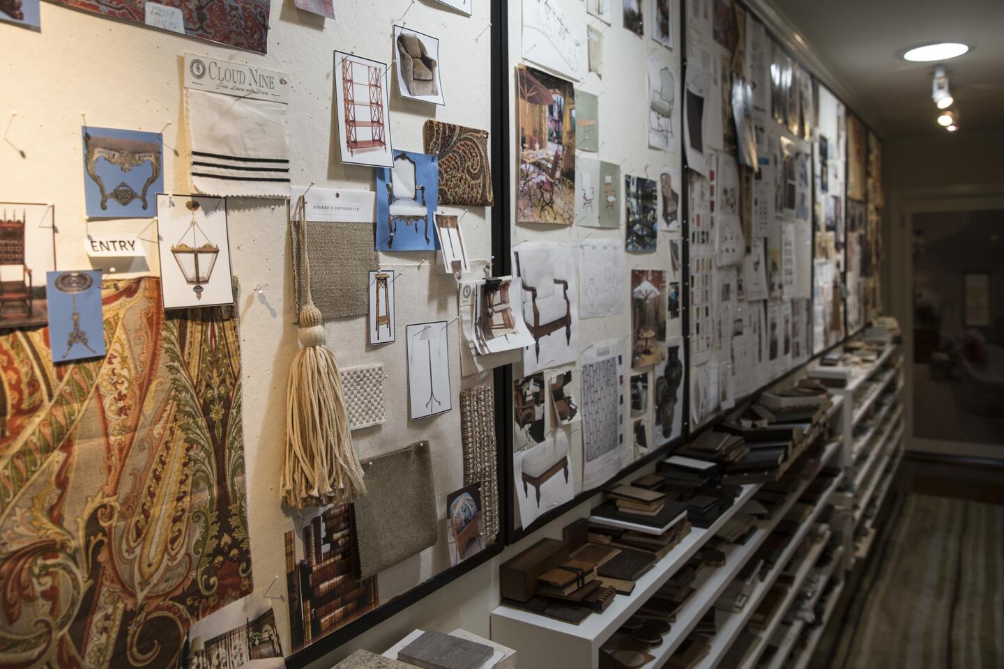
Designer’s duplex connects him to clients, community in West Hollywood
- Share via
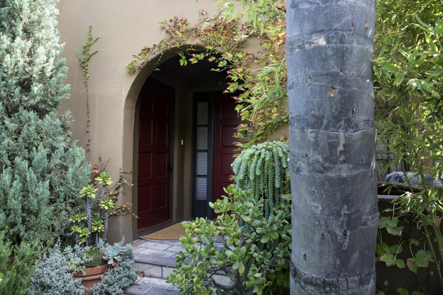
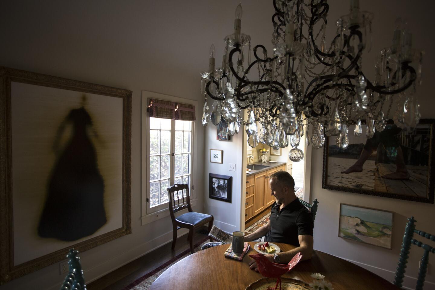
When Los Angeles interior designer Tommy Chambers decided to tackle a full-scale renovation project in West Hollywood, he was faced with an uncompromising client: Himself.
“I wanted to give myself what I had been giving my clients all these years,” Chambers says. “A full and complete, top to bottom original design using the best products, artisans and trades.”
Eight years ago, Chambers was living in a 4,000-square-foot midcentury home in Laurel Canyon. After he sold the house, however, he craved something a little less isolated and decided to downsize to the 1,250-square-foot unit in a duplex he purchased in 1999.
“I missed being connected to the world around me,” Chambers says of living in the Hollywood Hills. “That’s what I love about California. I wanted to get back to walking to dinners, museums and parks, seeing friends and giving myself back a life without depending on a car.”
He purchased the duplex, with its side-by-side units, as an investment property. “It was always going to be a rental,” he says. But after he moved his interior design office into one of the units, he began to see the advantages to moving next door.
It was walking distance to restaurants, and because of its small footprint, it would not require a lot of maintenance. And the work commute couldn’t be beat.
The unit’s modest two-bedroom floor plan also meant that splurging on high-end products like Ann Sacks tile, Walker Zanger stone, Waterworks fixtures and Paul Ferrante lighting didn’t break the budget.
But before he could move in, the unit that had been used as a long-term rental would need a serious update. In the end, it took Chambers more than a year to gut the unit and start from scratch.
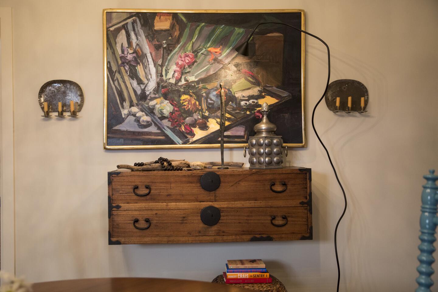
He summarizes his goals for the space that would become his residence: “I wanted to streamline the property, display my art collection and family heirlooms and books, and create an idea lab to show my clients what is possible.”
His objective was to “create a comfortable residence that felt bigger than its 1,250 square feet.”
So what does Chambers know that the rest of us don’t? Here are some tips and tricks:
Look up
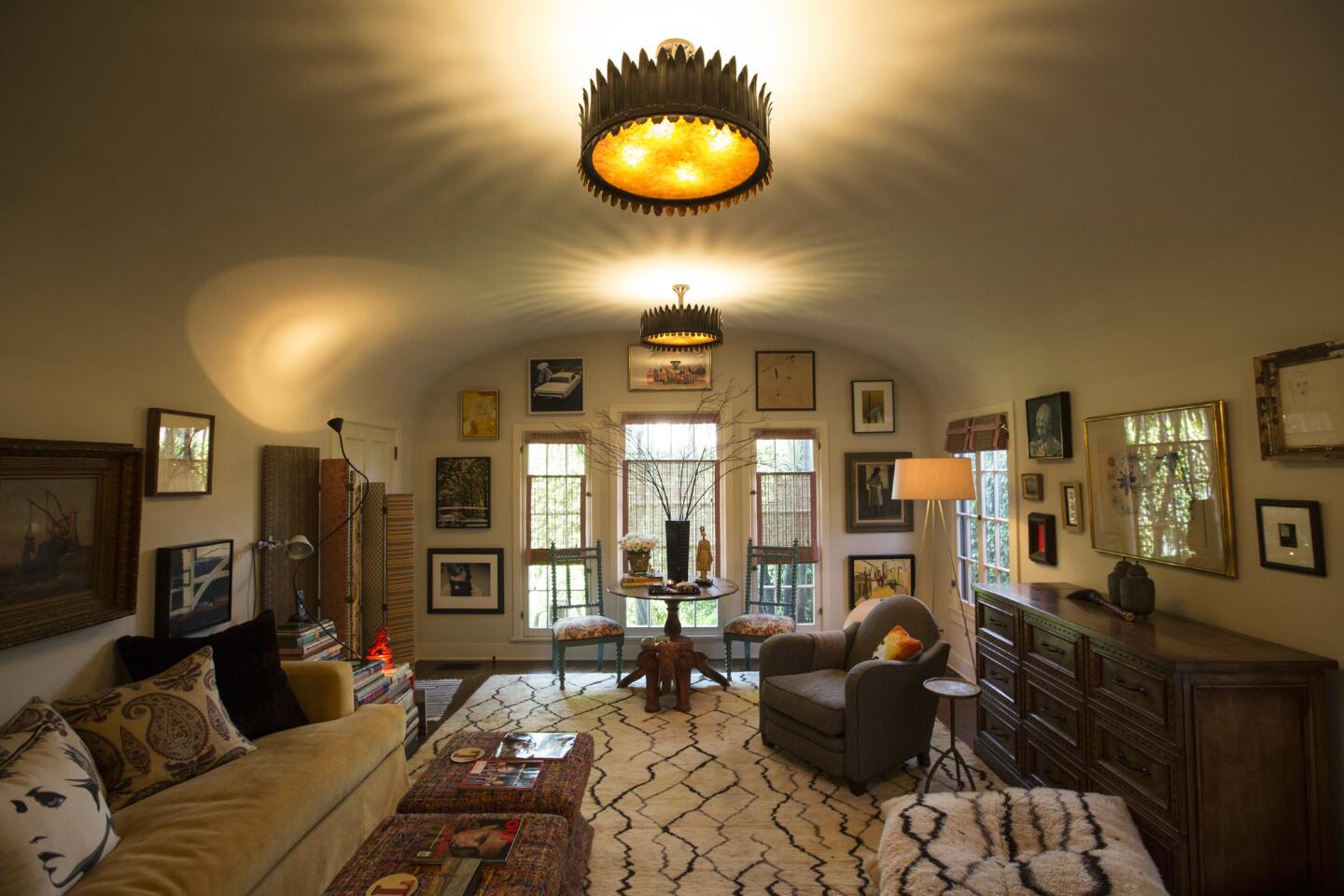
“Custom pendant lights and artwork installed up high make the not-so-big living room feel larger by drawing the eye up to the high barrel ceiling,” Chambers says. He also installed a pop-up television in a credenza which allows him to display artworks when the TV is not in use. It also holds throws and bedding for overnight guests.
Let the sunshine in
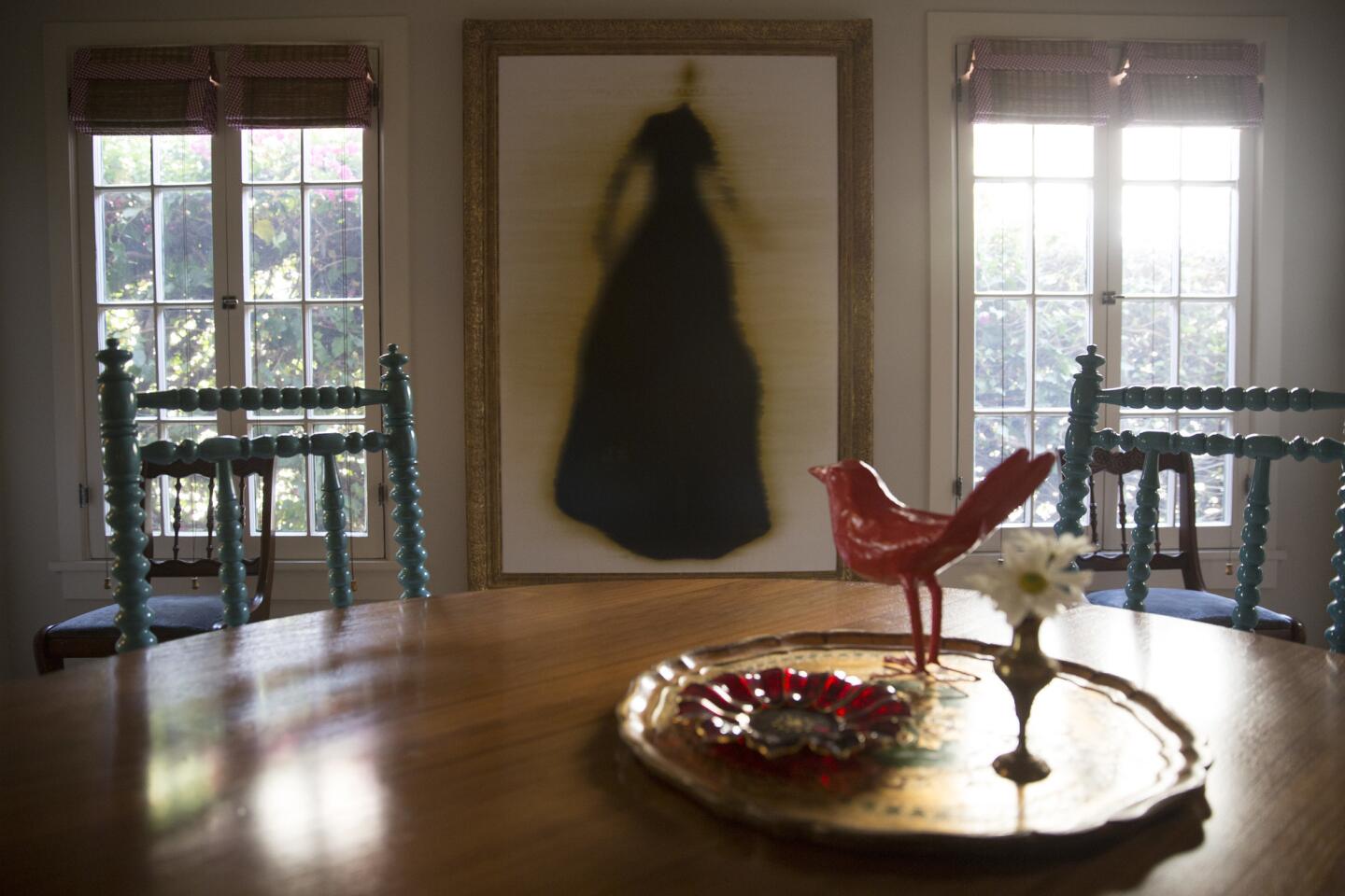
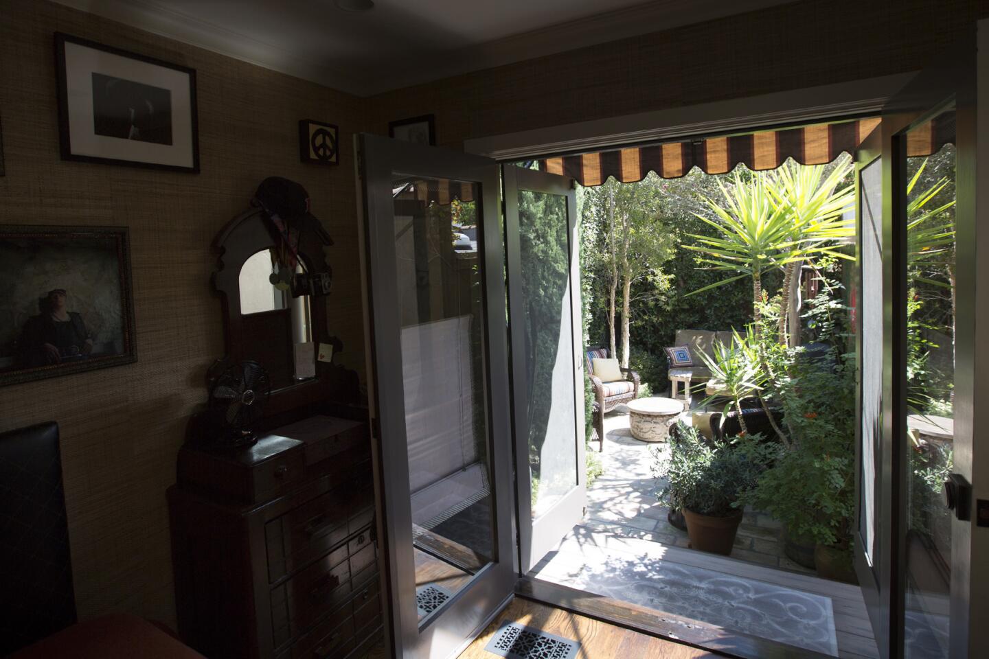
“Cover windows with loosely woven matchstick shades that enhance privacy without shunning natural light or views,” Chambers says.
Stay neutral
Benjamin Moore’s “Tapestry Beige” off-white paint and “Floral White” trim create soothing backdrops that make art pop. “It’s a great neutral (without being white) that maximizes the illusion of space,” Chambers says.
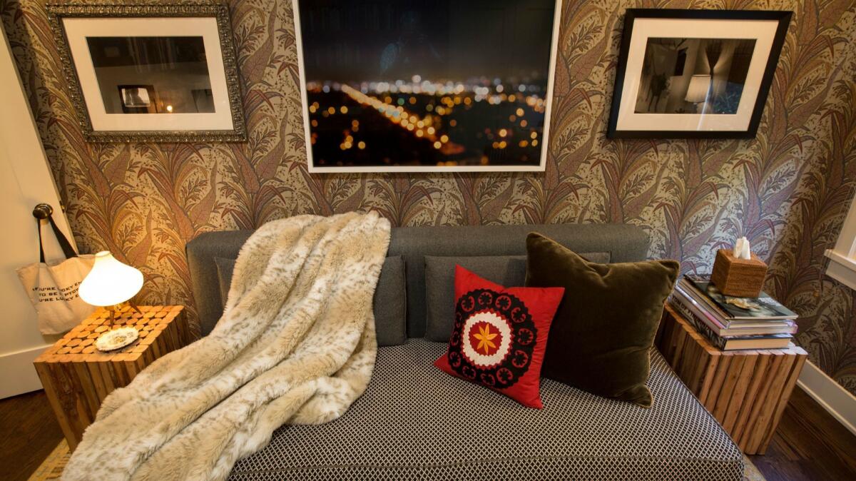
Create an overnight zone
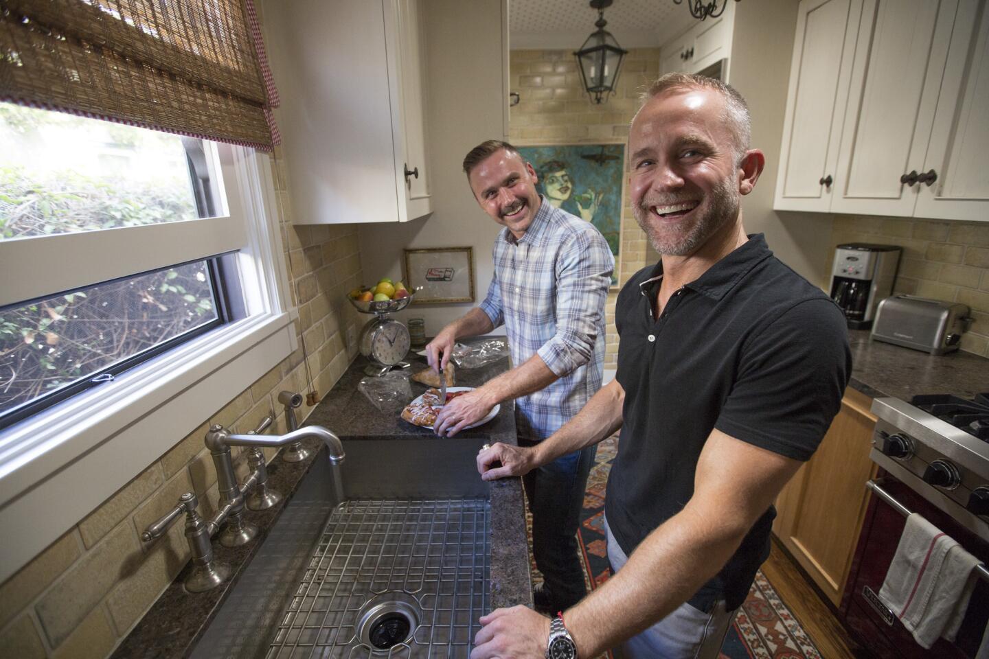
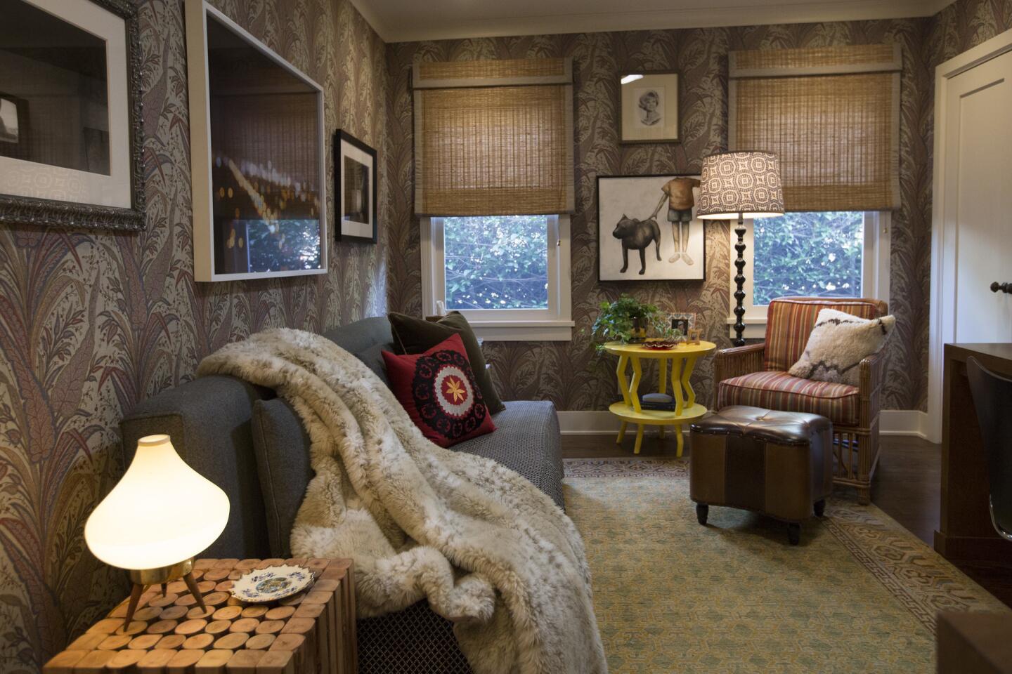
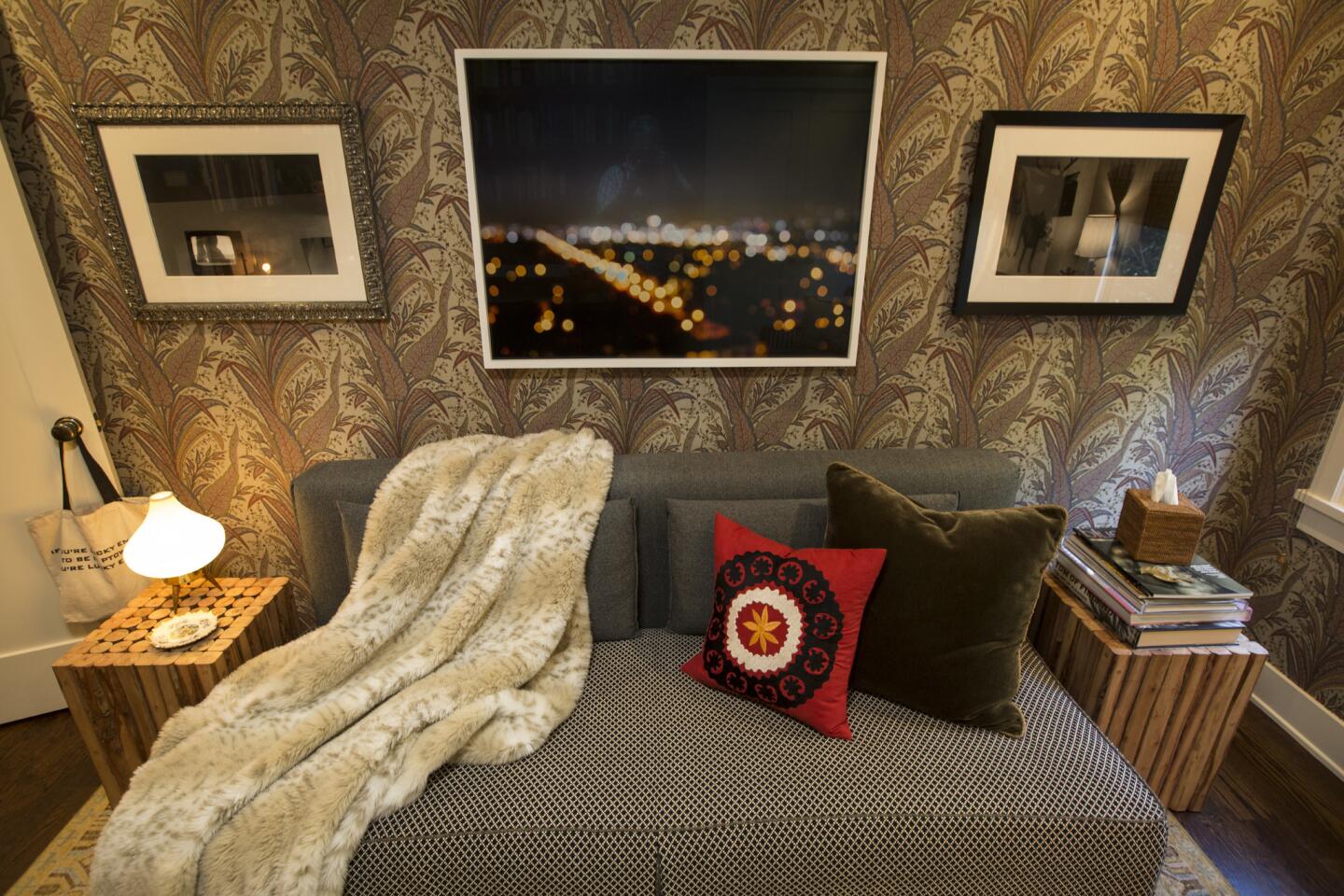
“My home office/study doubles as a guest bedroom, thanks to a sofa that pulls out into a queen-size bed,” says Chambers. After he condensed the large kitchen and service area to a galley kitchen, he was able to add a full bath/powder room and separate laundry room that can be used as a guest bath.
Let there be light
Natural light was a must. “The only original element saved during the extensive renovation were the 11-foot-high barrel ceilings in the living and dining rooms. The challenge for the rest of the flat, 8-foot, 4-inch-high ceilings throughout the house was to get natural light equally dispersed,” explains Chambers. “That was achieved by generously using Solatube skylights throughout.”
Go luxe
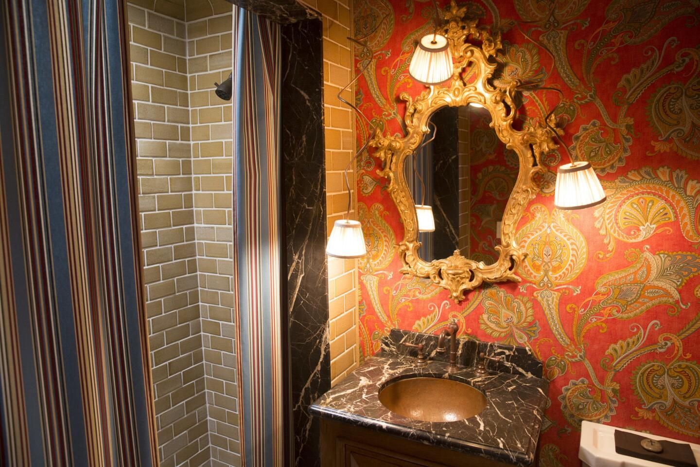
Luxurious materials make the most of a tiny bathroom. “By hanging fabric curtain panels instead of installing a door in the shower opening, I was able to keep its interior in view — making the bath feel larger and allowing it to act as a light well for the room thanks to a skylight located in the shower,” he says.
Embrace texture
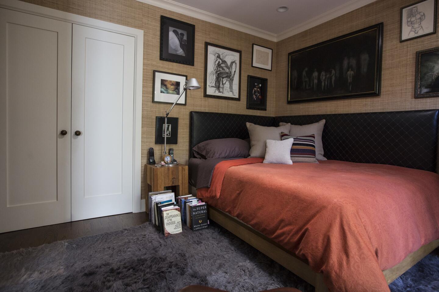
Grass cloth-covered walls, a shearling rug, a leather headboard and an antique family heirloom dresser add interest to the master bedroom without bulk.
Get creative
“The two-sided headboard is two separate upholstered pieces butted into the corner and installed with flat cleat hangers,” Chambers says. This allowed him to push the bed into the corner against both walls to give the room more space.
Go outside the footprint
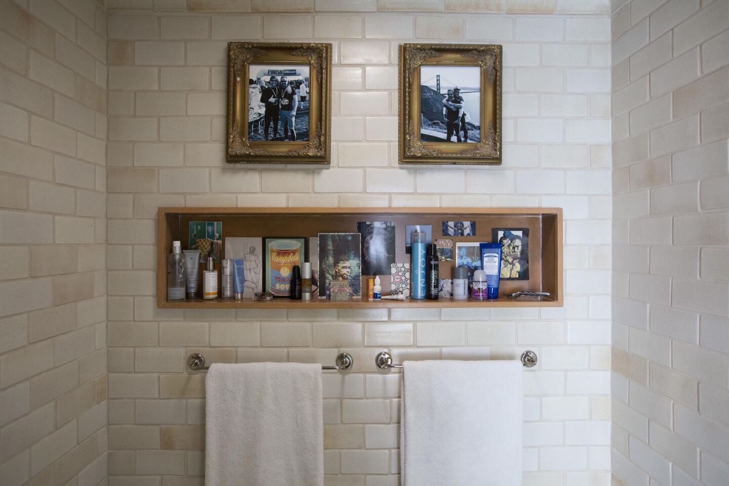
The master bath features a mix of marble and hand-glazed ceramic tile. “I popped out a bay window to add 12 inches to the shower width, which allowed for a bench and recessed shelves for sundries,” Chambers says. The outcome: A roomy shower without changing the footprint.
Multi-task
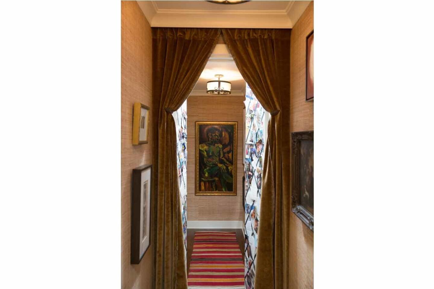
A 20-foot-long hallway was cut down to size with curtains to create portieres that signal the entrance to the master bedroom suite. “Behind the curtains, a pair of swing doors outfitted with a grosgrain ribbon bulletin board provides vertical space for me to display family photos and other mementos,” says Chambers. Again, an example of giving multipurposes to individual items.
Double duty
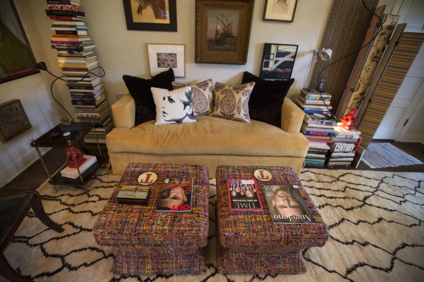
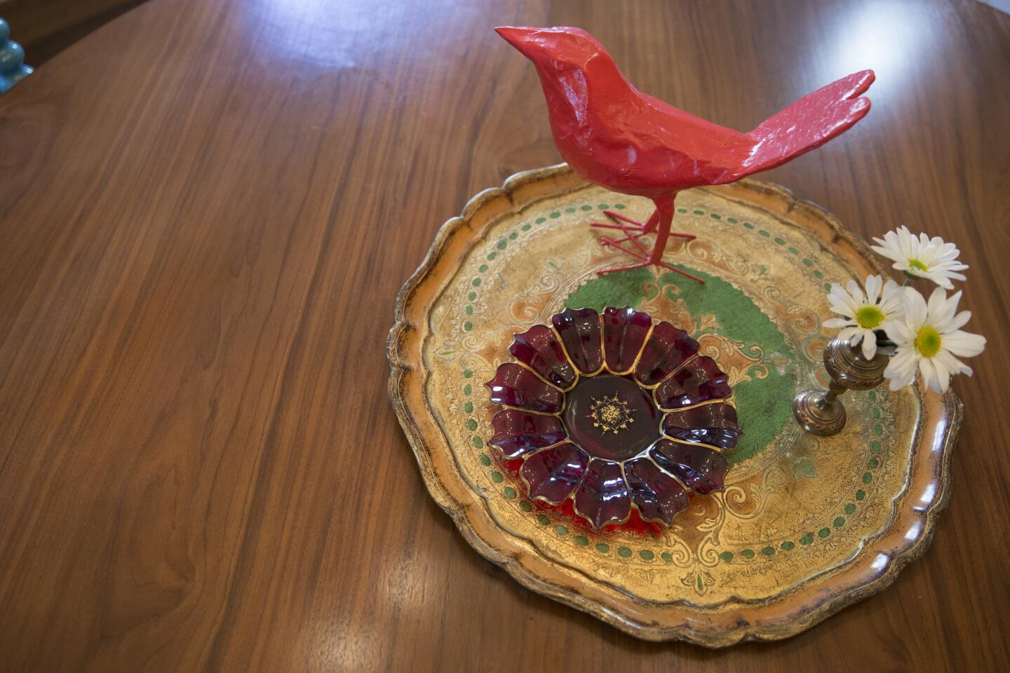
To give the rooms flexibility, “the majority of the furnishings have dual purpose,” Chambers says. “Both the living room and study become bedrooms when needed, thanks to sofas that convert into beds. The living room’s coffee tables open up into storage units. A folding table top (stored when not in use) allows the dining table to serve 12.”
Final advice
“Live at or, even better, below your means,” says Chambers. “It will give an ease and grace to your day-to-day life that material things can never do.”
Twitter: @lisaboone19
For an easy way to follow the L.A. scene, bookmark L.A. at Home and join us on our Facebook page for home design, Twitter and Pinterest.
ALSO:
Small-space living: 18 interiors to inspire
Now this is how you style a 700-square-foot rental
More Southern California home tours
