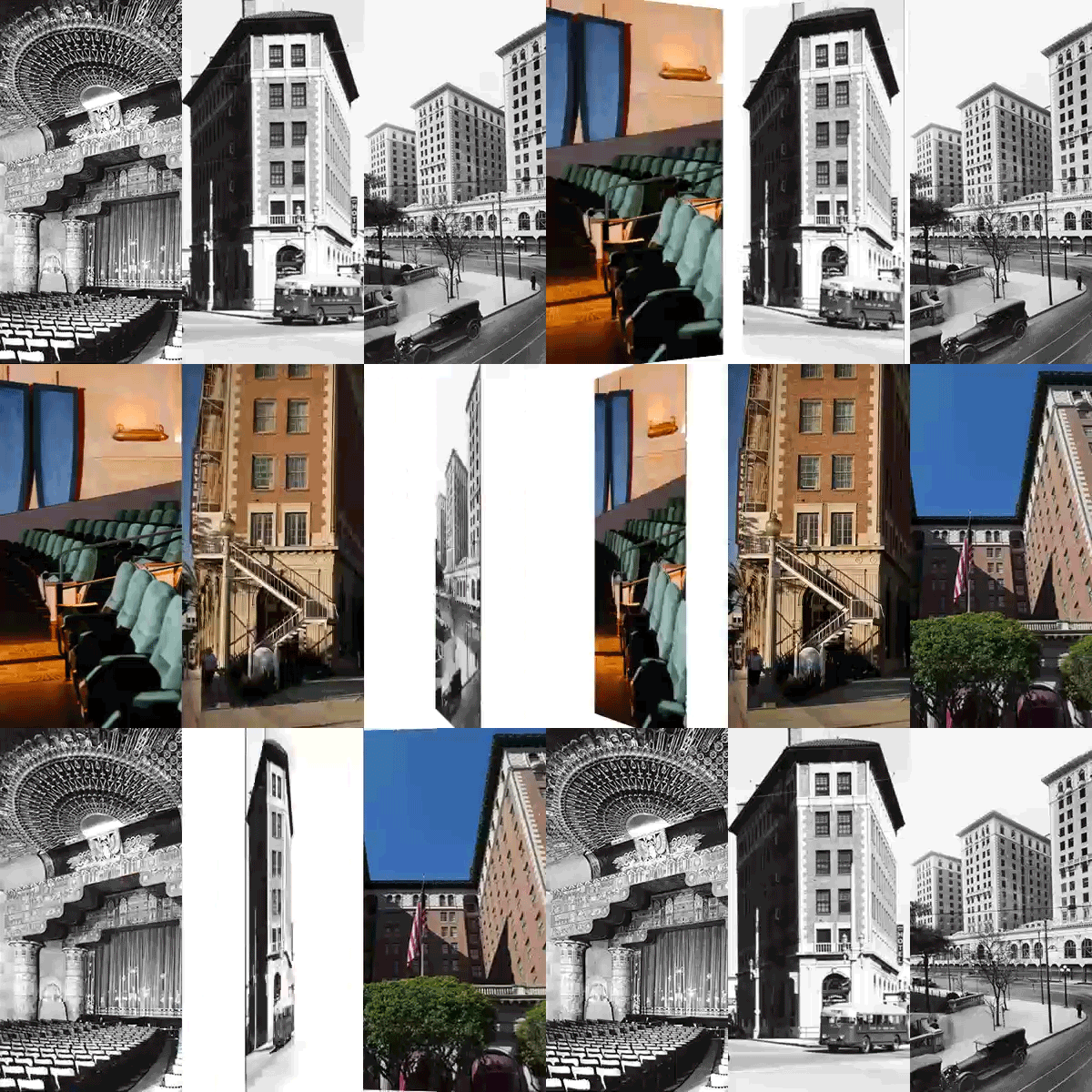
Architect Frederick Fisher: Building a lasting legacy in the L.A. art world
- Share via
Frederick Fisher is something of an invisible man among L.A. architects: He creates buildings that are acclaimed by their users but have often gone unnoticed by the world at large. His houses, academic buildings and spaces for making and showing art are all about substance rather than show. Well-proportioned rooms, natural lighting and finely detailed materials enrich one’s experience in a subliminal way. So subtle is the architecture, so elusive in the camera’s eye, that the forty-year career of Fisher and his longtime partners, Joe Coriaty and David Ross, is less celebrated than it deserves to be.
That’s likely to change in the next few years, for the 30-person office has four major Los Angeles projects in development. A glass wing will open up the Natural History Museum to Exposition Park and its new neighbor, the swoopy silver spaceship of the Lucas Museum. Close by, on the USC campus, the firm is rehousing the interdisciplinary Iovene Young Academy. A new production facility will enlarge the scope of the Center Theater Group downtown, and a state-of-the-art glass block will extend the Santa Monica City Hall.
In person Fisher is as quiet and thoughtful as his architecture, describing himself as “a pragmatic Midwesterner, the son of a hospital architect with a stack of books on Frank Lloyd Wright.” His mother shared her love of art, taking him to drawing classes and the Cleveland Art Institute. After studying art at Oberlin, he drove to L.A. and secured his Master of Architecture degree at UCLA in 1978. Inspired by a Frank Gehry lecture on the Ron Davis studio in Malibu, he applied for a job and was told they had no work. “The next day, Gehry called back to say his marketing person had quit and he needed someone right away to fill in,” Fisher recalls. “It was a great way to learn, and I graduated to model-making and design. He had a habit of giving young people responsibility, having them work from a little sketch.”
As he was leaving Gehry’s office, he designed the Caplin house in Venice, “which was loaded with every idea I’d had in architecture school.” His debut as an independent practice was a modest house-studio for ceramicist Elsa Rady, the first of a series of collaborations with artists. In the mid-1980s he won a competition to create MoMA P.S.1 in the New York borough of Queens, converting a public school into a versatile exhibition space. While Gehry claimed he had merely cleaned up a garage to create the Temporary Contemporary in downtown L.A., Fisher took a more aggressive approach in New York, stripping and tearing out walls to create rough, edgy spaces that would give artists total freedom. Gordon Matta-Clark had fun with a chain saw, and others have burrowed into the floor. Both galleries celebrate the excitement of creativity.
Adaptive re-use is a major part of the practice. A Santa Monica telephone company building was remodeled to house the Eli Broad collection, with beams and skylights replacing a forest of columns. A street-car depot was transformed into Bergamot Station, the most successful concentration of galleries in L.A. A Spanish-revival PacBell service facility in Harvard Heights became the Jane B. Eisner Middle School. The firm also turned a vintage guest house into the Annenberg Community Beach House in Santa Monica and gave new life to Sunnylands, the Annenbergs’ estate in Rancho Mirage.
“I’m not seen as an architect who produces signature work,” Fisher admits. “Buildings should respond to their setting, so each one is different. That’s a problem when people come to our office expecting to find a design they can select—‘I’ll have one of those’—and we tell them we don’t yet know what it should look like.”
The advantage of this approach is that Fisher’s buildings don’t go out of fashion or outlive their usefulness. Private art galleries are often ephemeral, but L.A. Louver in Venice looks as fresh as when it was completed in 1994. A crisp cubist composition of stucco, steel and concrete block is carved away to provide a gated entry court and an enclosed terrace that evokes a James Turrell Sky Space. As in P.S.1, a diversity of spaces are available for the installation of artworks, and it’s a good place to catch up on the latest work of David Hockney.
When the Huntington mansion was restored a decade ago, the board realized that they could build a new gallery to house the popular artworks for almost the same cost as putting them in storage. Fisher’s team rose to the challenge of extending the Virginia Steele Scott Galleries of American Art, grafting the Erburu contemporary wing onto a neoclassical building and creating a seamless joinery within. They took inspiration from the skylit Dulwich Art Gallery near London, a pace-setting design two centuries old, which also provided a model for Richard Meier’s Getty Museum.
The new Huntington galleries open up to nature through steel-framed walls of glass, and the temporary installation of classic English paintings was a huge success. As collector Frances Brody observed, “I don’t think they should put the pictures back in the house—they look better here.” In 2016 Fisher inserted another suite of galleries to house the Fielding Collection of early-American art and artifacts. Most recently the firm has reconfigured LACMA’s Resnick Gallery to accommodate a wide diversity of exhibitions in a pinwheel plan of semi-enclosed spaces. That saves the expense and waste of putting up and tearing down drywall partitions for each show.
Watercolors provide Fisher with an escape from the rigors of architectural design as well as a sketchpad for future projects. “They force me to slow down and lose control, because once you’ve applied brush to paper, you can’t undo it. To me it’s about looking, and every form of representation distills the essence of what we see.”
The hands-on approach that has served Fisher so well feeds into the larger, more public projects he is currently designing. “One of the glories of architecture is how big it is and how many things it touches,” he observes. “We want to demystify the experience of going to the Natural History Museum, especially for first-timers. Our design is all about transparency and connectivity, breaking down barriers between the activities within and those of a park that will host the Olympics for the third time in 2028.”
More to Read
The biggest entertainment stories
Get our big stories about Hollywood, film, television, music, arts, culture and more right in your inbox as soon as they publish.
You may occasionally receive promotional content from the Los Angeles Times.


