Courtyard home in L.A.’s Chinatown
- Share via
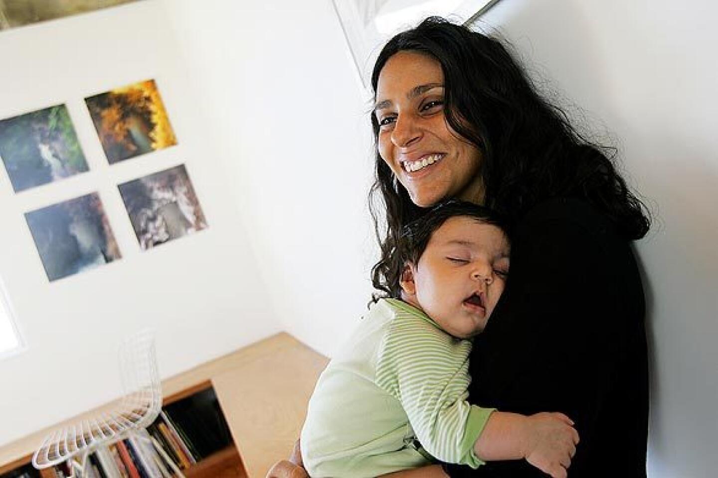
As architects with more than a passing interest in urban planning, Ali Jeevanjee and Poonam Sharma were thrilled to move to Chinatown, where the mix of residential and retail development in close proximity to public transit makes for a vibrant, pedestrian-friendly neighborhood.
“The idea of community might be a little unusual for Los Angeles,” says Jeevanjee, 33. “But this is a real community. In fact, it has the strongest sense of community that I’ve ever experienced.”
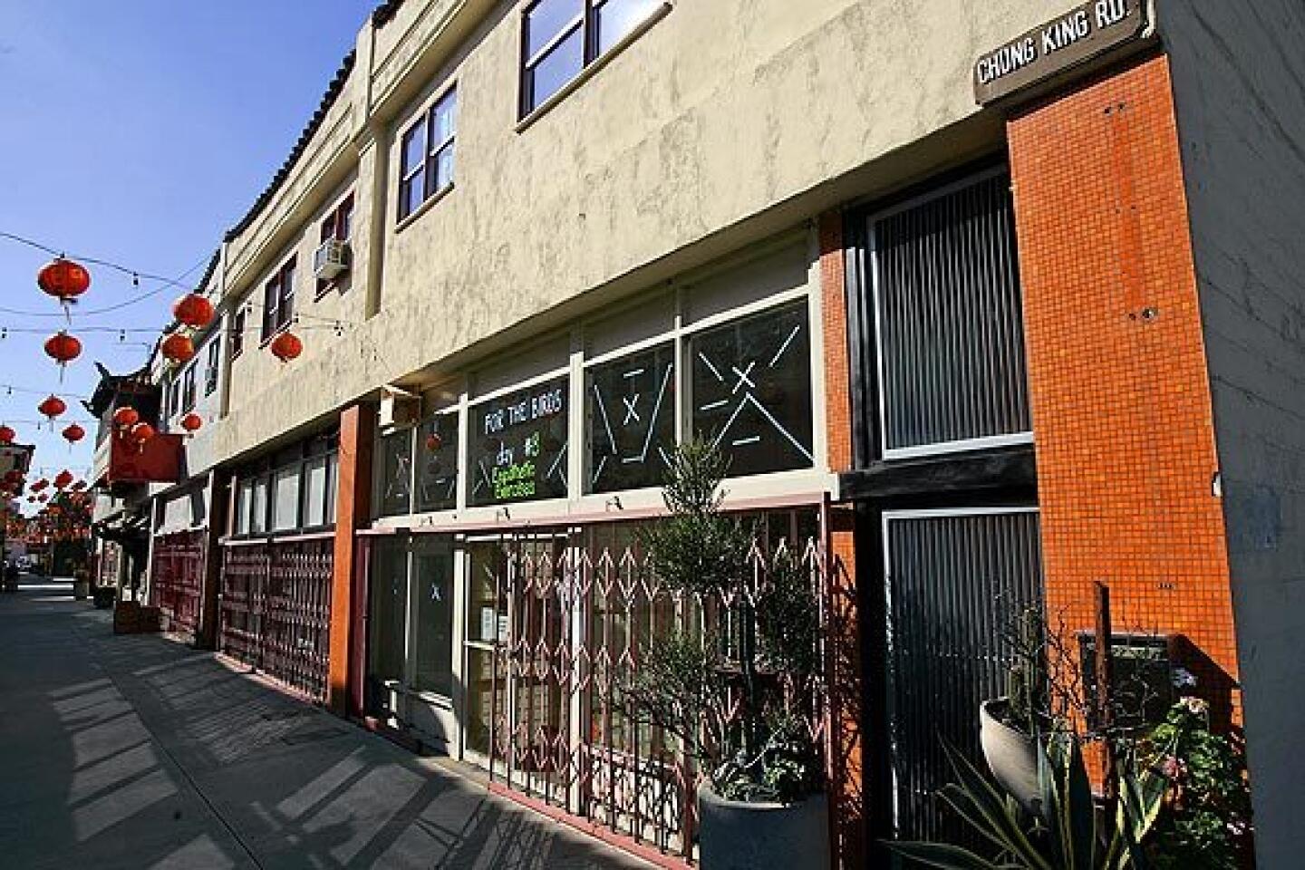
Jeevanjee and Sharma, the husband-and-wife team behind LOC Architects, moved late last year from Silver Lake, where they were spoiled by scenic environs and the ability to entertain friends and family in relative privacy. When they purchased two second-story apartments and a ground-floor gallery space along Chung King Road for $600,000, they understood that they would never be able to re-create that setting exactly, but that they could use their design skills to achieve the same kind of indoor-outdoor lifestyle.
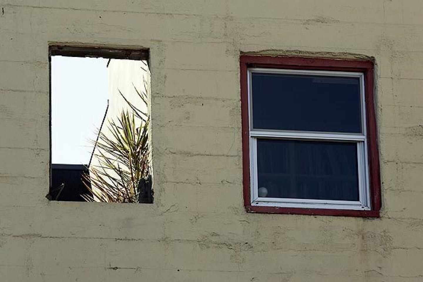
It was a challenge, however, because the Chung King building was designed in the 1940s. The two one-bedroom units were dark and cramped, with low ceilings and an enclosed kitchen. What’s more, their building is on one of the walking streets in the heart of Chinatown, where on any given night, hundreds of people may visit art galleries, shops and restaurants that retain the neighborhood’s historic charm. Jeevanjee and Sharma had to resist making any architectural changes to the exterior, as that would have affected the flavor of the street.
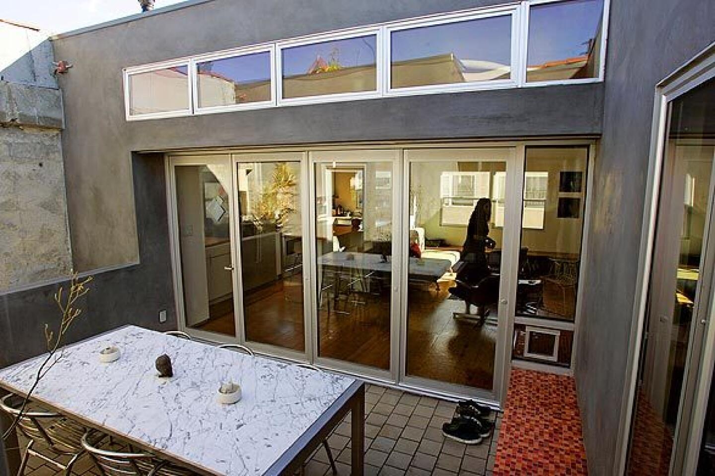
Their design combines the two 600-square-foot apartments and carves out a 17-by-11-foot opening in the roof to create a courtyard at the center.
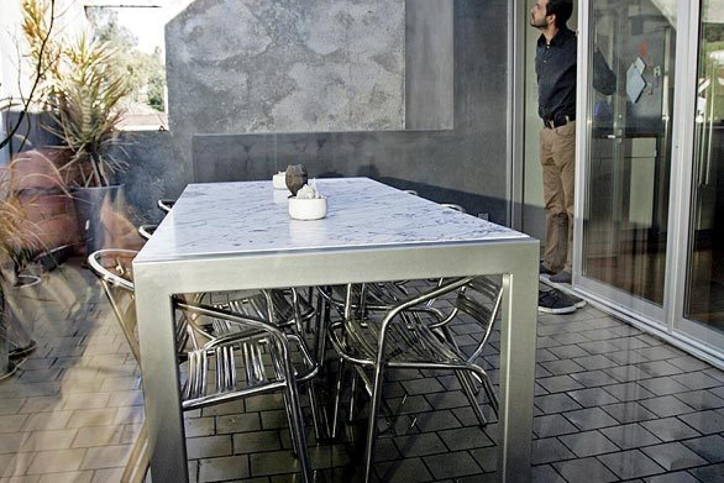
“Our first priority was in creating an outdoor dining area, because we both love to eat outdoors,” Jeevanjee says. “In our old place, we had a 10-person dining table on the patio, and we wanted to re-create that somehow.”
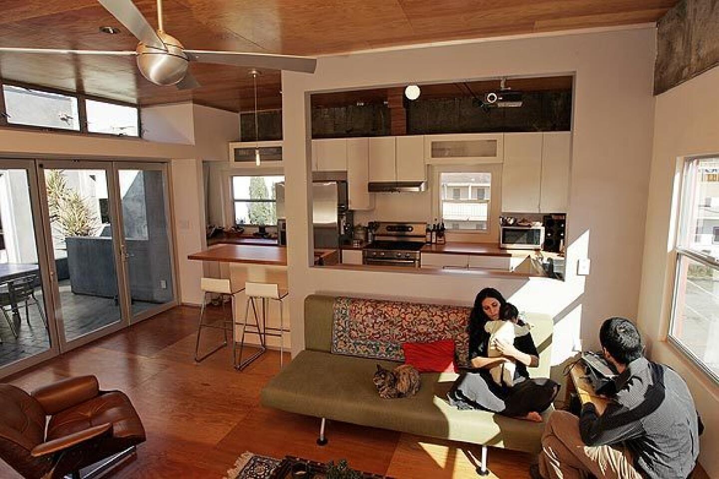
They raised the ceiling two feet and, to capitalize on natural light coming into the courtyard, added large panes of glass to adjoining rooms, which include the master bedroom, a baby’s room and a home office. Pivoting glass arcadia doors connect the open living area and kitchen to the outdoor space, now furnished with an LOC-designed marble-top dining table.
“You could say that the entire apartment was designed around a table,” says Sharma, 36. “Once we had that, everything else fell into place.”
To capture breezes in summer, the couple installed an open-air gate at the bottom of the stairwell leading to the street. Even in the hottest months, the gate creates a current of air funneling from Chung King Road to the courtyard and through clerestory windows into the living area.
Jeevanjee -- an alum of Harvard (undergraduate) and Cornell (graduate) who went on to work for Frank Gehry’s architecture firm -- has designed a number of stylish abodes in Los Angeles, including the Electric Avenue lofts, 16 live-work units in Venice Beach. (One of his collaborations, the 1+3=1 House in Venice, which consists of three separate but interconnected living spaces on a single lot, was a Home section cover story in October 2007.)
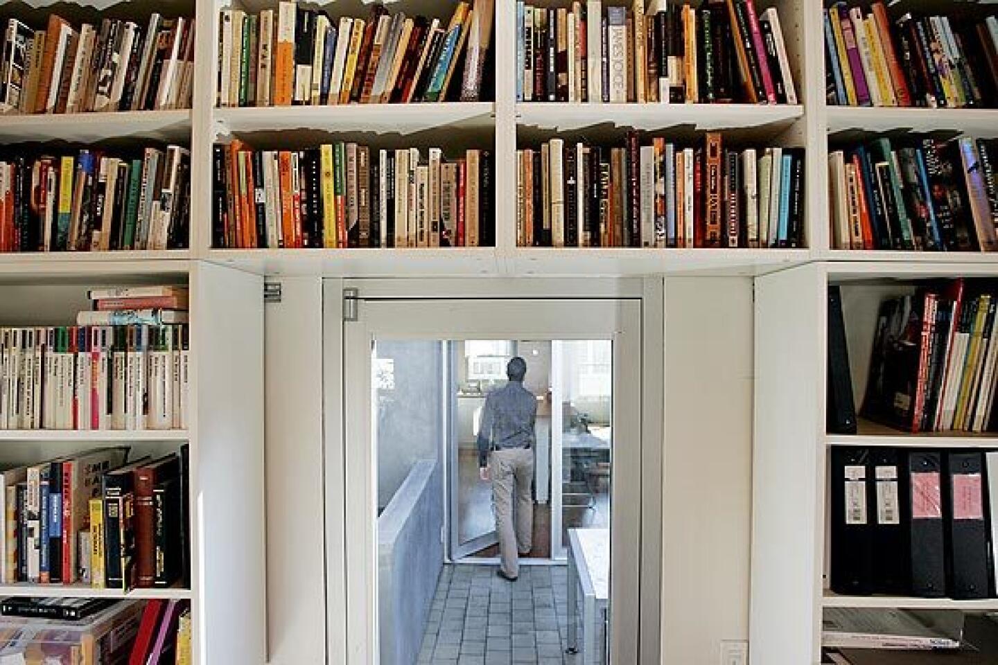
If his projects share a common theme, it’s the idea of transparency and connectivity -- that occupants can look from one room to another, even across an exterior space like a patio or courtyard.
“It’s a little more difficult to do that in a small space like this,” he says. “But not impossible.”
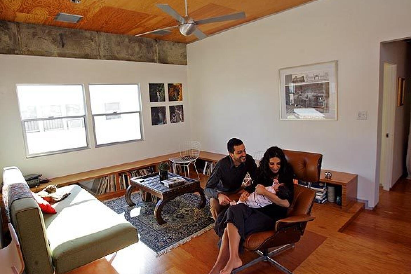
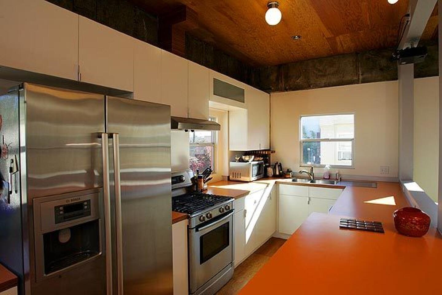
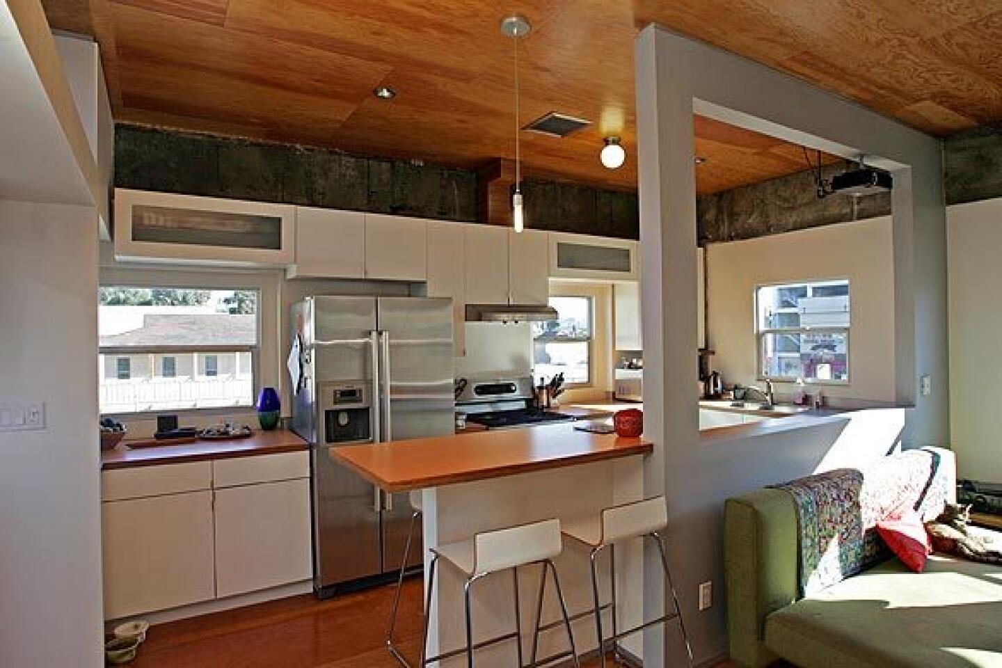
Indeed, the 1,000-square-foot Chinatown home feels surprisingly large for its modest size. That’s especially true in the living area, which includes a spacious open kitchen with views of nearby hills.
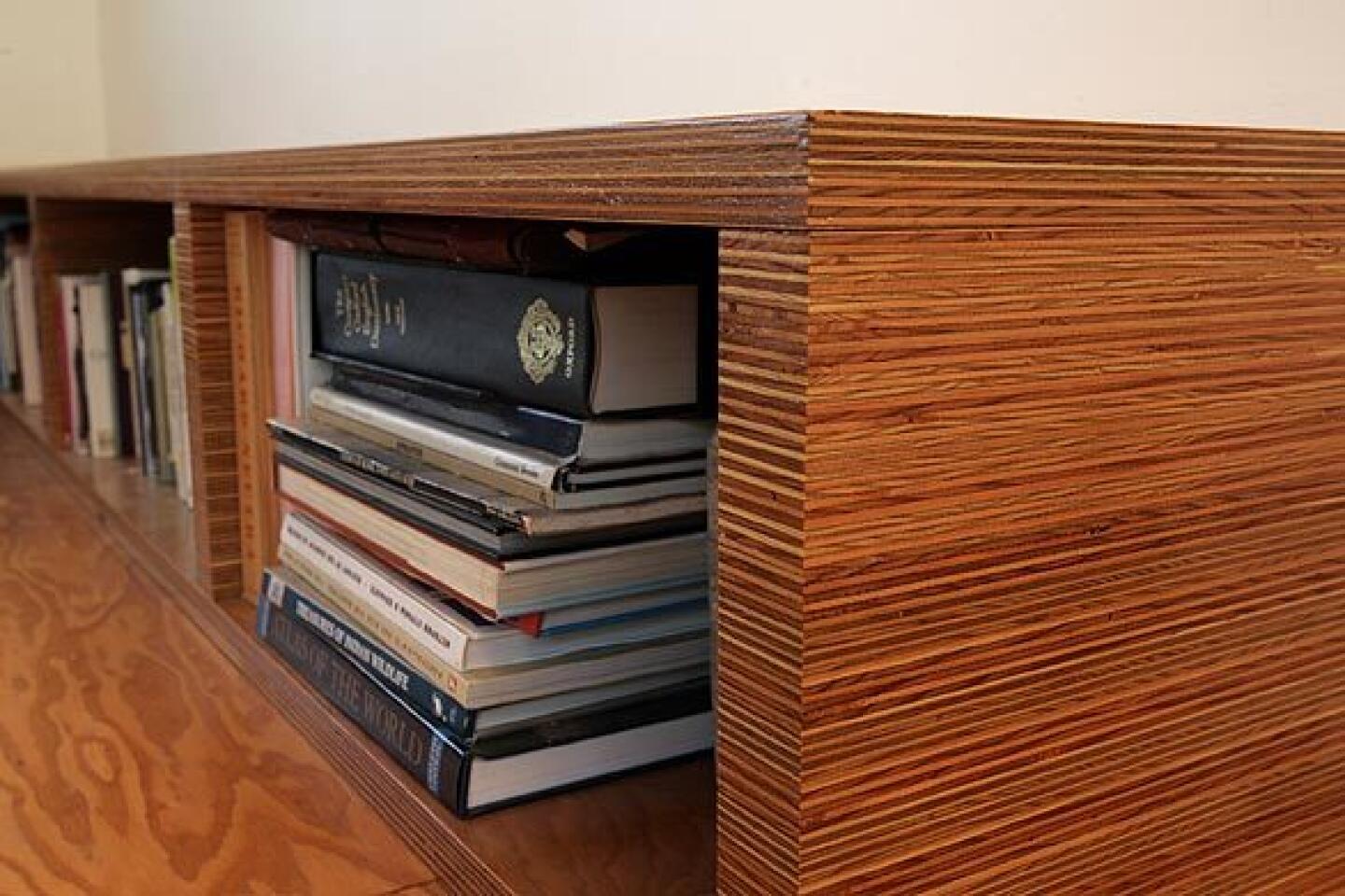
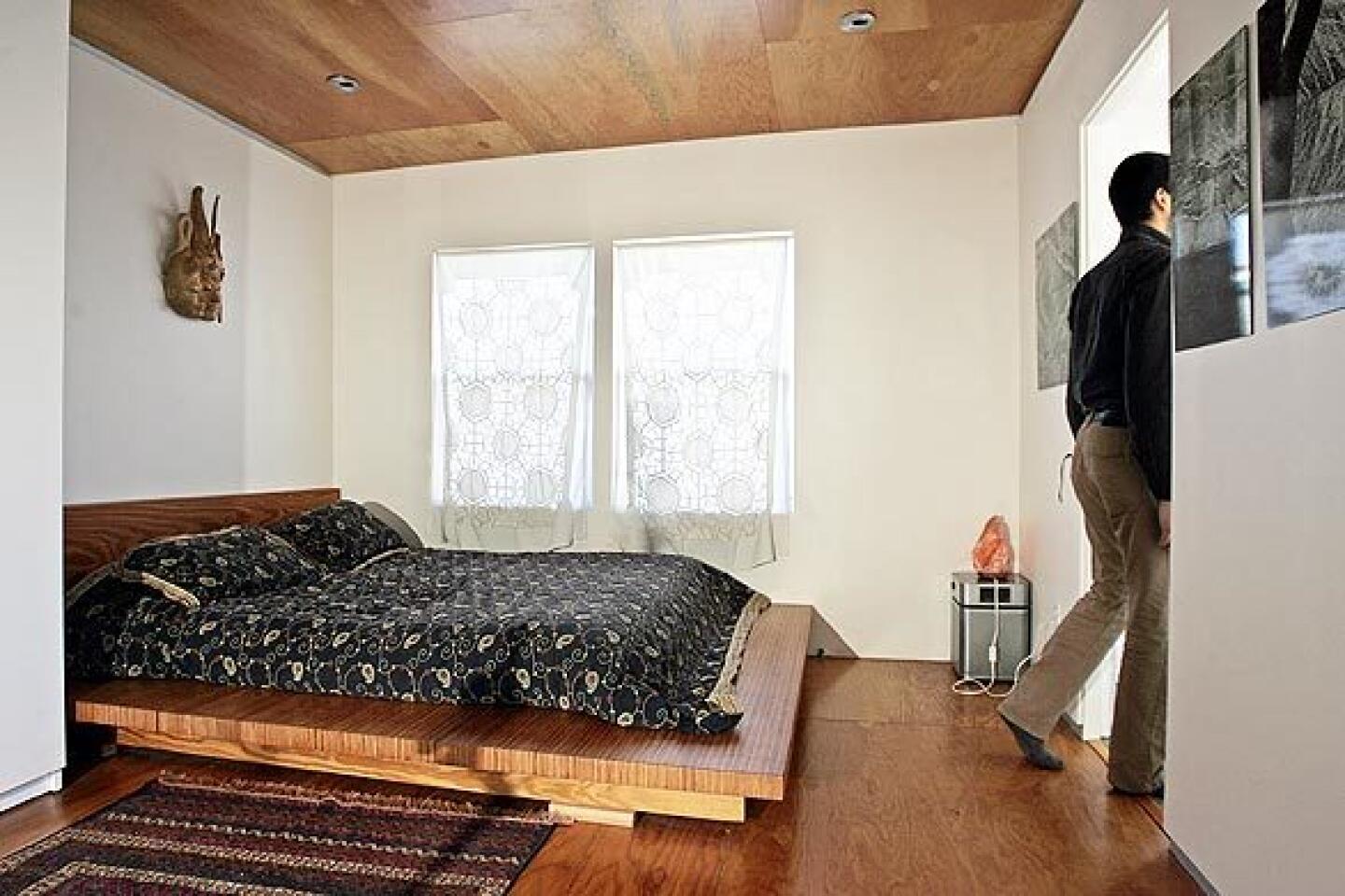
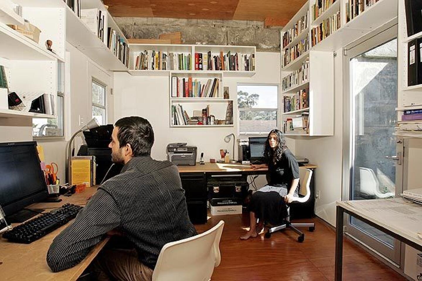
It’s the first project that Jeevanjee co-designed with Sharma, who was trained at the Southern California Institute of Architecture and worked with 5+Design, a firm with a portfolio of resorts, malls and residential communities. The home exhibits many of the couple’s shared interests, such as plywood, used in abundance for the floor, ceiling and furniture. That creates a nice contrast to some of the aluminum accents featured throughout, as well as the bold orange tile in the courtyard. In the kitchen and office, they used basic IKEA cabinets, which they accented with hardware of their own design.
“That was our basic challenge,” Sharma says. “To use inexpensive materials and use them in a way that’s beautiful -- because there’s an art to teasing beauty out of the ordinary.”
To offset the construction costs, which totaled about $200,000, the architects lease out the ground-floor gallery. In the future, they hope to plant a garden on the roof.
“You get a great view of downtown L.A. from the roof,” Jeevanjee says.
The couple are sensitive to the way mixed-use development integrates people into their communities. A mixed-use boom in the 1930s and ‘40s, when public transportation was at an all-time high, all but disappeared with the popularity of cars in the 1950s.
“Back then, urban patterns really called for mixed-use buildings,” says Jeevanjee, who’s working on two large-scale projects in Chinatown. “And now, 60 or 70 years later, we’re finding ourselves with increased traffic problems and density problems. So it makes sense that mixed-use is back in vogue.”
More to Read
Sign up for The Wild
We’ll help you find the best places to hike, bike and run, as well as the perfect silent spots for meditation and yoga.
You may occasionally receive promotional content from the Los Angeles Times.
