How small is too small? One family’s creative solution to growing their space
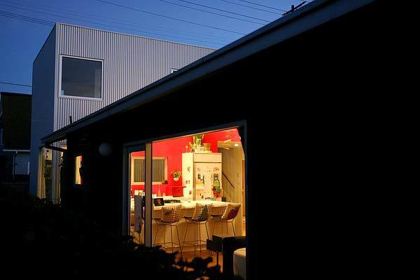
Scott and Sharonne Trattner wanted more space -- more space than a run-down, 900-square-foot Venice cottage could offer. The solution: Behind their 1920 home now sits a new modern, minimalist white box designed by architect Talbot McLanahan. Together, the two wings of the house -- old and new – now form a 1,600-square-foot family home bursting with color and contemporary style. Take a peek inside and see how the Trattners and McLanahan opened up the old house and linked it to its modern addition, which includes a new master suite, children’s bedroom and cozy deck. (Christina House / For The Times)
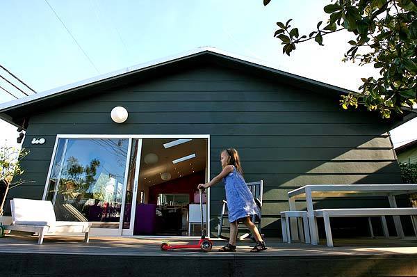
Ever Trattner, 5, pushes her scooter across the front deck of her family’s Venice home. To emphasize the contrast between old and new, the original bungalow is sided in dark gray cement fiber board. (Christina House / For The Times)
Scott Trattner, a Media Arts Lab creative director working on
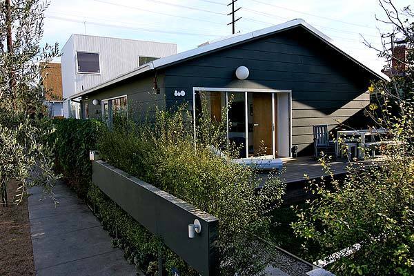
Another view of the front. Situated on a 3,420-square-foot corner lot, a block from Venice’s charming “walk streets,” the original house contrasts sharply with the new aluminum-sided addition. (Christina House / For The Times)
Advertisement
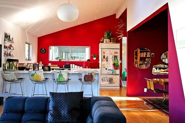
The original house has been opened up to be a loft-like space combining living room, kitchen and dining area. This photo was taken at the front of the house, in the living area (to be shown in detail later). Two bedrooms along the right side have been turned into an office and a dining room. (Christina House / For The Times)
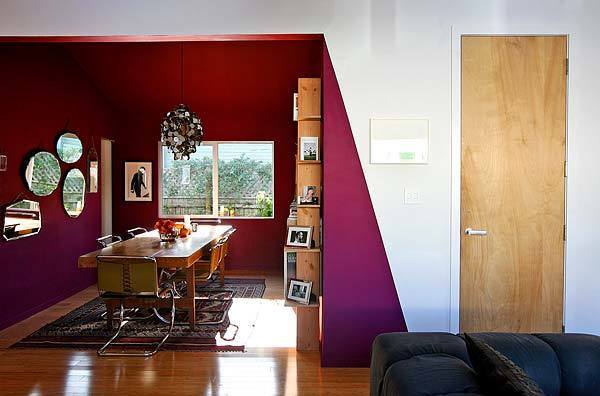
The couple tore down a bedroom wall and transformed the space into a dramatic dining room, which makes a statement with striking magenta paint. Behind the closed door lies ... (Christina House / For The Times)
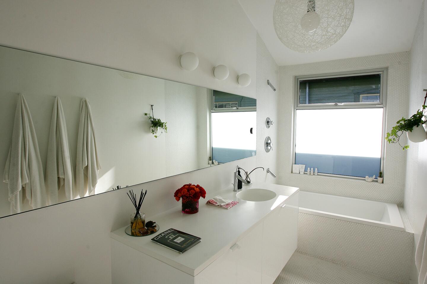
. . . one of three bathrooms. The Trattners used inexpensive
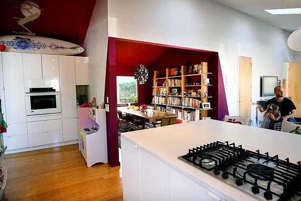
An alcove off the kitchen provides more room for more cabinetry and gives daughter Ever a place of her own to cook. (Christina House / For The Times)
Advertisement
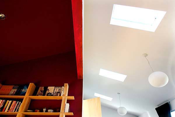
Three operable skylights hover above the main living area, providing a surplus of natural light and ventilation. (Christina House / For The Times)
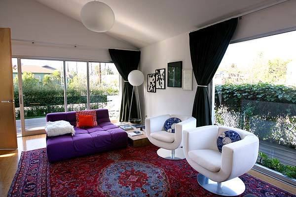
Looking back toward the living area at the front of the house. (Christina House / For The Times)
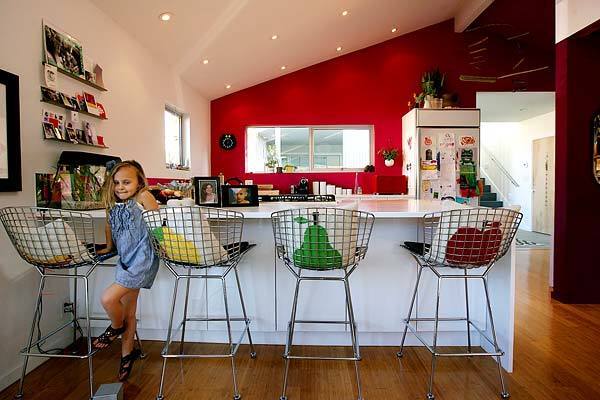
Ever takes a seat in the open and airy kitchen. The couple splurged on Corian countertops. “They cost as much as all of the
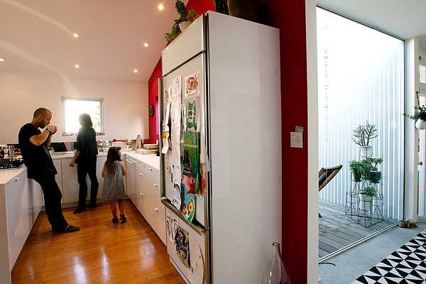
Scott, Sharonne and Ever Trattner hang out in the kitchen. To liven up the cabinets, the couple powder-coated the hardware. To the right: the hallway leading to the home’s new addition. (Christina House / For The Times)
Advertisement

As Scott does the dishes, Ever sees her reflection in the kitchen’s inexpensive back splash. (Christina House / For The Times)
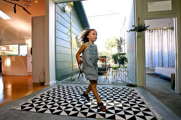
A light-filled corridor connects the original 1920 bungalow, left, to the boxy modern addition, right. The glass looks out to a small deck set in between. (Christina House / For The Times)
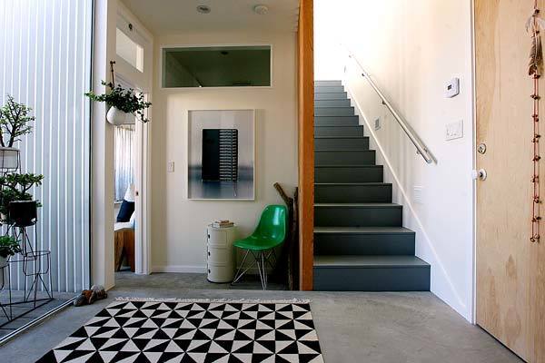
Architect McLanahan chose not to set the addition directly next to the original house. By putting the hallway and small deck in between, light and air can flow into the old kitchen and the new master bedroom. Exposed framing doubles as a screen along stairs leading to the daughter’s bedroom. Whereas the original house has wood flooring, the modern addition has concrete. (Christina House / For The Times)
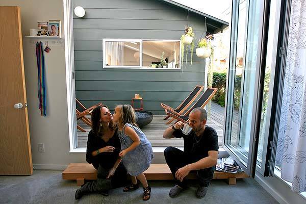
In the new master bedroom, Sharonne, Ever and Scott Trattner sit on a bench in front of the sliding NanaWall — one of their few splurges. It opens to the small deck and fire pit; the original wing of the house lies beyond. Though much of the house is exposed to a street or an alley, this outdoor nook remains private. (Christina House / For The Times)
Advertisement
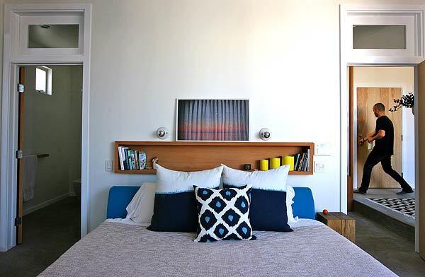
In the master bedroom: Hopper windows, or transom windows that can be opened, improve air flow throughout the house. (Christina House / For The Times)
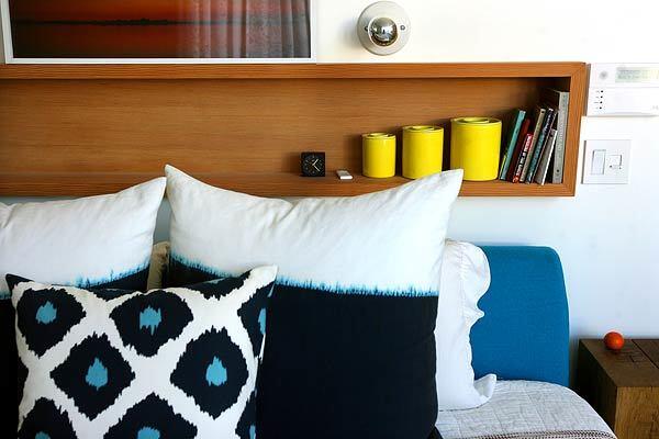
Architect McLanahan designed space-saving built-in shelving above the bed. (Christina House / For The Times)
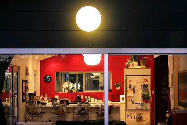
“We were idealists,” Scott Trattner says. “We wanted to prove that we could live in a small space. But it was hard.” With their living space expanded from the original 900 square feet to the new 1,600 square feet, the family not only has more breathing room but also the architectural mash-up of old and new that’s quite fitting for the unconventional neighborhood. It’s practical, too — “a whole different way of living,” Sharonne Trattner says.
Want to know more about the Trattner’s addition? You can read our full story here.
Check out these other stories of old homes remodeled for a new century:
In Atwater Village, a humble house gets remade with unconventional and budget-minded materials.
In Costa Mesa, a young couple turns an old barn into a slice of loft-like living.
In Venice, a 1906 house keeps its cottage looks outside but gets a modern makeover inside.
These and dozens of other home profiles can be found in our ever-growing Homes of the Times archive. (Christina House / For The Times)


