Pantone’s color of the year pick is actually a coded message about gender equality, fluidity
- Share via
Pantone’s choice of a baby pink and a pastel blue as color of the year for 2016 was inspired by “mindfulness,” a movement that has become increasingly popular in interior design.
The color authority said this year’s shades -- officially named Rose Quartz and Serenity -- were chosen as a symbolic “color snapshot of what we see taking place in our culture at a particular moment in time,” intended to convey a “a soothing sense of order and peace.”
But there’s more.
The soft pink and light blue hues are also a nod to gender equality and gender fluidity.
“In many parts of the world we are experiencing a gender blur as it relates to fashion,” Pantone explained in today’s announcement. “This more unilateral approach to color is coinciding with societal movements toward gender equality and fluidity, the consumer’s increased comfort with using color as a form of expression, a generation that has less concern about being typecast or judged and an open exchange of digital information that has opened our eyes to different approaches to color usage.”
The pastel pairing is the first time the esteemed color institute has released two colors of the year.
Leatrice Eiseman, executive director of the Pantone Color Institute, described the soothing colors as a way to counter stress. “Joined together, Rose Quartz and Serenity demonstrate an inherent balance between a warmer embracing rose tone and the cooler tranquil blue, reflecting connection and wellness, as well as a soothing sense of order and peace,” she said in the statement.
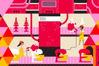
And while it remains to be seen if a cotton candy-colored KitchenAid mixer or baby blue chaise can summon calm, Pantone’s rose-colored take on forecasting trends -- in light of a rise in transgender awareness -- is a thoughtful approach that can be appreciated.
Los Angeles interior designer Timothy Corrigan and others said the choices represent a welcome change:
“People are ready for softer colors. They are moving away from the strong bold colors and geometric patterns that have been popular over the past few years. There is a return to comfort and innocence.”
ALSO:
13 enchanting gift ideas for house and home
Holiday gift guides for everyone (and pet!) on your list
Win Christmas this year with 11 gifts that no kid can resist
More to Read
Inside the business of entertainment
The Wide Shot brings you news, analysis and insights on everything from streaming wars to production — and what it all means for the future.
You may occasionally receive promotional content from the Los Angeles Times.


