Video: see how this Miracle Mile living room is transformed Apartment Therapy style

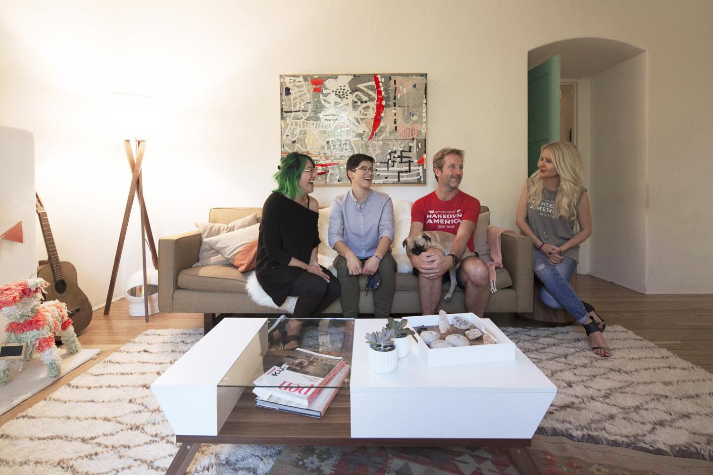
Maxwell Ryan, founder of Apartment Therapy, and Christiane Lemieux, of online furnishing company Wayfair, help decorate a Los Angeles apartment as part of Ryan’s cross-country book tour for his new book “Apartment Therapy Complete and Happy Home.”
- Share via
“What do you love about your apartment?” Maxwell Ryan asks Eugenia Barbuc and Corinna Loo as he surveys their Miracle Mile living room.
The couple has been chosen to receive a living room makeover courtesy of the Apartment Therapy founder during his cross-country book tour for “Apartment Therapy: Complete + Happy Home” (Potter Style, $35).
While they feel there isn’t much to love currently, they do know what they would like: More color. More fun.
“What do you want us to de-clutter?” he asks. Ever the therapist, Ryan avoids terms like “discard” or “get rid of.”
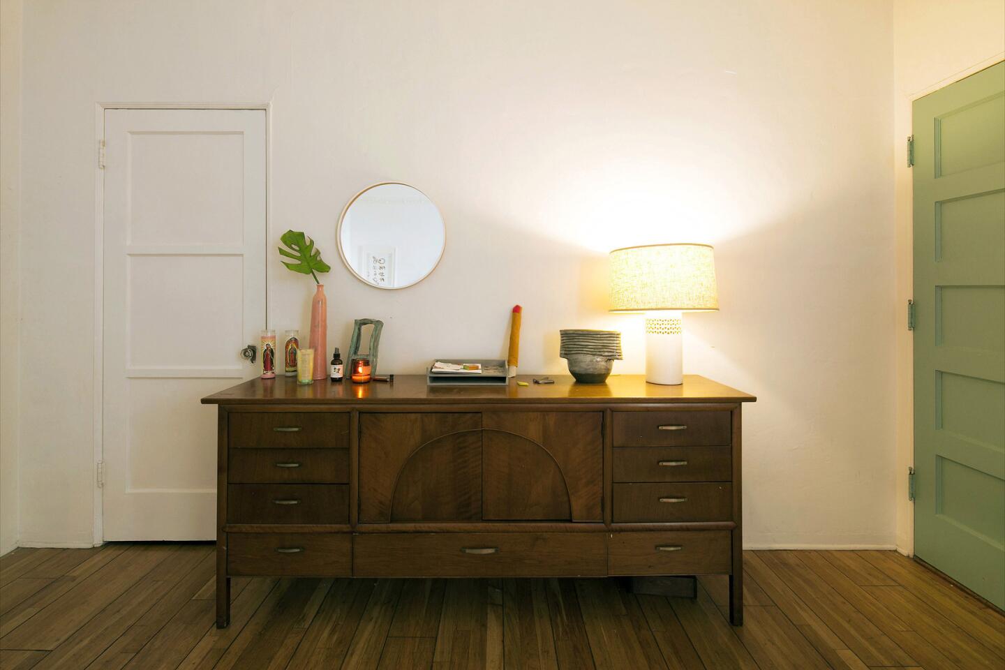
But there isn’t a lot of clutter. The couple may have lived in the Miracle Mile apartment for three years, but they don’t have much other than a midcentury credenza and a Room & Board couch they found on Craigslist. “It worked out well,” says Loo as she chats about carrying the couch down 6th Street. “When we got tired, we would just stop and sit on it.”
The two describe themselves as playful and happy yet say they agonize over the simplest of home decor decisions. “We want to feel like adults,” says Loo, 27. Adds Barbuc, 28: “We want to nest legitimately.”
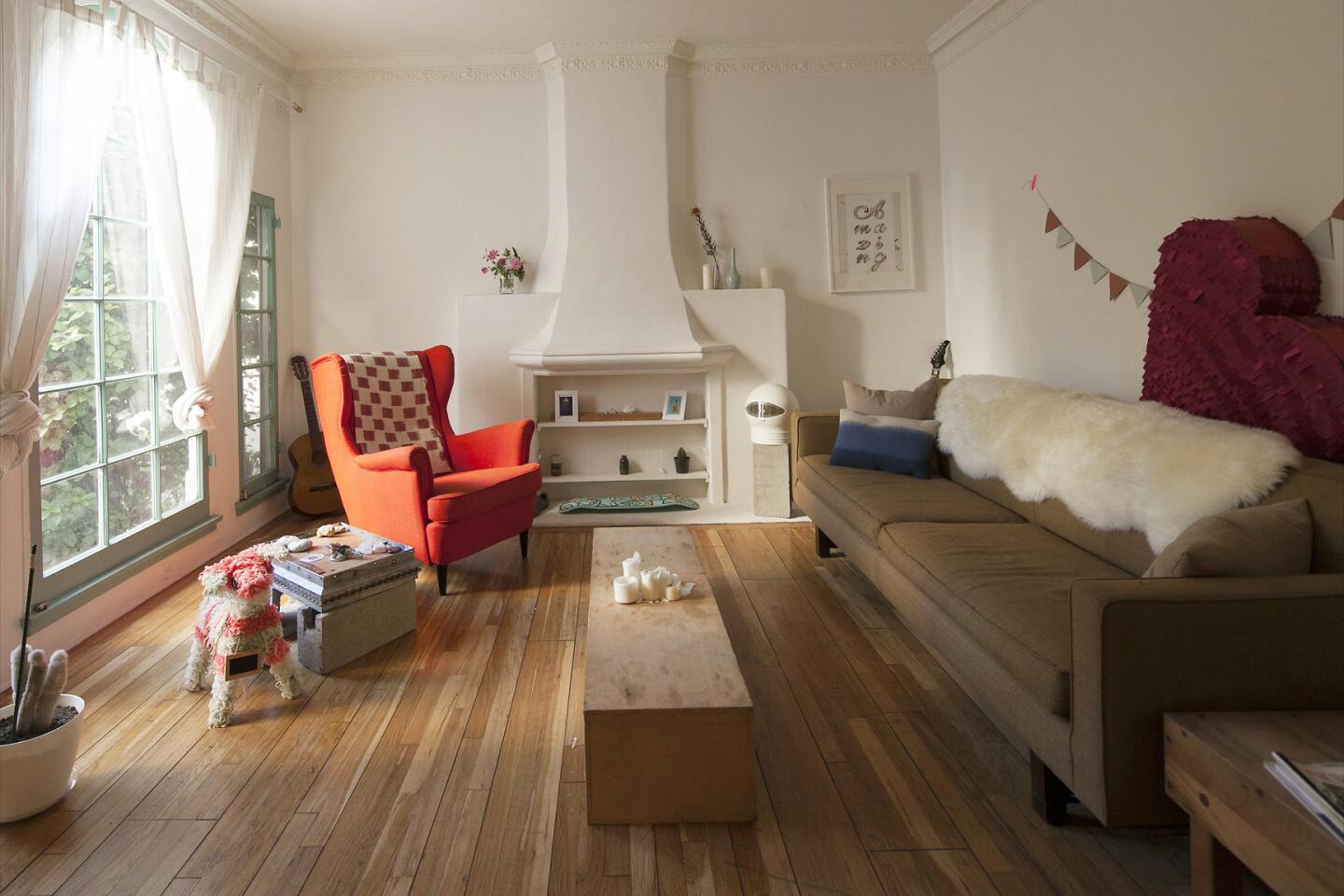
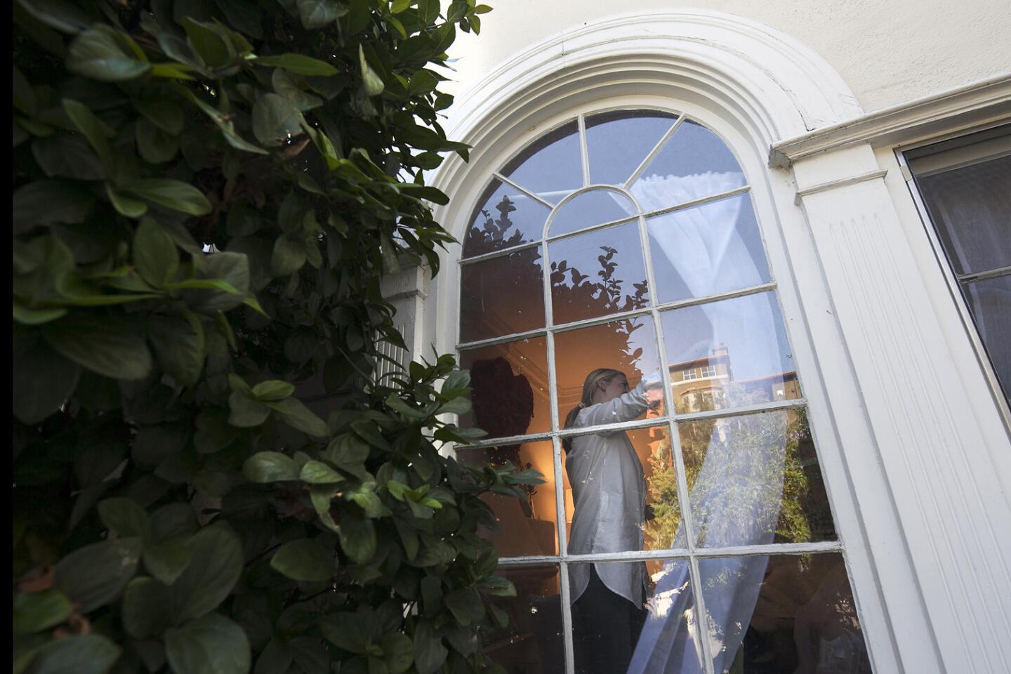
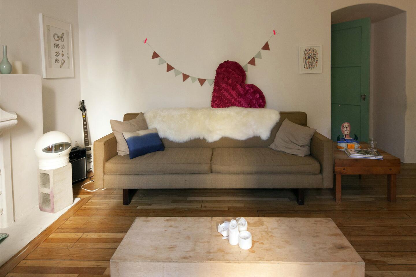
Their one-bedroom apartment is small but has lovely architectural details, including high ceilings, crown moldings and delicate decorative reliefs on the walls. Living room accents include cinder blocks, a wooden coffee table made from an art project and piñatas. Is it possible that a few relatively simple changes will make a difference? On a hot October day, Ryan and his colleague Christiane Lemieux, executive creative director of Wayfair, the online retailer that donated assorted home goods, waste no time in assessing the living room and getting to work.
“Where do you sit when people come over?” Ryan asks.
“We sit in folding chairs,” responds Barbuc.
The couch configuration feels right, but there is not enough seating.
Ryan moves on to acoustics. “Do you hear that echo?” he asks. The sound in the room makes the space feel cavernous. “We need to get fabric and rugs in here,” he says.
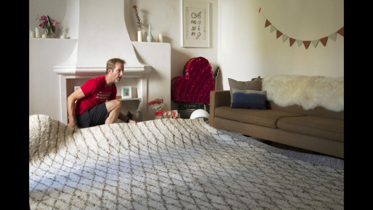
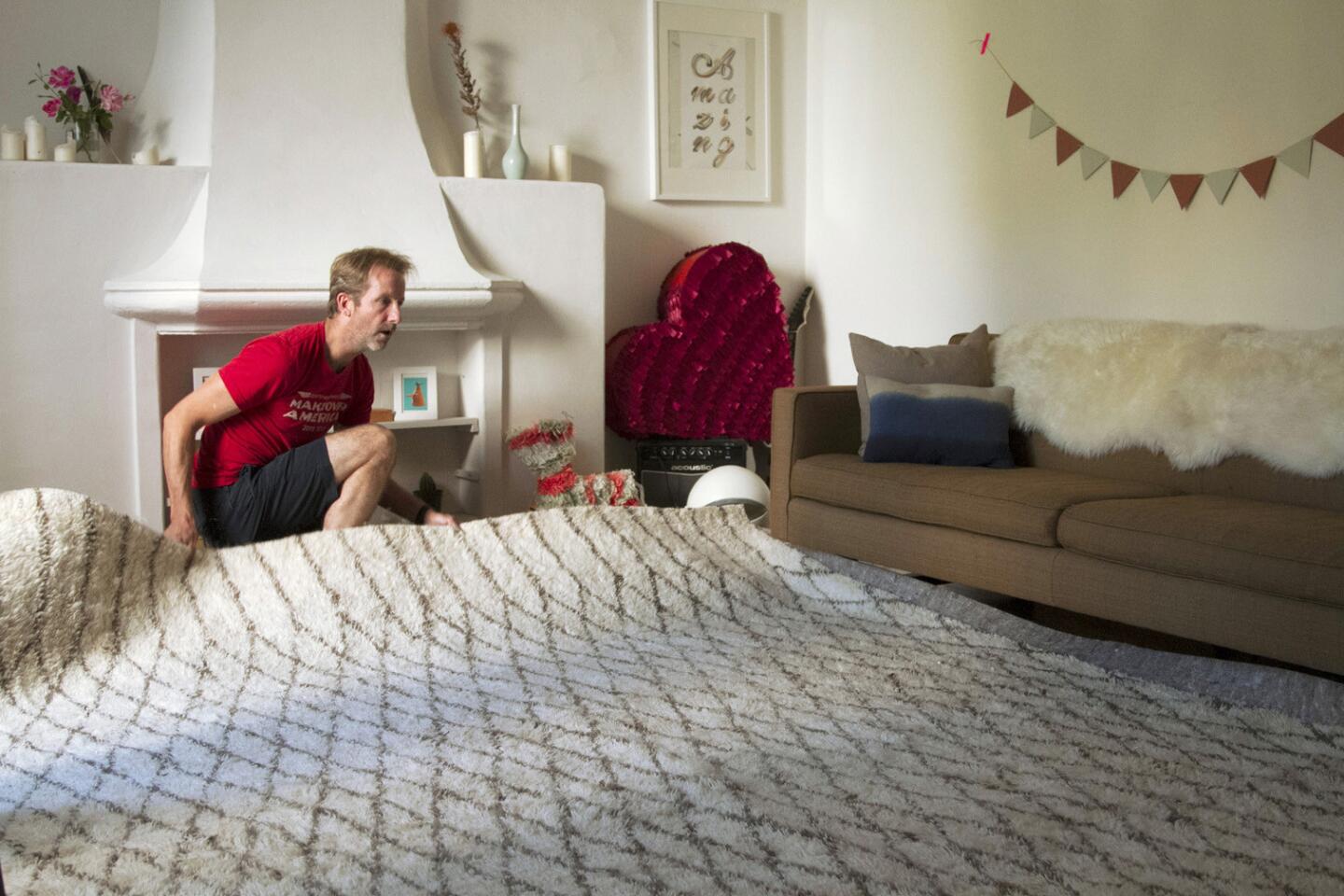
The dark living room is instantly brightened after Apartment Therapy founder Maxwell Ryan lays down an area rug by Safavieh over a rug pad.
Ryan and Lemieux agree that the bright red armchair from Ikea overwhelms the room. “It is the first thing people will see when they walk in the door,” he says. It’s moved to the bedroom. Similarly, a wooden bench the couple ordered is deemed too large for the room, so it joins the red chair in the bedroom.
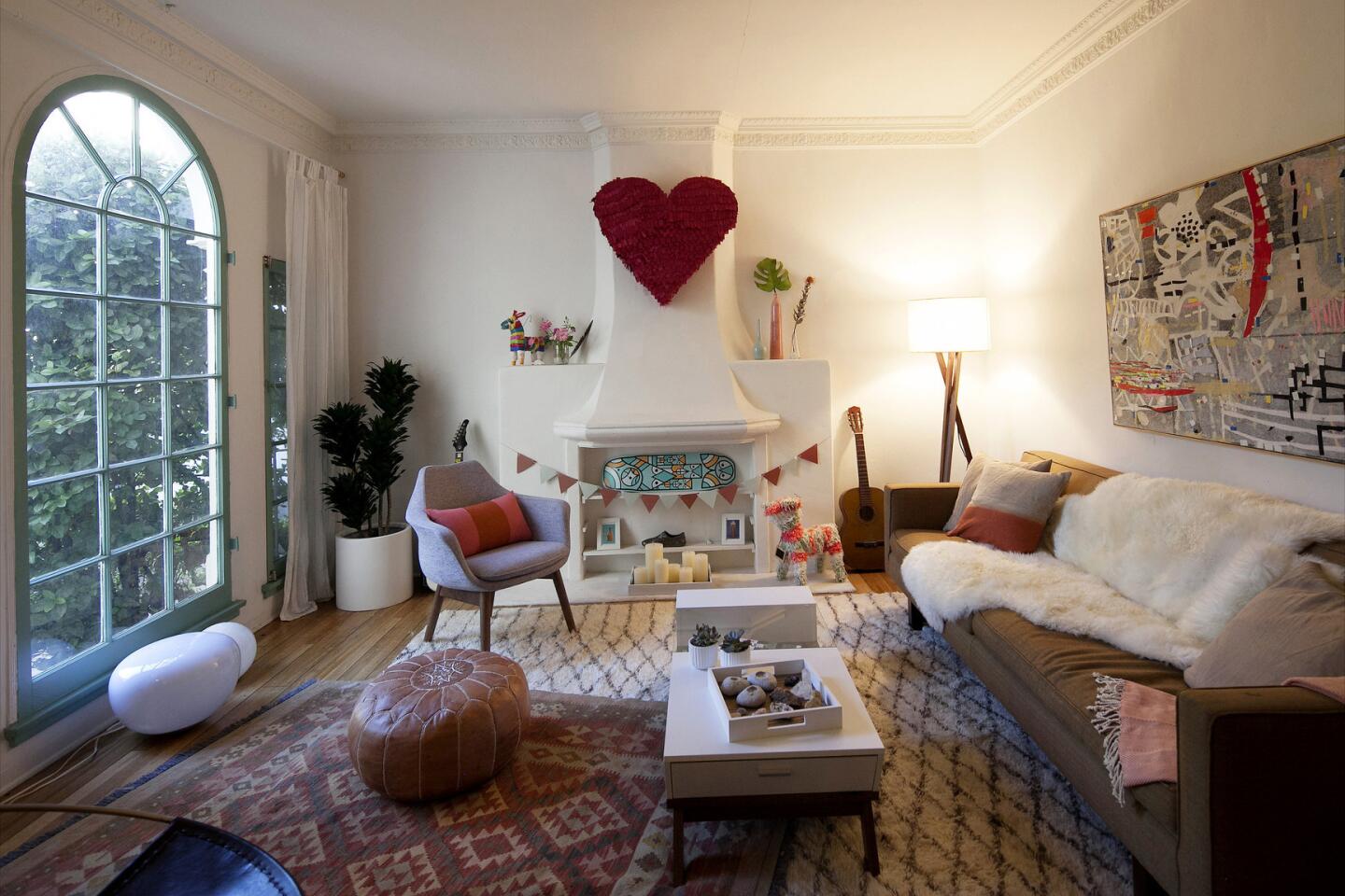
Working together over the next five hours, Ryan and Lemieux transform the living room into a lighter and brighter space with more seating. The end result is sophisticated and fun yet deeply personal as the designers incorporate the couple’s furnishings, art and collectibles into the room’s design.
In the span of an afternoon, the designers prove how invigorating it can be to reimagine a room.
Ryan estimates that revamps to the living room would have cost about $2,000 to $3,000, but many of his design principles can be adopted for free. Here are some decorating tips we picked up from watching a makeover in action:
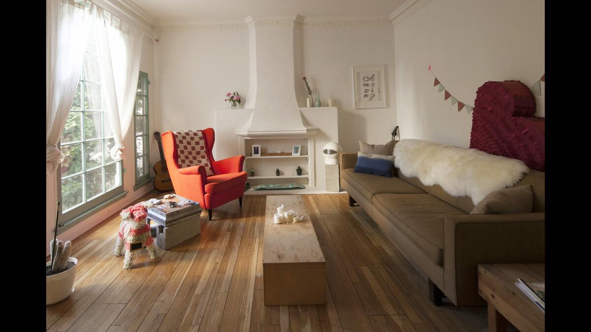
The one-bedroom Miracle Mile apartment belonging to Corinne Loo and Eugenia Barbuc is small but has lovely architectural details including high ceilings, crown moldings and delicate decorative reliefs on the walls. The couple was chosen to receive a living room makeover courtesy of Apartment Therapy founder Maxwell Ryan during his cross-country book tour for “Apartment Therapy Complete + Happy Home.”
Shop from other rooms
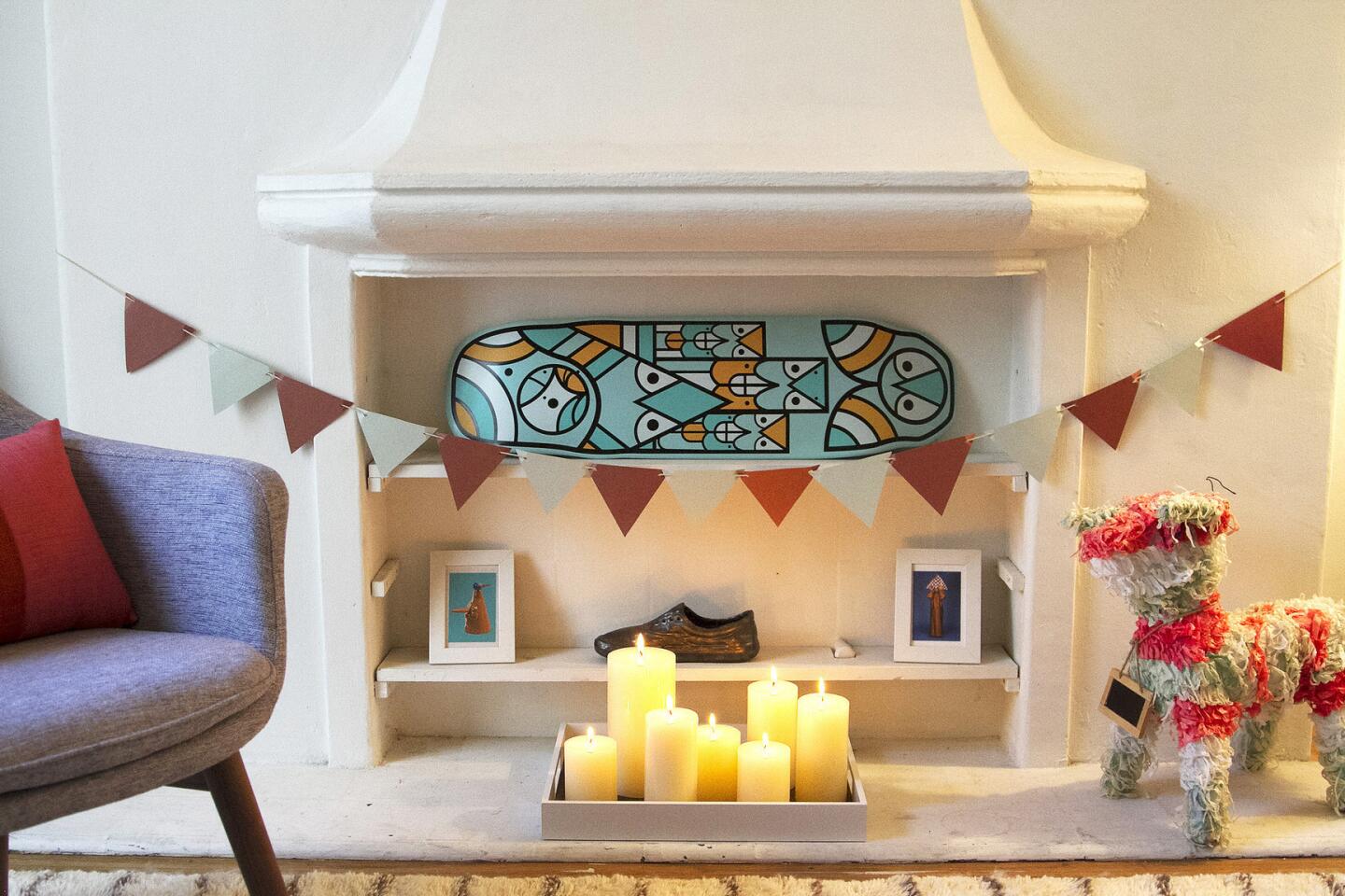
The red Ikea armchair was removed and placed in the bedroom in exchange for a smaller midcentury chair. This opened up the room and brought in more light. Concrete blocks were removed from the living room and placed next to the bed to create a side table for a lamp. Ryan repeatedly went looking for accessories in other rooms, adding art and a colorful piñata to the living room mantel for color and texture.
Lighting
The room was dark and melancholy. A tall walnut tripod floor lamp was added, along with a midcentury-inspired tripod brass table lamp from West Elm. The designers also placed seven candles in a tray in front of the fireplace to add warmth and illumination.
Layer carpets
Layering rugs is a cost-effective solution to larger, more expensive rugs. Ryan draped the couple’s Navajo-print rug over a new Moroccan tufted wool rug to add contrast and visual interest.
Mix materials
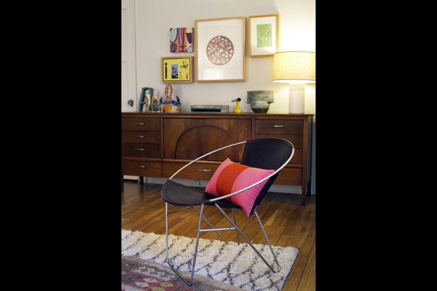
The designers added a new metal and leather armchair along with a soft tufted rug and a leather Moroccan ottoman. A glass and wood coffee table in white complements a dark walnut midcentury credenza. Pillows in pink and taupe hues add softness and warmth.
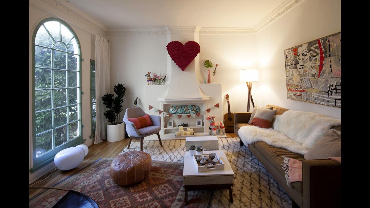
The new living room is a lighter and brighter space with more seating. It’s also sophisticated and fun and deeply personal, thanks to the use of the couple’s furnishings, art and collectibles in the makeover. For more house tours, go to www.latimes.com/home
Keep what you love
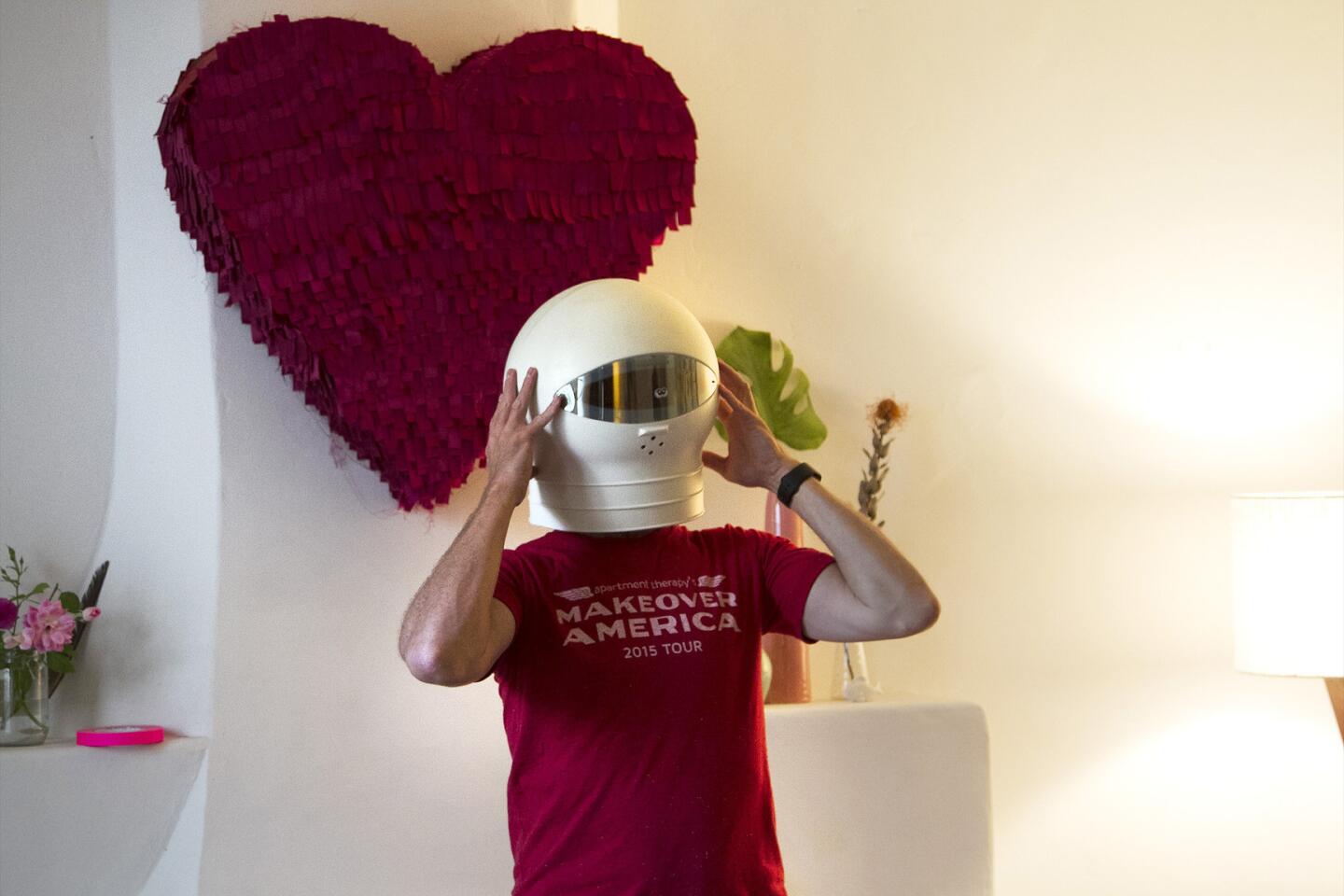
Ryan and Lemieux mounted the couple’s pink papier-mâché heart on the fireplace and held on to their quirky accessories to reflect their personalities: a colorful skateboard, piñatas, ceramics and an astronaut helmet. “It’s all about mixing their stuff with the new things,” says Lemieux. “That’s why it works.”
Color
The designers added color with pillows, throws and artwork.
Art
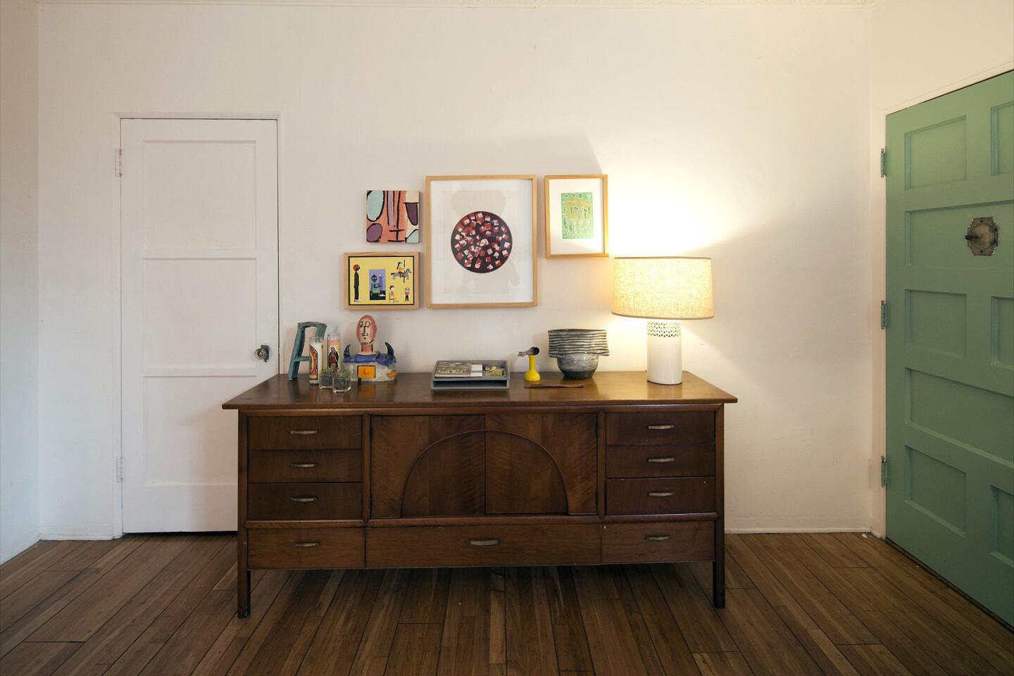
Framed artwork from the nonprofit Exceptional Children’s Foundation was installed on three walls. For the salon-style wall above the credenza, Ryan first placed artworks on the floor to visualize how it would look on the wall. He then centered the large piece over the credenza and layered artworks on either side.
Plants
Plants make a house feel cared for. Ryan passed on an artificial plant the couple chose in favor of a tall, low-maintenance Dracaena plant from Rolling Greens. Additionally, Lemieux added tiny succulents to the coffee table for subtle touches of green.
Create moments
Ryan and Lemieux created an entryway moment where the couple can place keys or mail when they walk in the door using a tall West Elm tray table.
“They wanted to make a change,” says Ryan. “We’re just facilitating it for them.”
Twitter: @lisaboone19
3 tips on hanging art at home
What’s the best way to hang art? We’ve got a few tips, excerpted from Maxwell Ryan’s “Apartment Therapy: Complete + Happy Home.”
1. Don’t hang anything too high. Most galleries hang art 57 to 60 inches on center (that’s the measurement from the floor to the center of the piece of art). With groupings, think of the collective as one big element and apply the same principle.
2. Adjust for seating. In dining rooms or offices, where people are primarily seated, it makes sense to lower art slightly to about 48 inches.
3. Allow for headroom. When mounting above furniture, keep 3 to 6 inches of wall space above a sofa or headboard, 4 to 8 inches above a table. This is close enough to keep the two elements visually connected but far enough that you won’t bang your head when sitting and standing.
ALSO:
Ellen DeGeneres takes us inside her pretty houses in ‘Home’
Highland Park cabin is rebuilt better but not bigger
Tiny Laguna Beach condo feels roomier with ship-shape design concepts
