When red meant Democratic and blue was Republican. A brief history of TV electoral maps
- Share via
Forty years ago this week, TV started telling the story of the presidential election as a battle between red states and blue states.
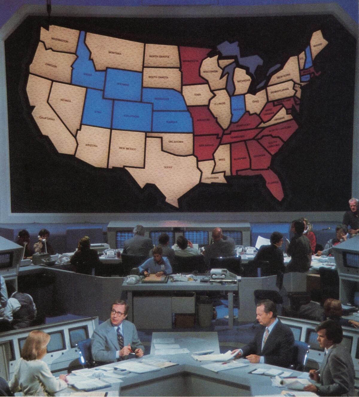
When the die-hards and political junkies who stayed up until 3:30 a.m. Eastern time on Nov. 3, 1976, watched NBC’s John Chancellor call Mississippi and the election for Jimmy Carter, they saw the win signified on the 14-foot-high molded plastic map of the United States mounted on a wall behind the anchor.
------------
For the Record
Nov. 8, 3:41 p.m.: The caption for the 1976 photograph of the original NBC electoral map misidentifies Cassie Mackin as Jessica Savitch.
------------
The state was then lighted up in red — the color the network had assigned for the Democratic candidate.
The party colors were eventually reversed. But from that night forward, that simple piece of stagecraft in Studio 8H at Rockefeller Center became the visual shorthand in detailing the race for the 270 electoral votes needed for the White House.
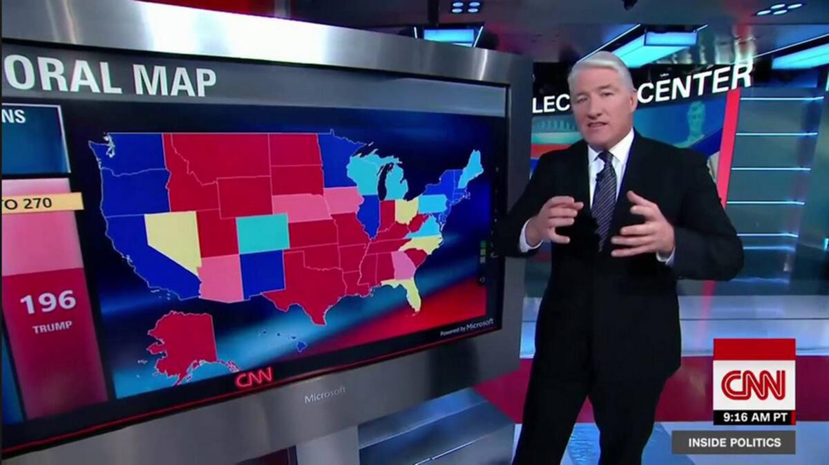
Digital versions of the electoral map have since become a living tool for on-air analysts — a way of feeding election-night suspense as each state turns red or blue. Since 2008, CNN’s John King has presented electoral college scenarios on a touch-screen the cable news network called its “magic wall.” (Other networks have followed with their own versions.)
It is so beautiful I wish that after the election I could take it home, but I don’t have a room big enough to hold it. It’s enormous and it's gorgeous.
— David Brinkley
The map has also become a symbol of political division in the country.
But while red and blue states are now part of our political lexicon, the concept was born out of a competition for ratings.
In the early decades of network TV news, election coverage was the main source of bragging rights for CBS and NBC (ABC’s news division was an also-ran until the 1980s). They invested heavily in sleek sets that resembled the decks of aircraft carriers. Mammoth computers offering predictions before the polls closed received camera time to give the proceedings an air of futuristic wizardry. Vast sums of money were poured into polling and research as the pressure to call winners first was fierce.
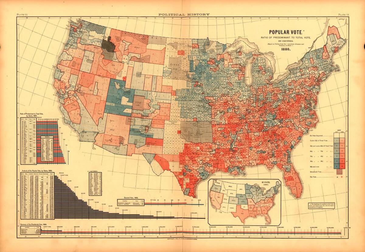
But by the 1970s, the on-air presentations pretty much looked the same. Legendary NBC News producer Reuven Frank once described election night as “a TV show about adding.”
In 1976, Chancellor, then co-anchor of NBC’s evening newscast with David Brinkley, made it known around the network that he wanted to come up with something different for that year’s coverage. He found a cohort in Gordon Manning, an innovative TV news executive known for having an idea a minute. Manning would often jot down his proposals on a napkin or a matchbook cover and drop them in the mail from wherever he was in the world. His friends called them “Gordo Grams.”
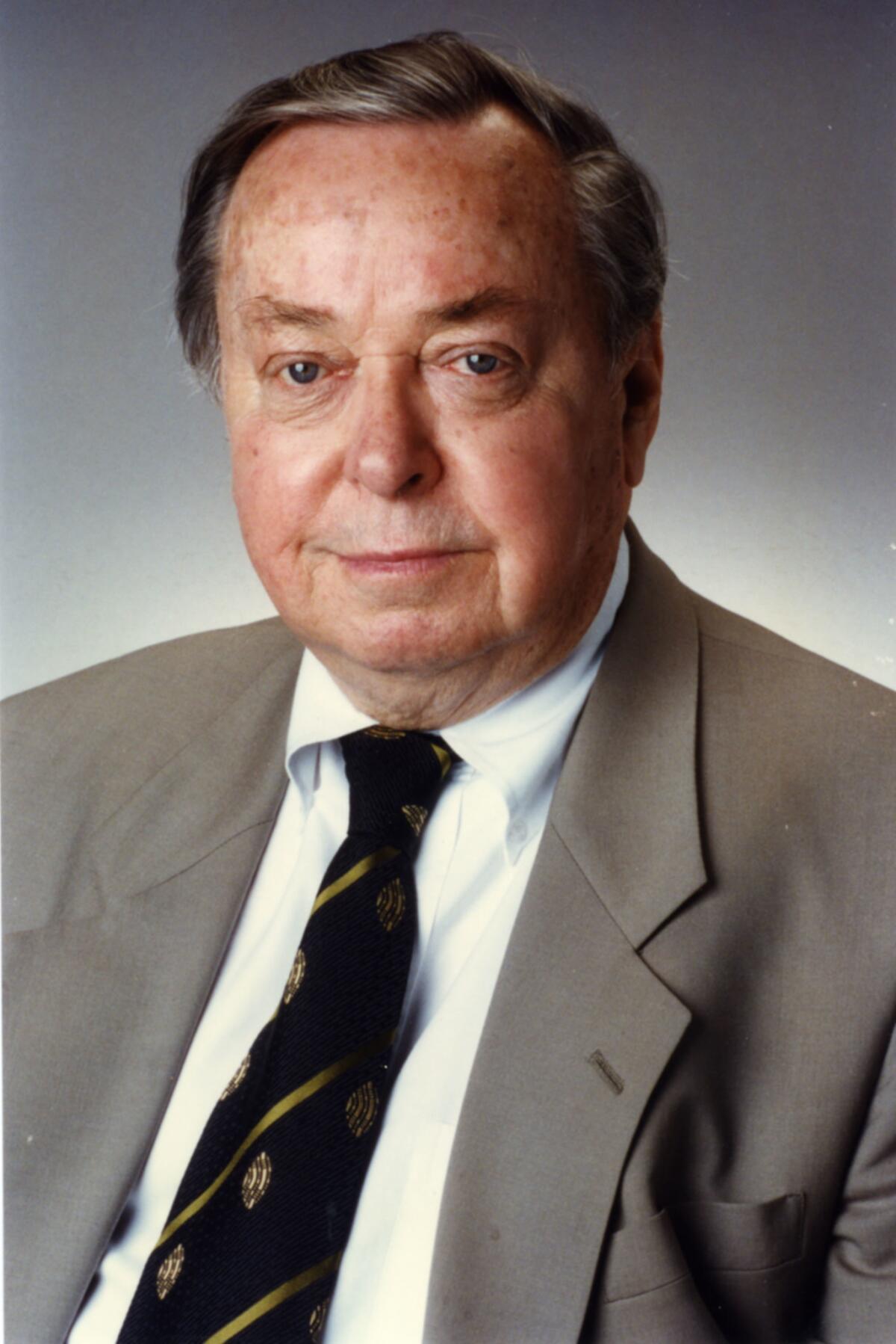
Manning, who died in 2006, is credited with devising the map that presented the electoral college projections in a compelling fashion on-screen as the results came in.
“He did a lot of out-of-the-box thinking,” said Manning’s son Douglas. “His vision was to create something that was dramatic and dynamic.”
NBC’s technicians and stagehands built a map with states made out of translucent white plastic. Lights with colored gels illuminated a state in either red or blue based on the results. The color schemes were based on the American flag and the rosettes worn by the members of British Parliament — Labour Party red for the Democrats and blue for the Republicans in honor of the Conservative Tories.
The 14-foot-high and 24-foot-long map took up much of the back wall of Studio 8H, which recently had become the home of “Saturday Night Live.” The sketch show, only in its second season at the time, was exiled to NBC’s studio located in the less-than-glamorous Brooklyn neighborhood of Midwood for three weeks to make room for the preparations involved in the network’s “Decision 76” coverage.
WATCH: "Saturday Night Live" sketch "2004 Presidential Election Map Colors" »
What happened in the days before the map made its debut became an often-told tale around NBC News. Network executives and producers who worked on the coverage claim the heat generated by the stage lights behind the map melted some of the plastic states during rehearsals.
”I never heard that,” Douglas Manning said. “I knew that the heat was a concern early on and they had to use the lights sparingly.”
A cooling system was installed in the studio in time for the map’s opening night.
Jimmy Carter and Gerald Ford provided a perfect race for the map’s debut, since the election’s tight finish pushed the results into the early morning hours. The map was always present behind the anchors and correspondents, giving viewers an instant picture of where the vote stood. Chancellor and Brinkley, both grizzled veterans of election nights by this time, appeared to glow as they looked over at the map every time a state lighted up.
“It is so beautiful I wish that after the election I could take it home, but I don’t have a room big enough to hold it,” Brinkley told viewers. “It’s enormous and it’s gorgeous.”
Manning, who operates a video and digital production company in Chicago, believes his father’s creation represented a significant advancement in TV news storytelling.
“It was groundbreaking in that it was constantly on the screen,” he said. “Now we’ve become accustomed to seeing visuals crawling across the lower third of the screen and everything else that was going on. This was a first step. You could draw your own conclusion on how things were evolving without the anchors having to utter a word.”
The map was also a hit, contributing to NBC’s election-night ratings win in what was largely the age of CBS’ Walter Cronkite.
“If you studied the ratings that night you will see the audience share for NBC grew as the night went on,” Bill Wheatley, a former NBC News executive, said in a 2012 interview. “There was almost no other reason that I can think of other than the fact we had the map.”
News executives at CBS and ABC derided NBC’s electoral map as a gimmick. But by the 1980 election between Jimmy Carter and Ronald Reagan, both networks had come up with their own versions, using on-screen computer graphics.
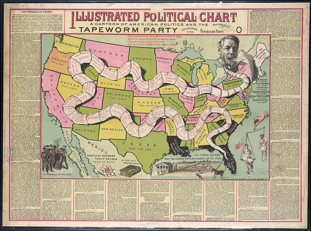
Viewers who flipped between networks may have become confused as both ABC and CBS filled in the Republicans’ winning states with red and the Democrats with blue, while NBC stuck with its original scheme over the years. The thinking in some quarters was that red was too closely associated with leftist political movements, an image the Democratic Party was trying to shake.
“Communists were called reds and Democrats were accused of being too far left,” said Larry Sabato, director of the University of Virginia’s Center for Politics. “It reinforced the stereotype about Democrats that they didn’t want.”
By 1996, Wheatley, who oversaw NBC’s political coverage, decided that the network needed to be in sync with ABC and CBS. The consistency set the stage for coverage of the disputed 2000 election between George W. Bush and Al Gore, which became a month-long battle over Florida’s 25 electoral votes and the presidency. The fixed image of the hues that divided the electorate in that race led to commentators and reporters describing states as red and blue based on their political leanings ever since.
Some credit Tim Russert as the first TV news person to refer to red states and blue states on a “Today” show segment in 2000, though he became more famous that year for writing “Florida Florida Florida” on a hand-held whiteboard, eventually displayed at the Newseum in Washington, D.C.
Gordon Manning may not be as famous, but his son Douglas said his father never made a big deal about how his map creation from 40 years ago became an icon in American political culture.
“He was a very modest man and a very old-school journalist,” Manning said. “He felt that journalists cover the story and are not part of the story.”
See the most-read stories in Entertainment this hour »
Twitter: @SteveBattaglio
ALSO
How Hillary Clinton watched baseball history
Businesses and investors are betting Clinton will win. What if she doesn't?
Think the election is rigged? Actually, conspiracy theories take hold across the political spectrum
The complete guide to home viewing
Get Screen Gab for everything about the TV shows and streaming movies everyone’s talking about.
You may occasionally receive promotional content from the Los Angeles Times.


