Q&A: Costume designer Sandy Powell works her magic on ‘Mary Poppins’ and adds intrigue to ‘The Favourite’
- Share via
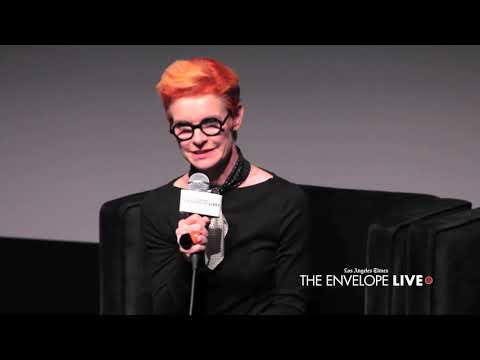
London-based costume designer Sandy Powell is a 12-time Oscar nominee (with three wins). She has twice earned double nominations in a single year (1999 for “Shakespeare in Love” and “Velvet Goldmine”; and 2016 for “Carol” and “Cinderella”), and could very well do so for a staggering third time come Jan. 22 for her two standout works this season: the fanciful Disney sequel “Mary Poppins Returns” and the offbeat tale of royal infighting “The Favourite.”
A skilled period film designer, Powell tackled 1934 London — and some striking fantasy sequences — for Rob Marshall’s “Poppins” and brought contemporary fabrics to the 18th century-set Yorgos Lanthimos film starring Olivia Colman, Rachel Weisz and Emma Stone.
Powell demurs on citing a favorite “Poppins” look but admits, “If I had to choose, I think as a group the painted costumes in the animation scenes are my favorite.”

Why is there a bird on Mary Poppins’ hat in the Emily Blunt-led sequel? ”Mary Poppins Returns” costume designer Sandy Powell reveals the surprising way the original film influenced that decision.
FULL COVERAGE: Get the latest on awards season from The Envelope »
My first thought when I saw “Poppins” was how chic she looked. I assume this was the intent?
If you look back at the original, I don’t think Julie Andrews looks bad at all; it just looks old-fashioned to us now. She’s very proper, she’s very neat — like she says, “practically perfect.” She’s vain, quite vain. So that was my excuse to make her so fashionable, in a family conservative respectable sort of way.
Mary’s lighter blue coat and the cranberry red coat — how did you arrive at these shades?
The blue was to echo the navy blue of the original nanny outfit. I wanted to make the coat a bit bolder, so I bumped up the color to a cobalt blue, which gave it that extra chic touch. It wasn’t black and it wasn’t navy; that would have been too severe. And then I reversed it and made a suit — a jacket and a skirt — for the big dance-number scene, which was an homage to the original, where in the chimney sweep dance number Julie Andrews wears a red coat so we can see her at night. I wanted [Emily Blunt] to be in the red because I wanted it to really stand out.
You liberally use polka dots and stripes and military hash marks throughout.
The polka dots are a very fashionable 1930s thing. And the other patterns, the little zigzags or stripes, I just wanted it to be quite graphic and not floral. I didn’t see her as even being remotely floral, which is why I didn’t put flowers in her hat. I just put a robin on the hat because that reminded me of the original with the robin on her hand in the song “A Spoonful of Sugar.”
The animation scene was sumptuous, with what appears to be painted clothing. What can you tell us about the process?
It was one of the first ideas I played with. The paint was done on calicos and cotton canvas.
What about Meryl Streep’s gypsy costume as Topsy?
It might seem unusual, but that was the most complicated costume to make, the treatment of it. All the painting on it is hand-done. The inspiration for her came from the artistic bohemians of the early 20th century. We don’t know much about her apart from the fact that she fixes things. So I thought, “She must be good with her hands; she must be artistic.” I wanted to make her an arty bohemian, with a lot of jewelry. And Rob’s one request was that it have fringing. He obviously knew that there’d be a lot of spinning and he wanted fringe.
Costuming the trio of “Favourite” stars “is such a dream job,” Powell says. “You have three strong women, they’re complicated and different characters all of them, and to top it off they’re central people. What more could you ask for?”
The early 18th century setting “is a really strange period that hasn’t been done much in film,” Powell notes, so she and her team made all 150 costumes utilizing a richly quiet yet limited color palette to achieve her goal: a period drama that looks as unconventional as the story is.
The color palette was also dramatic: golds, champagnes, pineapple yellows and woody oak tones as well as black and white. How did you choose it?
One of the first things I suggested was the reduced color palette. Going monochromatic, with a lot of black and white for the court. I wanted everything in the court to look as if it’s their world. The background was so sumptuous it worked having monochromatic costumes.
Did you alter the silhouettes at all?
The actual silhouette of the costumes we kept as historically accurate as possible; it was in fact quite complicated. So I thought then it would be quite nice to strip back all the adornments, make it uncomplicated with the color theme and not have all the decorations you’d normally have in the court.
Something very noticeable is how the women are all pared down in both costume and makeup, while the men are the fancy frilly dressers.
That absolutely was one of Yorgos’ instructions. He did say at the beginning — and on this he was absolutely adamant — he did not want it to look like a “normal” period costume drama with all the makeup; he wanted it to be real-life people in court. He wanted the women to have scrubbed faces, not have makeup, not have their hair overdone, not be solidified. He wanted the men to be the overdressed peacocks. The fact is, during this period, the men did look like that; they did look as posturing and ridiculous as the women.
There’s also a lot of physicality for the women: galloping on horses, shooting guns, fighting. You gave Rachel Weisz pants to wear. Why?
With Rachel I thought about the control. When I thought of all three women, I think: Which character appears to be the most in control? It wasn’t the queen. I wanted [Rachel] to command respect; she’s in control, not in a domineering way, but she’s really self-assured. I wanted her to have the freedom in the same way that Katharine Hepburn looked great in pants; she was my Katharine Hepburn character.
I actually really loved the queen’s bedchamber robe. It was beautiful and opulent.
That is my own favorite costume. Her dressing gown was a reversible robe: velvet on one side and a chenille bedcover that I bought on eBay on the other! The queen wasn’t mentally ill, but she was depressed, so she spent an awful lot of time in her bedroom, miserable. I thought, “She’s a queen, she’s miserable, she doesn’t want to get dressed — what shall I put her in?” When you’re depressed, you wear your pajamas all day. So I wanted the contrast of this robe to everything else when she does have to dress up.
More to Read
From the Oscars to the Emmys.
Get the Envelope newsletter for exclusive awards season coverage, behind-the-scenes stories from the Envelope podcast and columnist Glenn Whipp’s must-read analysis.
You may occasionally receive promotional content from the Los Angeles Times.


