Review: Petersen Automotive Museum’s new look conveys a happily tasteless exterior

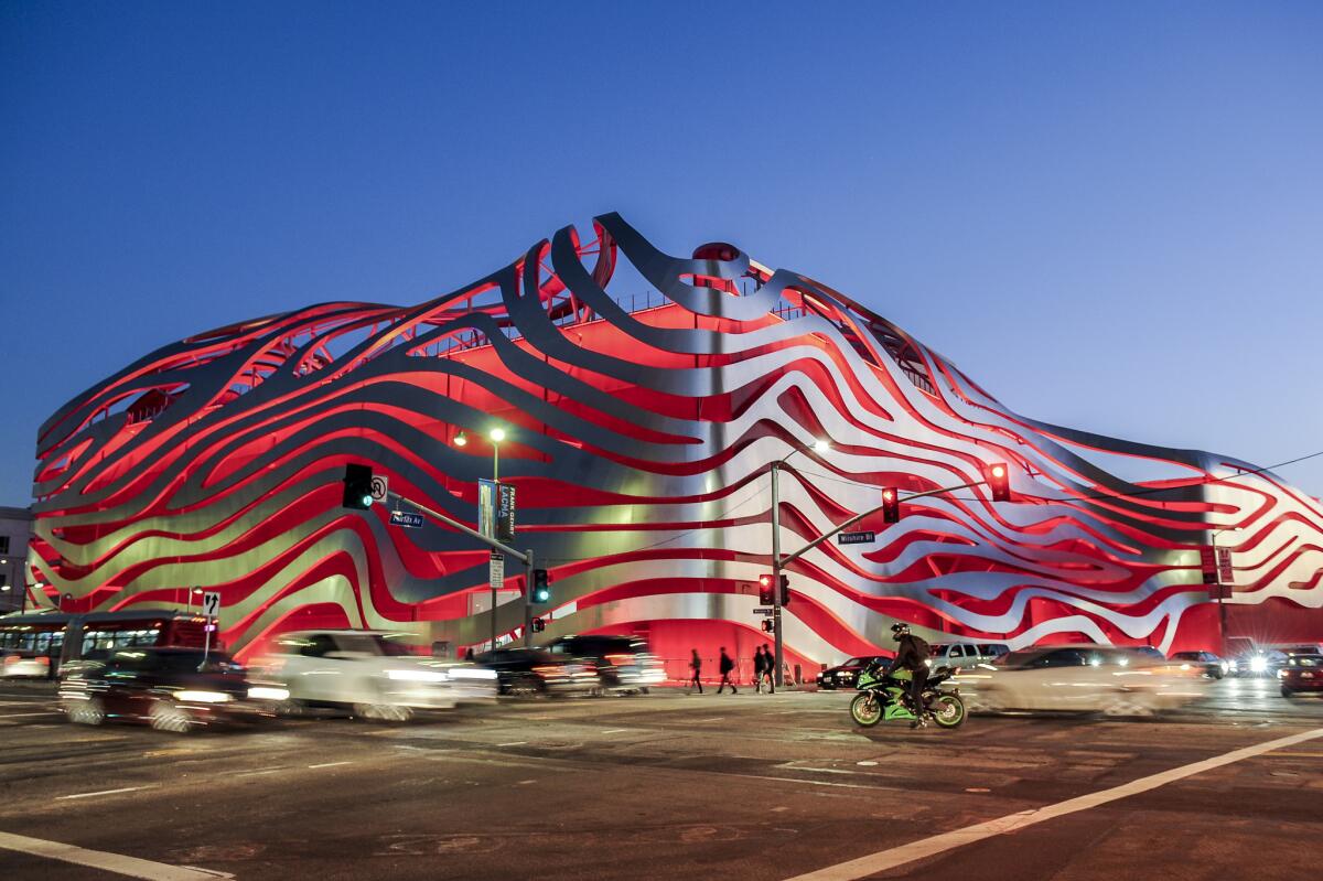
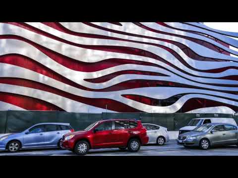
The road to excess? The redesigned Petersen Automotive Museum on Wilshire Boulevard in Los Angeles is a blood-red box draped in ribbons of stainless steel.
- Share via
It would be extreme — irresponsible, really — to suggest that staring too long at the new façade of the Petersen Automotive Museum, set to reopen Monday after a $90-million makeover, might leave you cross-eyed, cause your hair to spontaneously catch fire or turn you, Old Testament style, into a pillar of salt.
Still, the museum’s raucous, happily tasteless new exterior, designed by Gene Kohn and Trent Tesch of Kohn Pedersen Fox, a prolific New York firm known for more reserved work, is not the sort of thing you want to just come upon, sending your unprotected corneas right into the fray.
SIGN UP for the free Essential Arts & Culture newsletter >>
Think of the building instead as the architectural equivalent of a solar eclipse, a glowing object of curiosity Angelenos may want to consider obliquely, at least the first time around. And think of this review as a homemade pinhole projector designed to help them do just that. Service journalism!
If you were feeling generous, inclined to look for connections between the exterior of the new Petersen and the displays inside, you might glimpse in the museum’s heaving architectural profile — here soaring and bending, there sagging and falling in on itself — some relevant, even upbeat reflections of car culture, of movement and speed.
You might make out streaks of chrome against a field of red taillights. You might be reminded of Chris Burden’s roadway fantasia “Metropolis II,” a piece of art filled with 1,100 miniature toy cars and on view across Wilshire Boulevard at the Los Angeles County Museum of Art, or the 1973 J.G. Ballard novel “Crash,” with its description of highway flyovers laid atop “one another like copulating giants, immense legs straddling each other’s backs.”

Petersen Automotive Museum
Or you could acknowledge that the true impact of the design, with its stainless-steel ribbons draped over a three-story, blood-red box, is even more entertaining and populist than that, if also a little gorier. The new facade is not just among the most extroverted ever built in a city famous (and in some quarters infamous) for architectural exuberance. It is the product of an institution eager to take on the role of Prometheus and expose its innards to the buzzards of pop culture, word of mouth and Instagram, with the southeast corner of Wilshire and Fairfax Avenue standing in for the side of Mount Caucasus.
The geography here is key. There has been an architectural arms race going on along this stretch of Wilshire in recent years, with LACMA and the Academy of Motion Picture Arts and Sciences both announcing plans for ambitious new wings.
LACMA now intends to drag Peter Zumthor’s giant tar-black blob across the boulevard to the Petersen’s side. The Academy has coaxed from Renzo Piano a spherical extension to the back of the old May Company building that ranks among the most doggedly outgoing designs of his long career. There’s also been talk that LACMA, Frank Gehry and the transit agency Metro might team up to build a tower above a future subway station along Wilshire, on a piece of land just east of the car museum.

A look at the new façade of the Petersen Automotive Museum, set to reopen Monday after a $90-million makeover.
The Petersen has not merely joined this arms race. It has chosen the nuclear option. It has obliterated even the possibility of any thoughtful debate about what its building is trying to accomplish or how it might relate to those future neighbors.
Sure, you could note the wide gap between the guileless enthusiasm of the remade exterior, its absolute and endearing refusal to be embarrassed, and the well-appointed, highly rational interiors (with exhibition design by a firm called Scenic Route), which include wide galleries on three floors and a tastefully eye-catching staircase twisting from one level to the next.
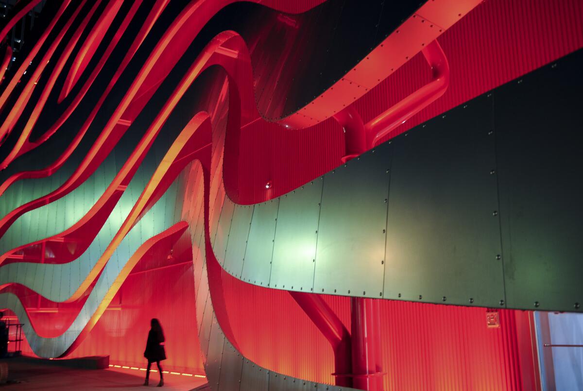
You could charitably add that the portions of the building where the ribbons frame outdoor rooms, both on the roof and along the sidewalk, have real presence, creating what the architects call “cages” of semi-enclosed space.
You could point out that earlier this year, after the red box was finished but before the ribbons were hung, the building’s exterior looked momentarily beautiful, a kind of accidental, oversized hommage to Bernard Tschumi’s Parc de la Villette in Paris.
You could recall, returning to the geography of the Miracle Mile, that the corner anchored by the Petersen happens to be the spot where the rapper Christopher Wallace, a.k.a. Notorious B.I.G., was killed while riding in the passenger seat of a green Suburban by a man driving a black Impala SS after leaving a party at the car museum in 1997. His path was blocked during the shooting by a white Toyota Land Cruiser, mixing blood and a peacocking parade of cars in a way that the new façade — unconsciously, sure, but unmistakably — picks up on, and giving Biggie a long overdue L.A. memorial.
You could speculate that the design is the result of a firm run by architects from the analog generation making an effort to keep up with its younger competitors, and that a few digital savants in the office (with help from 3D modeling software called Rhino) cooked up a serving of parametric spaghetti way too big for its plate.
You could say that the lopsided and relentless cheeriness of the façade reminds you of the restaurant manager in the movie “Office Space,” who gives a lecture to a waitress played by Jennifer Aniston about not wearing enough buttons, referred to as “flair” and plastered with upbeat phrases. The manager tells her, “It’s up to you whether or not you want to just do the bare minimum -- or, well, like Brian, for example, has 37 pieces of flair, and a terrific smile…. We want you to express yourself. Now, if you feel that the bare minimum is enough, then OK. But some people choose to wear more. And we encourage that, mkay?”
The Petersen is Brian. It chooses to wear more.
You could admit a soft spot for the original 1962 building, designed by Welton Becket as a home for the Japanese department store Seibu and now completely unrecognizable beneath the new skin, while acknowledging that a 1994 redesign for the opening of the Petersen, its row of columns along Wilshire suggesting the fins on a Cadillac, also borrowed shamelessly from the iconography of car design. And while giving the Petersen credit for preserving at least the structure of the original Seibu tea house on the roof.
You could begin to consider the fascinating connection between the slow but steady demise of car culture in Los Angeles, as the freeways clot and the public transit network expands, and the new façade, which looks like exactly what you’d get if you searched Google images for the phrase “architectural death throes.”
You could ask if what the corner of Wilshire and Fairfax needs is not an endorsement of the building-as-Hollywood-blockbuster model, with architects playing to potential ticket buyers as surely as the studio head green-lighting the next “Iron Man,” but something that reads the urbanism of this block in less cartoonish terms. Architecture moves a lot more slowly than the movie business, after all. Imagine a Marvel sequel that stayed in your local cineplex for 35 years.
You could, finally, name the 2006 Mercedes Benz Museum in Stuttgart, by the Dutch firm UNStudio, as proof that 21st-century temples to automotive design can be meaningful pieces of architecture, sophisticated enough to hold their own against the cars they hold, and unapologetic crowd pleasers at the same time.
In each case you’d have architectural or pop-culture history on your side. But every one of those observations, in the end, promises to be drowned out by the sheer volume of an architectural explosion arranged by a museum that has embraced its inner Michael Bay.
ALSO
L.A. theater openings, Dec. 6-13: Cirque du Soleil’s ‘Kurios’ and more
Lawren Harris painting sells for record sum on heels of museum show
‘Indecent’ is a moving reminder of art’s power to expose truths
More to Read
The biggest entertainment stories
Get our big stories about Hollywood, film, television, music, arts, culture and more right in your inbox as soon as they publish.
You may occasionally receive promotional content from the Los Angeles Times.


