French landscape firm wins Pershing Square competition with call for ‘radical flatness’
- Share via
The newest plan to remake downtown L.A.’s Pershing Square is elegantly simple. If only the same could be said for the process that will now be required to get it approved, paid for and built.
A team led by Agence Ter, a French landscape architecture firm that is prolific in Europe but barely known in this country, was named the winner Thursday in competition organized by Los Angeles City Councilman Jose Huizar and a nonprofit group called Pershing Square Renew.
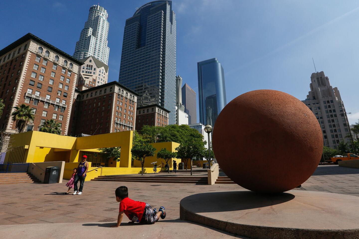
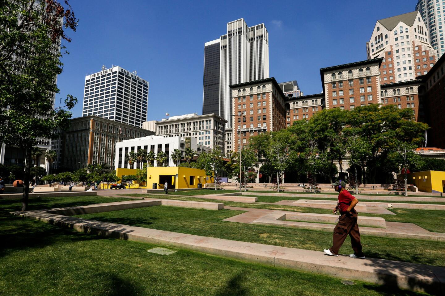
The winning design focuses on opening the park directly to the sidewalks around it, replacing concrete with grass and providing extensive new pockets of shade. It is very much a reaction to, if not an outright apology for, the visual clutter of present-day Pershing Square, which remains a conspicuous dead space in an otherwise revived and money-soaked downtown.
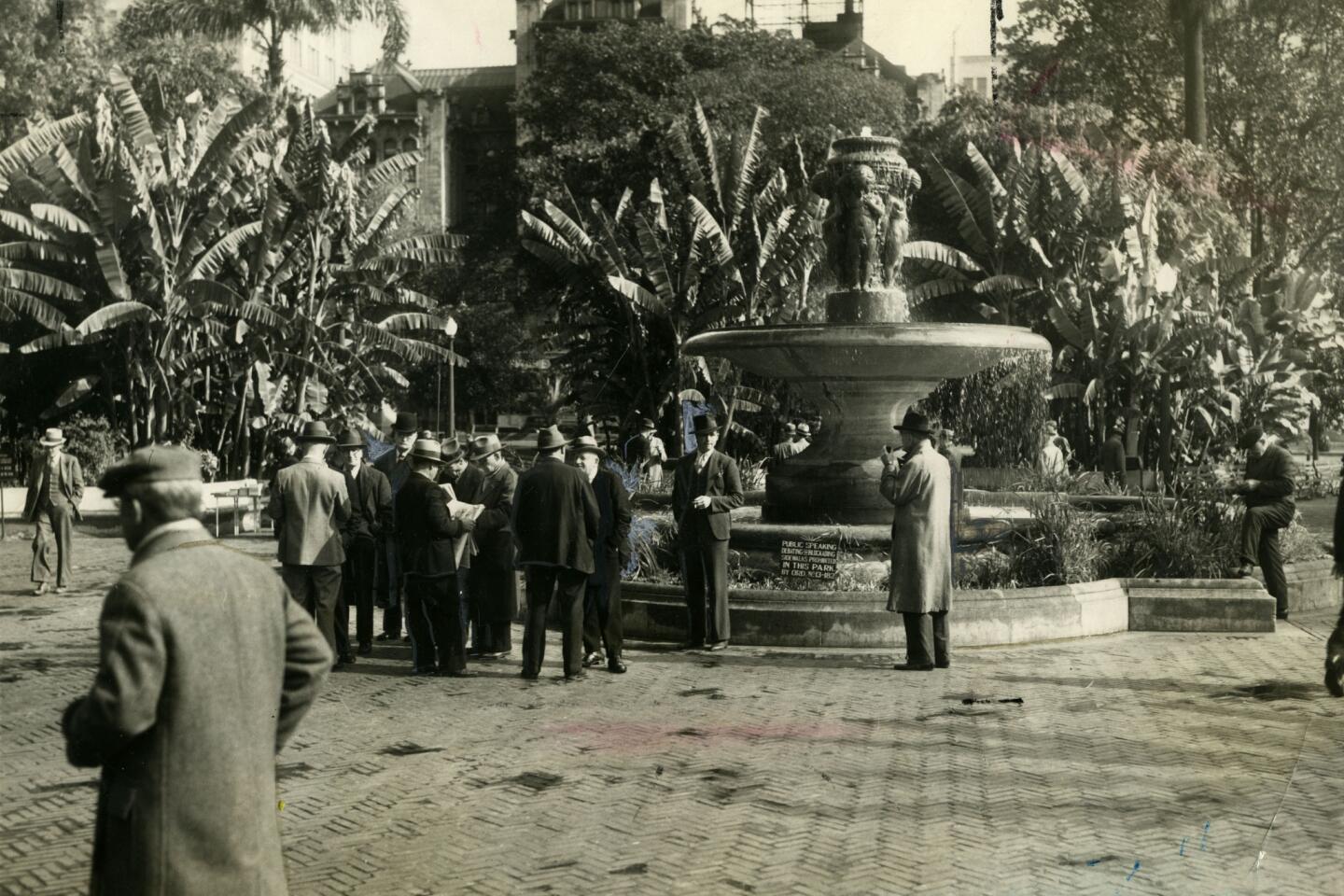
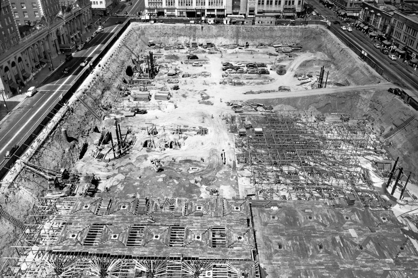
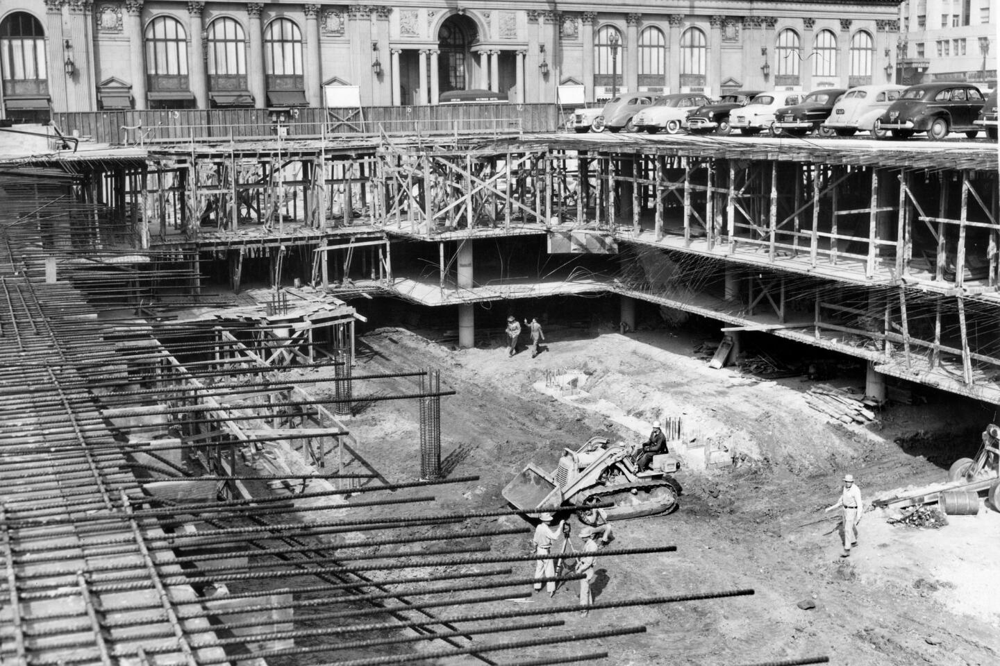
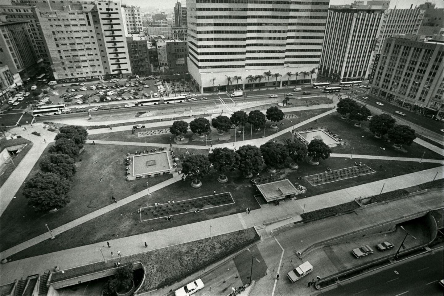
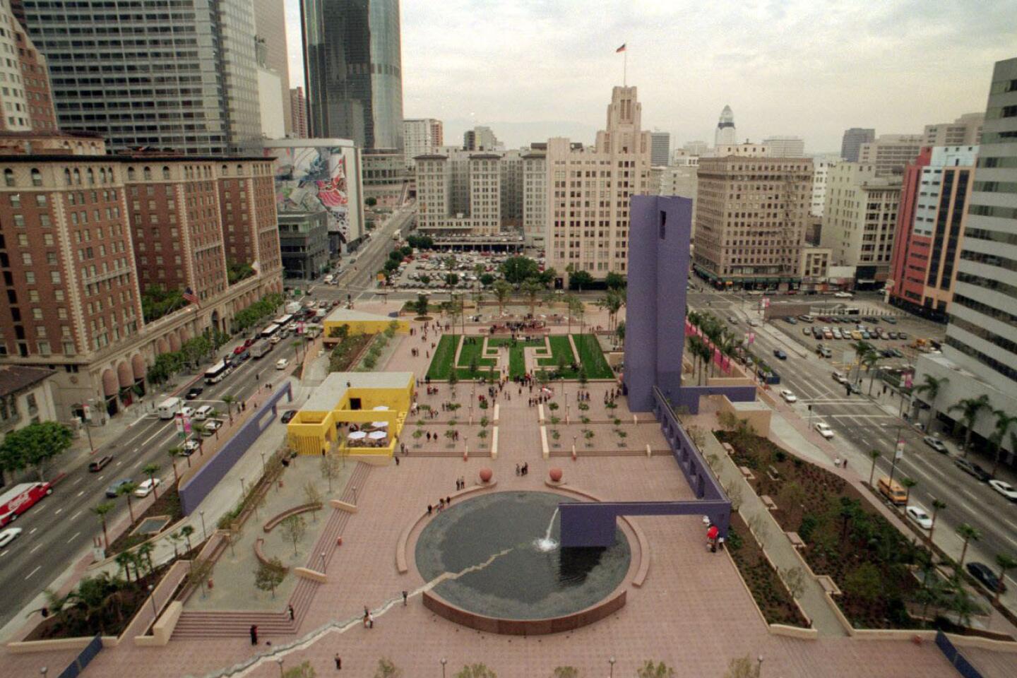
One of L.A.’s oldest public spaces, Pershing Square suffered the indignity of having its trees and grass torn out so that a parking garage could be sunk beneath it in 1951. In 1994, after an earlier design competition fizzled, Mexican architect Ricardo Legorreta and landscape architect Laurie Olin were hired to redesign the square again; along with bright color and a good deal of hardscape, they added walls and towers to the existing parking ramps along the perimeter, redoubling the sense that the park was cut off from the life of the surrounding city.
The Agence Ter proposal, which beat out entries from three finalists, aims to solve those problems by relying on what Henri Bava, one of the firm’s founders, describes as a “radical flatness.”
Its plan would slice off the top five feet or so of the parking garage and lower the surface of park, now raised slightly, back down to sidewalk level. It would have parking ramps on two sides — along Olive and Hill streets — instead of four.
In trying to make up for the sins of parking-obsessed planners of an earlier generation, the Agence Ter team faces a challenge familiar to designers and urban planners across Southern California. Retrofitting the car-centric urban landscapes of postwar Los Angeles to make them more accessible to pedestrians, cyclists and the users of public transit stands at the center of the city’s ongoing effort to reshape and redefine itself for the 21st century.
When it comes to the design of public plazas, that effort sounds straightforward enough. After all, the great urban parks around the world, from Trafalgar Square in London to Central Park in New York, are both flat and wide open to city life around them.
But in Los Angeles we face particularly daunting challenges simply because of the degree to which we embraced car-based planning strategies in the decades after World War II.
It is not enough simply to endorse the idea that we want public spaces in L.A. to be more welcoming, our civic realm livelier. We also have to find the money to remove the extensive automotive infrastructure that helped deaden those spaces in the first place.
That removal can be pricey: Bava said Thursday he thinks his team will need to spend least a third of the park’s estimated $50-million budget just to perform the planned surgery on the top level of parking garage. (Rios Clementi Hale Studios, the firm that designed nearby Grand Park, spent a similar amount removing parking ramps.) And Bava will have to be careful not to slice too deeply because the revenue from the garage is not something officials are eager to give up.
In the longer term, according to many urban planners, demand for parking is likely to decline as ride-sharing services grow, autonomous vehicles gain approval and Los Angeles County continues to expand its transit network.
There are also political and fundraising challenges ahead. Though the city’s Recreation and Parks Department made a show of solidarity with the redesign effort on Thursday — the stage in center of the square set up for the news conference was draped quite prominently in Rec and Parks signage — the competition has been run to a significant extent by Huizar’s office and funded by real-estate developer MacFarlane Partners, which is building a new residential complex across 5th Street from the square. Whether City Hall — or to be more specific, the ranks of the bureaucracy that builds and maintains parks in Los Angeles — enthusiastically embraces the redesign is an open question.
Pershing Square’s facelift will be paid for with a mixture of private and public funds, though it’s unclear precisely how the final total will be divvied up. The remade square is expected to open by 2019 if — and this is a pretty big if — there are no major fundraising snags.
Huizar said Thursday that a “more definitive” timetable and financing plan, including news of some public funding, would be announced “in two weeks or so.”
The winning team, headed by Agence Ter and L.A.’s SALT Landscape Architects, came together thanks to connections among Bava, USC landscape architecture Dean Kelly Shannon and SALT’s Allen Compton. It also includes the graphic design firm Pentagram, Deborah Murphy Urban Design + Planning and architect Rachel Allen.
There is a directness in the team’s proposal — even a minimalism — that clearly appealed to the nine-member competition jury, which included Janet Marie Smith, an executive with the Dodgers who was trained as an architect and planner; Toronto landscape architect Janet Rosenberg; and Cal Poly architecture dean Michael Woo, a former Los Angeles city councilman and mayoral candidate.
The Agence Ter design is noticeably calmer and less formally aggressive than the other proposals, which called for lifting sections of the park into the air, building a high-rise urban farm or creating rolling hills.
It also includes a giant pergola — what the designers call a “smart canopy” — that will run along Hill Street. Lined with photovoltaic panels, it would generate electricity while also providing shade.
At night the canopy will be illuminated with a design by artist Leo Villareal, best known for the “Bay Lights” installation on the section of the Bay Bridge nearest San Francisco. Tucked beneath the canopy will be a series of small kiosks; designed by Allen, they will include space for a café, restaurant and welcome center, among other amenities.
The park would be most thickly planted along its Olive Street edge, with an edible garden and a water feature in front of the Biltmore Hotel. The plan imagines not just a wide public plaza along 6th Street but new bike paths and wider sidewalks surrounding Pershing Square.
At the literal (if not quite the conceptual) center of the Agence Ter design is a Great Lawn, sure to be a controversial feature given the severity of Southern California’s ongoing drought. Let me go on record, then, as supporting it: In a city as lacking in attractive and accessible park space as Los Angeles the last place we should be banning lawns is in the civic realm.
If we need to cut private water use to make public lawns possible, we should have no regrets about cutting away. Radical or not, flat, green, open and shaded places for people to gather are precisely what we need more of in Los Angeles.
MORE:
Pershing Square’s 1994 redesign concept was aiming for ‘humane’ and ‘romantic’
Photo slider: Pershing Square then and now
Two downtown L.A. parks and the tricky task of designing them to best serve the city
Pershing Square redesign: New renderings of the four finalists
Downtown L.A.: The hot spot moves, but the rise continues
More to Read
The biggest entertainment stories
Get our big stories about Hollywood, film, television, music, arts, culture and more right in your inbox as soon as they publish.
You may occasionally receive promotional content from the Los Angeles Times.
