Column: How the best picture fiasco saved the Oscars from nostalgia overload

- Share via
If the academy could go back and do it all over again, do you think it would?
No, I’m not talking about the choice of Warren Beatty and Faye Dunaway to announce the best picture winner at Sunday’s Oscars ceremony.
Or about the decision to parade a bus full of wide-eyed tourists across the broad lip of the Dolby Theatre stage during the show, a stunt that might have been conceived as a funny commentary on class but played more cruelly, a chance for the swells to turn the tables and ogle the commoners.
I mean that instead as a question about authenticity and the nostalgic architectural trappings of the Academy Awards ceremony: If Hollywood could jump in a time machine and spin the dial back to, say, 1925, would it?
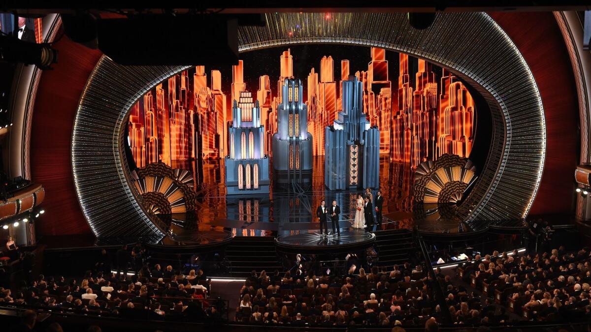
I ask because the clear impression I got attending the Oscars this year (for the first time) was that the design of the Dolby Theatre, the production design for the show itself and — at least until the final trophy of the night turned out not to belong to them — the way the cast and crew of “La La Land” loomed, with their 14 nominations, over it all conspired to produce a four-hour reverie lifted right from the Jazz Age.
And maybe that’s one reason the best picture snafu produced such an odd reaction. At least inside the theater, what I felt wasn’t so much acute shock as much as disorientation, as if somebody had suddenly woken all of us up.
Looking back it’s clear the fiasco was a blessing in (heavy) disguise: It saved this year’s ceremony from nostalgia overload. When “Moonlight” director Barry Jenkins and the stars and producers of the film made their way to the stage after Beatty announced the mistake, it was as if the present were suddenly intruding on a happily uncomplicated version of the past.
SIGN UP for the free Essential Arts & Culture newsletter »
Until that moment we’d been lulled, not unpleasantly, into a “La La Land” trance. (I realize now that even the name of that movie is less alliterative than soporific — and maybe most effectively enunciated while half in the bag.) Derek McLane’s set design was, with the exception a couple of odd detours in the direction of Chinoiserie, ruled by affection for Art Deco, as if the academy were trying to channel Donald Deskey and turn the interior of architect David Rockwell’s Dolby Theatre into Radio City Music Hall.
Rockwell’s design for the theater building as a whole — like the Hollywood & Highland open-air mall that encloses it with a design meant to mimic the Babylon set from D.W. Griffith’s “Intolerance” — is a valentine, heavily gilded if paper-thin, to Old Hollywood. The best of the onstage numbers was the “La La Land” medley starring John Legend and a stage full of old-fashioned L.A. lampposts, the kind you can see in Chris Burden’s “Urban Light” installation in front of the Los Angeles County Museum of Art.
Host Jimmy Kimmel (though his self-deprecating, improvised close to the show, in the wake of the best picture chaos, was impressive) operates most of the time in a genially milquetoast, throwback vein, as Vince Vaughn suggested when he compared him to the midcentury actor Sal Mineo.
Like “(500) Days of Summer” before it, “La La Land,” though set in the present, carefully frames its views of L.A. architecture to give pride of place to the old over the new. On balance the movie’s version of history is more compelling — less gaudy — than the Dolby Theatre’s.
Still, had the best picture honor sealed “La La Land’s” dominance in the Oscar race this year, Sunday night would have unfolded as a nearly unbroken line of early-L.A. nostalgia, from the the red carpet to the show to the final award.
Instead the evening ended with a reversal of fortune of epic scale. “Moonlight,” with its painterly cinematography by James Laxton, is not immune to the pull of memory. But its story, like its treatment of the architecture of the Liberty City section of Miami, is also bracingly frank about the blind spots of contemporary American culture when it needs to be.
When the academy completes its ambitious new movie museum at the old May Co. building on Wilshire Boulevard in a couple of years, this dynamic will change — but only to a degree. The museum’s architectural centerpiece will be a spaceship-like glass dome designed by the Italian architect Renzo Piano; the ruling aesthetic will be a sort of retro-futurism instead of the pure nostalgia of the Dolby. It will be one kind of fantasy replacing another.
All of which is to say that the “Moonlight” victory was surprising not just because of the envelope mix-up but also because the reversal meant that a movie about contemporary America — a movie offering a complex portrait of present-day African American culture, no less — had earned the top prize.
In general, in its architecture as in its best picture winners — in Rockwell’s Deco opera-house-in-a-shopping-mall, in Piano’s dome, in “La La Land’s” utterly charming but fully retrograde celebration of prewar L.A — the academy seems most itself, most comfortably at home, when it is traveling forward or backward in time.
Twitter: @HawthorneLAT
ALSO
Netflix bets on a new design series — and architect Bjarke Ingels
Making sense of Measure S, the latest battle in L.A.’s long war over development
The airport as public square and protest central
More to Read
The biggest entertainment stories
Get our big stories about Hollywood, film, television, music, arts, culture and more right in your inbox as soon as they publish.
You may occasionally receive promotional content from the Los Angeles Times.


