Review: Why does DTLA’s huge new Hauser Wirth & Schimmel art complex underwhelm? It’s a familiar story

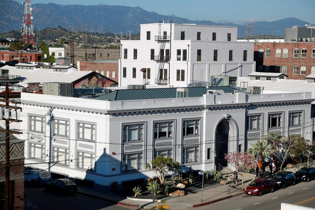
Hauser Wirth & Schimmel occupies an entire city block on East 3rd Street in the downtown Arts District.
- Share via
Sometimes the credits tell you everything you need to know.
Take the slightly unusual way Annabelle Selldorf’s name appears in the materials promoting Hauser Wirth & Schimmel, the massive and much-anticipated Arts District outpost of the international gallery Hauser & Wirth, which was founded in 1992. Selldorf — born in Germany and based for more than three decades in New York, where her firm is best known for crisply remaking historic buildings for museums and other art-world clients — is listed as the project’s “consulting architect.”
That’s not the kind of attribution you see very often, especially not on a high-profile effort of this type. What it means is that local fans of Selldorf’s precise and restrained work shouldn’t expect that her L.A. debut will reflect the full range of the architectural intelligence she displayed at New York’s Neue Galerie, the Clark Art Institute in Massachusetts or in earlier projects for Hauser & Wirth, which now has six locations around the world.
See more of Entertainment’s top stories on Facebook >>
This is closer to Selldorf Lite. Or maybe Selldorf Once Removed.

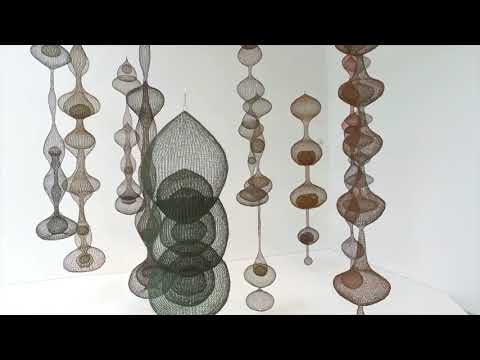
A preview of the Hauser Wirth & Schimmel gallery in a revamped 19th century flour mill in downtown Los Angeles. It’s set to open to the public on March 13 with its inaugural show “Revolution in the Making: Abstract Sculpture by Women, 1947-2016.”
Most of the architectural decisions that have shaped the gallery, which fills an old flour mill built in phases from 1896 to 1929, were made by Creative Space, a Los Angeles firm, in close collaboration with Paul Schimmel, the talented, voluble and well-connected former Museum of Contemporary Art curator who has been the driving force behind the project. The landscape architect is Mia Lehrer.
FULL COVERAGE: Spring 2016 arts preview | Exhibits | Theater | Dance | Pop music | Books
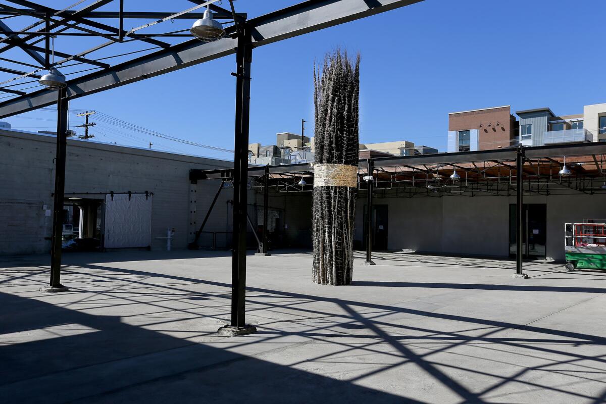
Selldorf, for her part, helped choreograph many of the big moves in this complicated urban and architectural rehabilitation effort. Together with Schimmel she decided to carve a big public walkway through the complex from 2nd to 3rd streets. It opens in the middle onto a large courtyard.
In the final product, Selldorf’s organizing ideas seem mostly intact — the spine of the internal street, the openness of the circulation, the range of gallery spaces. It is in the details — the placement of duct work, the choice of handrails and hardware, the angle at which light fixtures are attached to walls or ceilings — that the project falters a bit.
That’s not to say that HW&S — at 116,000 square feet big enough to feel more like a museum than a gallery — isn’t an appealing or significant addition to one of the most rapidly changing neighborhoods in Los Angeles.
Occupying nearly a full city block at the corner of 3rd and South Garey streets, making it a close neighbor of both the Southern California Institute of Architecture and Michael Maltzan’s One Santa Fe apartment block, the gallery complex is especially impressive for its public-mindedness.
In the densifying heart of a city less and less defined by the deep supply of private garden space that so dramatically marked its 20th century character, the gestures that HW&S makes to its neighborhood, the room it provides for residents looking for a cup of coffee or a place to sit down and read email rather than buy a piece of art, may prove particularly meaningful.
See the most-read stories in Entertainment this hour >>
Unlike One Santa Fe, which is packed with architectural ideas but marked by cruise-ship-like bulk, HW&S brings new energy to the area by stringing together and remaking a collection of existing buildings. It has helped keep not just the scale but the urban character of this slice of downtown intact.
Among the reasons that Selldorf’s relatively hands-off role in the project is a pity is that this particular collection of buildings seemed to have the potential to cohere as a kind of supremely rare but quintessentially L.A.-style urban village.
And to be honest, it still might, since in a number of ways the complex remains a work in progress. A restaurant along one edge of the central courtyard won’t be complete until summer. A second plaza, along the alley marking the gallery’s eastern side, is set to open a couple of months after that.
The complex is anchored by a two-story building along 3rd Street, built in 1917, that once served as the administrative center and employee bank for Globe Mills. Behind that, along Garey, is a large loading dock. The whole composition is overlooked by a five-story concrete tower.

Bound trees in Hauser Wirth & Schimmel’s courtyard are by Jackie Winsor.
The galleries occupy three zones, each with its own architectural character. (There is 23,700 square feet of exhibition space in total.) At the back are the most rational and straightforward of the rooms for art, with white walls, exposed bow-truss roofs, concrete floors and big square windows looking onto 2nd Street. Across the interior street from those galleries is a large, raw space inside the oldest structure on the site, known as the Barn.
The most dramatic gallery occupies the heart of the 1917 building, filling a double-height room topped with a long, narrow and peaked skylight. It’s here that you get the most direct impression that Schimmel has his priorities squarely in order.
Many gallerists would have turned this space, just off the main entrance, into a gift shop or cafe — or some high-grossing combination of the two. Instead, Schimmel and his architects have installed low-slung biomorphic platforms to hold a range of sculptural artworks.
If the complex, for all its easygoing, rough-around-the edges charisma, doesn’t begin to communicate the particular strengths of Selldorf’s approach to remaking old buildings for new programs — what architects call adaptive reuse — it also fails to match the achievement of one obvious local precursor: Frank Gehry’s 1983 Geffen Contemporary (nee Temporary Contemporary) building for the Museum of Contemporary Art.
Gehry’s design turned an old warehouse complex into a high-ceilinged, no-frills MOCA satellite that over the years has proved arguably more popular (and in certain ways more flexible) than the museum’s flagship building, by Arata Isozaki, on Bunker Hill.
It might seem unfair to compare a gallery to a branch of one of L.A.’s best-known museums. Yet Hauser Wirth & Schimmel clearly aspires to that sort of standard, and not just because of its size. Its website boasts of “museum-caliber amenities,” which along with climate-controlled galleries and the forthcoming restaurant include a 2,000-square-foot bookstore.
To call the architecture museum-caliber, though, would be a stretch. Instead, Los Angeles is left with the kind of cultural attraction we’ve become all too familiar with: the underwhelming Southern California debut from a well-known out-of-town architect, a design not so much disappointing as suffused with a faintly nagging sense of what might have been.
Twitter: @HawthorneLAT
More to Read
The biggest entertainment stories
Get our big stories about Hollywood, film, television, music, arts, culture and more right in your inbox as soon as they publish.
You may occasionally receive promotional content from the Los Angeles Times.


