Consider the social-architectural context of LACMA’s 1965 design

- Share via
It’s one of those tidbits of Los Angeles architectural history that can seem minor or hugely emblematic, depending on the context.
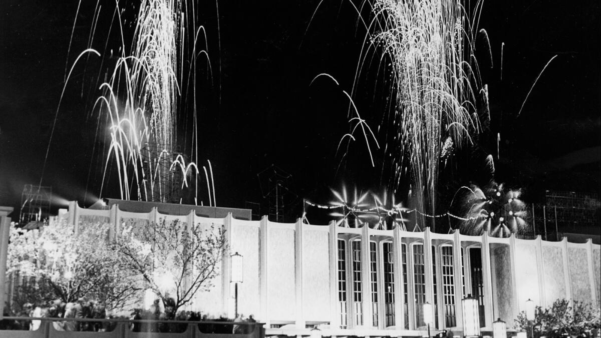
In April 1965, the Los Angeles County Museum of Art opened its new campus on Wilshire Boulevard, designed by increasingly prolific hometown architect William Pereira. That same year, the museum, through its book-printing arm, published “Architecture in Southern California” by David Gebhard and Robert Winter, the first new guide to L.A. architecture in nearly a decade.
FULL COVERAGE: LACMA at 50
The book included two projects designed by Pereira’s office. The LACMA campus was not one of them.
The omission was partly an expression of editorial independence from a pair of young architectural historians. It also summed up quite neatly the prevailing conventional wisdom about the LACMA buildings when they appeared: that in their proper, boxy and beige late-modern dress they were dignified at best and stolid and self-serious at worst.
The decision not to include LACMA in the guidebook “was intentional,” Winter, now 91, said when I reached him by phone. “We thought it was so ugly.”
As the museum turns 50 this year and debate continues about LACMA Director Michael Govan’s plan to replace the Pereira buildings (and a later addition by Hugh Hardy) with a giant new wing by Swiss architect Peter Zumthor, it’s worth remembering how the original LACMA campus was greeted — as well as a few things about the Los Angeles into which it was born.
Museum boards make conservative architectural choices all the time, of course, and the buttoned-up competence of the Pereira buildings would have been less meaningful in the historical scheme of things if not for one fact: Los Angeles in 1965 was a place in which an entirely new and singular way of thinking about architecture, art and city-making was beginning to emerge.
It was a period of tumult, deepening generational divides and unrest, politically and culturally. The Watts riots would explode in August, just four months after the museum opened. The construction of freeways in Southern California was at its height, promising new connectivity across the region but at the neighborhood level bringing painful dislocation.
Prodded by the sense that the Southern California landscape was being radically remade, Richard Lillard by 1965 had nearly finished writing “Eden in Jeopardy,” his impassioned book railing against L.A.’s love of constant “demolishing, subdividing, road making, migrating, building, changing, improving.” William Bronson’s “How to Kill a Golden State” made a similar argument a couple of years later.
But if a certain California was dying, another was ready to take its place. In architecture, younger architects and critics were poking at modernism, undermining and looking beyond it to a far greater degree than Pereira was willing to.
A 1965 essay by Charles Moore, “You Have to Pay for the Public Life,” considered a range of new monumental architecture in California. Like Gebhard and Winter, Moore ignored Pereira’s LACMA, focusing instead on Disneyland, which he called (not with a straight face but with a genuinely smiling one) “the most important single piece of construction in the West in the past several decades.”
In Los Angeles, signs of the same new philosophy were taking shape. The Ferus gallery, buoyed by the work of the young artists Ed Kienholz, Billy Al Bengston and others, had already reached the peak of its influence. Young artists and architects would soon be setting up studios near the beach, as far west from Hancock Park and the new LACMA as they could get.
Frank Gehry’s studio for the graphic designer Lou Danziger was finished in 1965 on an otherwise unremarkable stretch of Melrose Avenue. The building, wrapped in the plainest sprayed-on stucco Gehry could find, was a deadpan celebration, far more carefully composed than it let on, of the postwar, car-dominated L.A. streetscape.
So were Ed Ruscha’s photography books on Los Angeles, including the 1965 series “Some Los Angeles Apartments.” The distance between that point of view and Pereira’s would soon become a literal subject of Ruscha’s work in the 1968 painting “Los Angeles County Museum on Fire.” Also in 1968, LACMA mounted an exhibition, designed by Gehry, on Bengston’s art. Gehry’s installation used plywood and corrugated-metal walls and sent up Pereira’s stuffy architecture as effectively as Ruscha’s now-famous painting.
In the second edition of their guide, published in 1977, Gebhard and Winter did carve out room for an entry on LACMA, though without any enthusiasm. “The architecture is not much,” they wrote.
It seemed not much thanks to Pereira’s particular approach, which was always more diligent than imaginative. In designing the museum campus, he was certainly not ready to break completely with the flat-roofed, largely ornament-free modernism that had by the 1960s held sway in architecture for at least three decades.
Nor was the LACMA board ready to throw in its lot with something new, not when the entire city would be judging this attempt to establish some cultural credibility for Los Angeles. The whole point of the exercise was to show that Southern California was coming into maturity as an arts center. Novelty and expressions of youthful rebellion against an increasingly staid modern movement in architecture would hardly do.
It’s in that context that we should understand LACMA’s much-analyzed flirtation with Mies van der Rohe, the German modernist by then working in Chicago. Choosing Mies, as the museum almost did, would not have been an expression of daring so much as a different — perhaps more deeply felt, certainly pricier — brand of good taste. Meanwhile, the lead donor, Howard Ahmanson, preferred Edward Durrell Stone, whose style was close to Pereira’s, though maybe a touch more decorative.
If Pereira wasn’t ready to break from the Miesian model in any radical way, he sensed (as Stone did, as even the LACMA board must have by the time it settled on a final choice) the growing restlessness among architects and critics with orthodox modernism.
But recognizing that impatience and moving to uproot it were different things for an architect like Pereira. In an essay on LACMA for The Times, published in late March 1965, he stressed above all the logic of his design. This was a public building and he wanted readers to know it wouldn’t be wild or wasteful.
In the end he split the difference between propping up a sagging movement and suggesting a path beyond it. His three LACMA pavilions, set back from Wilshire Boulevard atop reflecting pools and reached by a pedestrian bridge, are wrapped, as The Times noted in 1965, “by colonnades of slender concrete columns [and] faced with tens of thousands of split-faced Cipollino marble tiles, all individually hand set.” There are hints of a newly decorative and permissive approach, but the loosening up is carefully calculated.
Disneyland, Watts, Melrose. Gehry, Ruscha, the Ferus group. The deadpan, the small-d democratic, the city in literal and painted flames.
Was there a coherent movement there, taking shape right under William Pereira’s nose? Is there some way to neatly connect those names and places? Not really. But it’s possible to say that what those artists, writers and architects were looking at and inspired by was everything the new museum campus, in its well-appointed good taste, was happy to ignore.
The pedestrian bridge was the giveaway: The museum was designed to be a refuge from that emerging city, full of energy and anger, made of plywood instead of Cippalino marble. That didn’t make it unique among the cultural landmarks of its day — the Music Center and in fact all of postwar Bunker Hill is arranged in much the same way — but it does help explain why it generated so little excitement. “The architecture is not much.”
The unruly charisma of its urbanism, its tolerance and the wide space it opened up for experimentation — these were postwar L.A.’s great contributions to world culture. Pereira’s LACMA put a lid on that city just as it was beginning to boil.
More to Read
The biggest entertainment stories
Get our big stories about Hollywood, film, television, music, arts, culture and more right in your inbox as soon as they publish.
You may occasionally receive promotional content from the Los Angeles Times.


