Review: The new Broad museum, though efficiently designed, really only comes alive on the periphery

- Share via
It’s a depressingly reliable fact of Los Angeles architecture: Nothing comes easily on Bunker Hill.
In the five decades since city planners radically remade Grand Avenue in a burst of urban-renewal ambition, demolishing its Victorian-era houses and apartment buildings and carving the hilltop into vast super-blocks, architects have struggled to make sense of its peculiar, wide-open scale, which can swallow subtlety whole.
Arata Isozaki, Rafael Moneo and Wolf Prix are among the prominent architects to produce disappointing buildings along Grand. Even Frank Gehry’s Walt Disney Concert Hall, ultimately a triumph, suffered agonizing delays and fundraising crises and took nearly 15 years to complete.
The newest addition to this uneven parade of high-rises, cultural buildings and still-empty parcels is the Broad, a $140-million museum of modern and contemporary art set to open Sept. 20 at the corner of Grand and 2nd Street.
An efficient three-story box of exhibition and archive space wrapped in an eye-catching, bone-white honeycomb of fiberglass-reinforced concrete panels, it was designed by the New York firm Diller Scofidio + Renfro (DS+R for short), which won a small invited competition organized in 2010 by Eli Broad, the billionaire philanthropist and art collector.
Broad has had contentious relationships with architects over the years — in the 1980s, he hired Gehry to design a house in Brentwood only to fire him and recruit another firm to finish the job — and for this project set an aggressive construction timetable that was serially extended. In a related development, Broad has filed suit against the German company, Seele Inc., brought on to build the museum’s unusual latticed skin, saying fabrication errors added roughly $20 million to construction costs and delayed the opening by more than a year.
It wouldn’t be fair to say that the museum, which has moments of real charm, buckles under the burden of those expectations and conflicts. But in a number of places, including its surprisingly punchless facade, it shows the considerable strain of holding up that weight.
The elements of the Broad that have been most closely scrutinized or most often reworked, in fact, are the most uneven. It is only in the relative shadows — in the peripheral or easily overlooked spaces, or in the rooms added or enlarged late in the design process — that the architecture of the museum really comes to life.
When you see the Broad from a distance, what stands out is a sense of near-total enclosure — the consistent cover of the white facade, which DS+R’s Elizabeth Diller refers to as the “veil” covering the “vault” of archive and office space filling most of the second floor.
The skin recalls the 1964 American Cement Building on Wilshire Boulevard, by the L.A. firm DMJM, as well as SANAA’s 2007 New Museum in New York and a range of postwar experiments in concrete shade screens by Le Corbusier and other modernist architects.
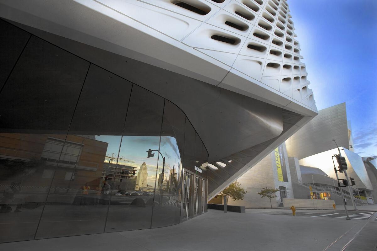
More to the point, it helps the Broad act as a foil to Disney Hall next door. Where the concert hall is reflective and extroverted, the museum is matte and mute.
SIGN UP for the free Essential Arts & Culture newsletter >>
Early on the architects considered using fiberglass-reinforced panels for the facade — officially GFRC, for glass fiber reinforced concrete. Fairly quickly, in consultation with engineers on the project, they decided on a structural precast concrete skin instead, only to revert to GFRC when the precast panels proved tricky to execute. (See the pages of Broad Collection vs. Seele Inc. for the gory legal details.)
A large dimple along the front of the museum, which the architects call an “oculus,” marks the location of a second-floor lecture hall overlooking Grand. The rest of the facade is oddly inert and largely opaque, with little of the lightness or translucency suggested by the word “veil.” (The architects had strict instructions from Broad and Joanne Heyler, the director of the museum, to keep any direct sunlight from reaching the galleries, leaving the openings in the skin relatively pinched.)
This is no small imperfection in a building whose exterior draws so much of its architectural power from pattern and material texture as opposed to form.
As you approach the museum on foot, you begin to notice just how dramatically and effectively the facade is lifted at the front corners, exposing walls of glass behind the skin and seeming to pull the Grand Avenue sidewalk into the museum. There is an appealing loggia along the front, formed by the gap between the glass and the portion of the veil that comes all the way down, in a flying V, to the pavement.
The entry from the parking garage is not handled with nearly as much grace. Elevators bring visitors not directly into the lobby but to the plaza along the southern edge of the building. When the elevator doors open they’ll be standing with their backs to the museum, facing not DS+R’s architecture but a bland new apartment tower, the Emerson, on the far side of the plaza.
Once they’ve found their way into the museum lobby, they’ll discover a remarkable, cave-like room, long and narrow, with undulating walls finished in gray Venetian plaster. There is no ticket desk; museum staffers will roam the ground floor on foot, like employees at an Apple store.
The rather spare architecture of the lobby is designed to fix your attention on a single feature: the 105-foot-long escalator that pierces the rolling walls of the ceiling and leads directly to the main exhibition space on the third floor.
There is a sort of clearing at the end of the escalator; this space, the real heart of the museum, is dominated by the drama of the ceiling, whose fixed skylights are visually an extension of the veil pattern that makes up the facade.
Once you wander in any direction away from the center of the top floor, into one of the smaller gallery spaces created by substantial but movable partitions 16 feet high, the power and presence of the ceiling fades. At least for the opening exhibition, the balance between wall space for paintings and room for the architecture to breathe — and the skylights to assert themselves — is tipped very much in the direction of the art.
Along the edges of the top floor, looking through the glass walls and the veil, you get tightly controlled, almost punitively limited glimpses of Disney Hall and Grand Avenue.
Stairs wrapped in dark, womb-like walls lead back down toward the lobby, passing the second-floor archive (where paintings on storage racks are visible through a pair of big picture windows) and the lecture hall (quite basic) on the way.
From the bottom of the stairs it’s a short walk to the surprisingly spacious, appealingly direct ground-floor galleries or — past a bookshop tucked into two corners of the lobby — back out to the plaza. Designed by DS+R and the landscape architect Walter Hood, the outdoor space features a collection of 100-year-old Barouni olive trees framing a sizable lawn, a surprising choice in the middle of a drought.
A free-standing restaurant fills the back of the plaza. In 2020 a Metro stop will open on Hope Street, a short walk from the Broad’s lobby.
In many ways the museum marks a step forward for DS+R, a firm long known for conceptual and theoretical projects that has designed soon-to-open buildings for Stanford University and U.C. Berkeley as well as an expansion to the Museum of Modern Art in New York. The Broad is a more confident and resolved piece of architecture than the firm’s 2006 Institute for Contemporary Art in Boston, a top-heavy waterfront building overstuffed with clever (and some too-clever) design ideas.
It is also a far more rational and constrained building than it initially appears. Because of a strict height limit — and because Broad wanted a large, column-free exhibition space on the top floor and parking below, with room for the archive in the middle — a stacked box was essentially the only design option.
Positioning that box at the top of Bunker Hill, though, was hardly simple. Grand’s postwar makeover, faithful to the modernist planning dictates of the era, turned it into a street that operates for much of its length on two levels, with room for deliveries and parking below, on Lower Grand, and pedestrian and car traffic above. (Broad, founding chair of the MOCA board and major player in the extended Disney Hall drama, is as familiar with the complexity of that landscape as anyone.) Instead of rising directly from the corner of 2nd and Grand, the Broad bellies up to the existing bi-level roadway so that its lobby meets the sidewalk of Upper Grand.
Against that complicated infrastructural backdrop, Broad and the architects understandably opted for an interior layout that is perfectly clear, if rather prescriptive: You take the escalator to the top floor to see the art. Then you take the stairs back down, peering into the archive along the way.
The result is a streamlined ratio of exhibition to ancillary space, something increasingly rare in an age of museum bloat. The Broad has 50,000 square feet of gallery space -- 35,000 on the third floor and 15,000 more on the first — in a building totaling 120,000 square feet. Renzo Piano’s new Whitney Museum in New York has the same amount of interior exhibition space in a building covering 220,000 square feet.
Still, it’s not in the center but around the edges of that basic sequence that the museum proves most compelling and full of personality — in the cylindrical glass elevator at the back of the lobby, for instance, or the small gallery next to it, framed in near-Baroque vertical folds and for now holding a fantastic mirrored installation by the Japanese artist Yayoi Kusama.
These moments and a handful of others show a verve that is elsewhere compromised, tamped down or reined in — and suggest that DS+R, for all its imaginative talent, is still figuring out how to shepherd its boldest design ideas through a challenging construction process, so they emerge fully and powerfully intact.
MORE:
How Edye Broad’s ‘natural eye’ drew her billionaire husband into the art world
Broad museum’s storage ‘vault’ to offer unique peek beyond the exhibits
Filling L.A.’s new Broad museum is an art in itself
More to Read
The biggest entertainment stories
Get our big stories about Hollywood, film, television, music, arts, culture and more right in your inbox as soon as they publish.
You may occasionally receive promotional content from the Los Angeles Times.


