Column: America’s explosion of income inequality, in one amazing animated chart

Democratic presidential candidate Bernie Sanders has said he believes there should be free public college education in the United States. California provided tuition-free college learning for generations.
- Share via
Defenders of the economic status quo in America continue to assert that economic inequality (1) doesn't exist, (2) isn't as bad as you think, or (3) is actually good for everybody.
That's despite empirical evidence that the gap between the rich and the middle class is wide and growing and that the trend is hollowing out the middle class, as well as sociological findings of its corrosive effect on society and politics. Among the "grave moral consequences of widening inequality in an environment of modest growth" identified by political economist Benjamin M. Friedman in 2009, for instance, are "racial and religious discrimination, antipathy toward immigrants, [and] lack of generosity toward the poor"--all features of our current campaign landscape.
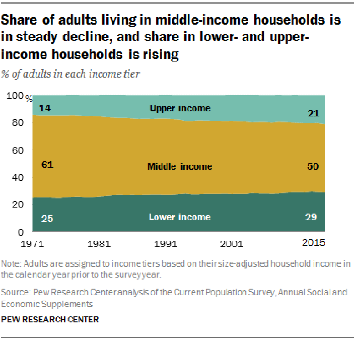
The distribution of adults by income is thinning in the middle and bulking up at the edges.
— Pew Research Center
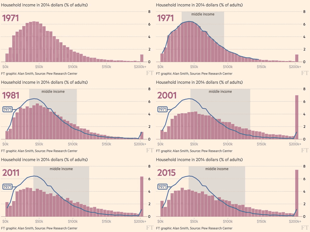
The best graphical illustration of the economic trend we've seen is the animation below, showing the shift in "middle income" households from 1971 to 2015. It was created by the data team at the Financial Times, based on statistics from a December 2015 report by the Pew Research Center on America's middle class. (The chart recently picked up a silver at the Malofiej awards of the Society for News Design's European district.)

The chart shows the peak representing the income blocks with the largest percentages of households moving from the "middle income" category toward the lower income range, while the largest single block, households with annual earnings of $200,000 or more, moving from a small share of the total to the largest single share, easily outstripping all other income segments. Each bar in the graphic represents the percentage of adults by $5,000 increment of income except the last one on the far right, which covers all income in excess of $200,000. All figures are in 2014 dollars.
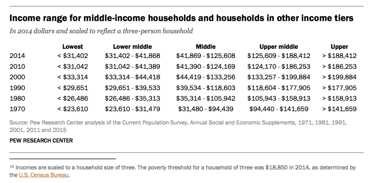
Pew divided U.S. households into five segments: two low-income groups with income of up to $41,868 in 2014 dollars, two upper-income groups with income over $126,608, and everyone else between those two marks.


"The distribution of adults by income is thinning in the middle and bulking up at the edges," Pew reported. The percentage of adults in the highest-income segments grew from 14% in 1971 to 21% in 2015, while those in the lowest two income categories grew from 25% to 29%. Middle income households as a percentage shrank from 61% to 50% in that time. No wonder that those considering themselves middle-income feel as if they're a diminishing breed.
The Financial Times further noted that Pew found a demographic divergence, too: "Older Americans were the biggest gainers by far in terms of their progression up the income tiers during the current century, and also when compared with the start of the 1970s....The group aged 18-29 has seen the biggest slide."
Some of the debate over income and wealth inequality in America rests on the definition of just what "middle class" means. As we pointed out last year, "middle class" as a demographic definition has been declining in terms of income; those who fit the demographic definition of middle class have been feeling a increasing and genuine economic pinch over the years.
The sociopolitical implications of this trend are frightening, especially to those whose income places them above it. That explains much of the desperation of efforts, mostly by conservatives, to explain it away, often by asserting that Americans are much richer than they think and will enjoy a more comfortable retirement than they're led to expect, or dismissing concern about economic inequality as "one of the myths propagated by the left." The argument often is based on the notion that doomsayers fail to take into account pension and Social Security income, but the truth is that pension income tends to accumulate at the high end of the income scale, and Social Security benefits are modest.
These graphics tell a more direct story. Inequality in income and wealth is a troubling headwind for the American economy, it's getting worse, and it's a real danger looming in our political future.
Keep up to date with Michael Hiltzik. Follow @hiltzikm on Twitter, see his Facebook page, or email [email protected].
Return to Michael Hiltzik's blog.
MORE FROM MICHAEL HILTZIK:
A computer is now the Master of Go -- but let's see it win at poker
Chinese investments in U.S. hotel companies spur national security scrutiny
Silicon Valley nightmare: SEC wants to crack down on screwball accounting gimmicks
Inside the business of entertainment
The Wide Shot brings you news, analysis and insights on everything from streaming wars to production — and what it all means for the future.
You may occasionally receive promotional content from the Los Angeles Times.


