Strangers in DallasŌĆÖ arts scene
DALLAS ŌĆö This cityŌĆÖs three-decade effort to create an arts district has been hard fought by any definition of the term. It began in 1977, when Kevin Lynch, the noted planner and writer on cities, helped pick out a site just northeast of the downtown core, hard up against a partially sunken freeway, for a linked collection of museums, concert halls and public parkland.
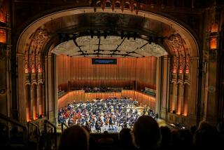
Over the intervening years the 68-acre area has been built out in consistently ambitious but decidedly piecemeal fashion, with an arts museum (designed by Edward Larrabee Barnes) and symphony hall (I.M. Pei) arriving in the 1980s, a sculpture park (Renzo Piano) in 2003 and an expanded arts high school (Brad Cloepfil) last year.
That long history of fits and starts may explain why the newest member of the district -- the $354-million AT&T; Performing Arts Center, which is made up of a new opera house, a theater and a park, with a third auditorium and an outdoor performance space yet to be built -- feels stuck in something of a time warp.
ItŌĆÖs not the architecture of the two newly completed buildings, which will open officially Monday, that is really to blame. Both the Winspear Opera House, by the prolific London-based Foster + Partners, and the Wyly Theatre, by Joshua Prince-Ramus, of the New York firm REX, and Rem Koolhaas, his former boss and partner in the Office for Metropolitan Architecture, are marked by sharply contemporary forms and stuffed with cutting-edge production technology.
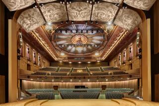
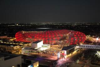
The Wyly, a tall box of a building wrapped in a skin of aluminum tubes, is standoffish outside and yoga-flexible within; in classic Koolhaas form, the 600-seat theater dares the Dallas arts establishment to complain about its severe, basement-level concrete lobby, the almost punitively narrow main staircase and a terrace lined with bright-green fake grass. The 2,200-seat Winspear, which sits beneath a giant canopy designed to shade its generous plaza, is smoother and more congenial -- comfortably plush where it is not edged in deep red, hard-candy gloss.
What feels dated here, instead, is the districtŌĆÖs organizing principle -- the idea that grouping together institutions for the arts, and recruiting an all-star team of leading architects to design them, remains a viable means of coaxing underdeveloped urban neighborhoods to life. It is the same logic that produced Lincoln Center in New York and, of course, the Music Center atop Bunker Hill, but here, in this latest phase of the Dallas project, it has been souped up for the age of celebrity architecture.
It is not so much a discredited philosophy of city-making as a consistently underachieving one. Finding the right balance in such projects between master planning and architecture -- between background design and foreground design -- is, in practice, nearly impossible. What their champions hope for is a collection of architectural icons that are also deferential to a larger urban whole, though that is essentially a contradiction in terms.
What arts districts are quite good at -- though it is usually not polite to point this out while holding a champagne flute during the black-tie opening festivities -- is driving up the value of the real-estate portfolios of the developers who own the land along their edges.
This monthŌĆÖs issue of D Magazine, which is almost entirely dedicated to coverage of the new performing arts center and the larger arts district of which it is a part, is full of sentences like this one about the developer Trammell Crow: ŌĆ£Crow was the first developer to buy into the proposed arts district, and the 90,000 square feet he purchased in the summer of 1978 for about $20 a square foot was worth $125 a square foot within three years.ŌĆØ
Because the planning for DallasŌĆÖ arts district began roughly two decades later than that of Lincoln Center or the Music Center -- both very much products of imperious Late Modernism -- it has been marked from the beginning by an emphasis on pedestrian movement and street-level design. It certainly has little of the Acropolis-like separation between building and sidewalk that brings such an air of exclusive detachment to the examples in Manhattan and Los Angeles.
When Michel DesvigneŌĆÖs landscape design for the area between the opera house and the theater is complete the district will likely seem more walkable still. And ultimately, if current plans hold, another green space, the separately designed Woodall Rodgers Park, will soon be built just to the west and north, capping part of the freeway.
Still, as is so often the case with this kind of effort, the new buildings feel detached not only from the city around them but also from each other. Because of its size, siting and the umbrella-like reach of its canopy, the opera house has taken up an undeniably central position in the district. But like the theater, it has a distinct personality and exerts its own separate sphere of influence. This is true of the districtŌĆÖs older designs as well -- PeiŌĆÖs 1989 Meyerson Symphony Center seems entirely uninterested in any sort of urban dialogue with BarnesŌĆÖ 1984 Dallas Museum of Art, for example. And the 2003 Nasher Sculpture Center by Piano and landscape architect Peter Walker, tucked away behind high travertine walls, exists in its own world; it puts as much distance as architecturally possible between itself and the parking lots and freeway access roads that sidle up near it.
To an extent this sort of individuality is unavoidable. What board of trustees wants its new opera house to match the museum down the block?
Still, the phenomenon has grown more attenuated and more extreme now, in the waning light of the starchitecture era. Cultural buildings by Koolhaas, Foster and their leading competitors can be as stunning and as aloof as runway models, looking at their neighbors in ways both haughty and wary.
That sense of detachment, touched with a bit of superiority, is what, inconveniently enough, gives the Wyly a good deal of its architectural force. It is a technically advanced building, to be sure, with its equipment and rigging arranged above the reconfigurable stage, rather than beside or behind it. That allows the theater to have an unusually tall and narrow shape, to grow vertically instead of horizontally: The footprint of the building, essentially, is the footprint of the auditorium, which is wrapped in the glass on three sides.
The lobby, executed in concrete, glass and aluminum panels, and topped by hanging fluorescent fixtures by the lighting designer Susan Tillotson, is sunk below ground, reached by a rather steep forecourt that slopes down from the street.
The forecourt acts as a kind of moat, announcing the WylyŌĆÖs disdain for the idea that it might reach out amicably to meet the opera house and its patrons.
The opera house, for its part, has the opposite problem: It is in general too eager to please, and too eager to match the luxurious feel of postwar halls like the Kennedy Center and the Metropolitan Opera or filigreed classics such as La Fenice in Venice.
Ultimately, the gregariousness of FosterŌĆÖs design, for all its confident execution and grand scale, becomes a sign of everything that is so thorny and unpredictable about planning and building an arts district.
The opera houseŌĆÖs soaring canopy throws a protective, paternal arm over a collection of venues that qualify as anything but a happy, close-knit architectural family.
--
christopher.hawthorne @latimes.com
More to Read
The biggest entertainment stories
Get our big stories about Hollywood, film, television, music, arts, culture and more right in your inbox as soon as they publish.
You may occasionally receive promotional content from the Los Angeles Times.


