Pyramid and Other Schemes
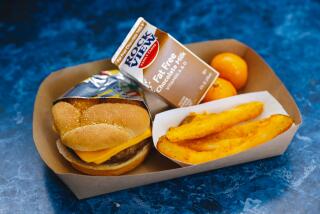
There isnŌĆÖt a fast-food chain on the planet that could regularly meet the new veggie-heavy, low-salt, minimal-protein food guidelines of the U.S. government. ThatŌĆÖs a categorical statement, and some PR person from McDonaldŌĆÖs or Burger King will no doubt reply: ŌĆ£ThatŌĆÖs so wrong -- someone who got the salad and chucked the croutons and dressing would have no problem.ŌĆØ Right.
The guidelines are hard even for people who shop for and cook their own food, as newspaper writers who tried (including Times staff writer and humorist Roy Rivenburg) have attested.
Now the government is trying to develop ways to make the guidelines more understandable, if not simpler to meet. The last guideline was represented as a pyramid, with good foods (eat lots of these!) at the bottom, the blood-pressure-raising bad stuff at the narrow peak. It had its confusions: Are beans really in the same category as meat? But it was understandable at a glance, even if not often enough glanced at.
Now itŌĆÖs the turn of graphic artists and great minds to boil down the 84 pages of detailed eating and exercise instructions into the illustrated consumer version. Another pyramid? Interlocking wheels? A 3-D representation on the Web?
The government faces an even bigger challenge: selling the idea to children, most of them well versed in the perfect French fry and unfamiliar with chard and squash. Even yogurt cups are now frowned on because of sugar content. The battle is worth fighting, but unlikely to be won outright.
More to Read
Eat your way across L.A.
Get our weekly Tasting Notes newsletter for reviews, news and more.
You may occasionally receive promotional content from the Los Angeles Times.


