Of L.A.’s Private Plazas and Public Streets
California Plaza in downtown Los Angeles appears to be back on its wobbly track again with the preliminary approval by the city’s Cultural Affairs Commission of the latest revision in the ambitious plans for the billion-dollar-plus project.
The commission, prompted by an advisory panel of independent architects, had raised some strong objections to the central performance plaza proposed as the ground-level focus of three office towers there, and a connection to the long-awaited reconstruction of Angel’s Flight.
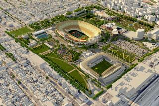
Located off of Grand Avenue, north of 4th Street on Bunker Hill, the plaza would feature a variety of performance areas, including a landscaped stage area set in a water garden. Edging the multileveled plaza would be restaurants, shops and entries to the office buildings.
The major objection--and what prompted the latest redesign--was that to stretch the plaza, as proposed, over Olive Street would in effect turn the street into an unappealing 300-foot tunnel, discouraging pedestrians and limiting access from the north and from Angeles Plaza senior housing.
This problem was solved in part by supervising architect Arthur Erickson. He cut back the plaza by about 150 feet, placing the Angel’s Flight landing not on the plaza above, but on the Olive Street level, generally improving pedestrian access and placing the proposed Dance Gallery at the corner of 4th Street.
But part of the larger problem of California Plaza’s design has been the emphasis on the private plazas and not on the public streets.
It is the streets that are the rivers of life of cities, and, which if encouraged, have the potential to generate the pedestrian activity needed to energize plazas and other open spaces.
A plaza, no matter what piece of art or fountain is featured there, will not do it by itself.
The cultural commission understands this, and the Community Redevelopment Agency (CRA) and private architects are beginning to. This augurs well for a downtown that, from a design point of view, has suffered much damage in recent years in the rush of new development.
Bunker Hill is a case in point.
There are those who think that the gritty, steep streets and aging housing of Bunker Hill of old should never have been lobotomized 30 years ago by urban renewal, and that with time and love the historic area could have been gently gentrified. Perhaps.
And then there are those, such as myself, who feel that given the resulting wasteland, Bunker Hill could have been developed with more of an urbane sensitivity, particularly the prime 11 acres now known as California Plaza.
That promise was very much in the air when the site was put up for grabs in a competition conducted by the CRA 10 years ago. Outstanding among the various plans submitted was one proposed by developer Robert Maguire and orchestrated by the late Harvey Perloff of UCLA.
It was a playful version of New York’s Rockefeller Center, studded with pedestrian-friendly spaces and places styled by a rare association of designers that included Frank Gehry, Hardy Holzman Pfeiffer Associates, Lawrence Halprin, Robert Kennard, Ricardo Legoretta, Barton Meyers, Charles Moore and Cesar Pelli.
Although the plan won broad critical approval and was recommended by the CRA staff then headed by Edward Helfeld, it was rejected by the agency’s board under pressure from Councilman Gilbert Lindsay. In an interview a few years later, Lindsay said the design had nothing to do with his role, and that, simply, he was partial to lobbyists of other proposals, who were partial to him.
As for Mayor Tom Bradley, he stood by while the disposition of the largest parcel of a city-controlled downtown renewal project was in effect auctioned off for what Lindsay admitted were campaign contributions. So much for history.
The proposal that won was California Plaza, designed by Erickson and proposed by a development team then headed by Cadillac Fairview and now by Metropolitan Structures.
While the Maguire plan followed the existing street pattern, the Erickson scheme covered the streets with bridges and plazas linking the various proposed structures. It is these plazas and bridges that prompted the most recent conflict.
The project has never been particularly pedestrian-friendly, not even the much acclaimed Museum of Contemporary Art, designed by Arata Isozaki.
The museum itself is an engaging play of forms and materials with a reasonable interior circulation system and functional galleries. But the museum’s long blank wall along Grand Avenue is repellent. Why couldn’t there have at least been a few windows to a peek into the galleries?
And the restaurant is hidden away in the corner of the lower plaza, like a broom closet. It would have been so much nicer on the upper level, looking out at the water fountain and the city beyond.
Making California Plaza work, not only as a destination for the thousands of persons who in time will work there, but also as connection to the rest of the city, becomes even more important now that the Disney Concert Hall is going to be built at Grand and First.
One of the appealing elements of the winning Disney design by Frank Gehry is a large, informal plaza spilling out onto Grand, where he has suggested that the street be fashioned to encourage an easy flow of pedestrians.
If the Disney project can be built as designed, if California Plaza can be made more accessible, and if the surrounding streets can be made more pedestrian friendly, then perhaps Bunker Hill will live, and thrive, again.
More to Read
The biggest entertainment stories
Get our big stories about Hollywood, film, television, music, arts, culture and more right in your inbox as soon as they publish.
You may occasionally receive promotional content from the Los Angeles Times.


