Small house in Marina del Rey remade modern, airy, open

When Joe Borst bought a run-down 1952 house in Marina del Rey, he and girlfriend Maria Torres hoped to transform the 1,200-square-foot cookie-cutter plan into something that felt larger, more open and modern ŌĆö a tall order given the limited budget.
The couple could afford to renovate the house but not to expand it, so the mission became to rethink the floor plan ŌĆö to leave the perimeter of the house intact, adjust how the existing space was used and make the most of the houseŌĆÖs backyard.
Borst called on his close friend Robert Sweet of the design-build studio Ras-a in Redondo Beach to handle the makeover.
ŌĆ£I gave him free rein,ŌĆØ Borst said. ŌĆ£I had seen a lot of his work, and he knew what I wanted: lots of light and open space.ŌĆØ
The house came with low ceilings and a complicated series of rooms. One bedroom was sealed off from the rest of the house as a separate rental unit. In the backyard, Borst said, marijuana plants were growing amid the rebar remnants of a partially completed garage.
Sweet took the house down to the studs. Working with a reconstruction budget of about $150 per square foot, he started by opening up the homeŌĆÖs three-bedroom, two-bathroom layout, which had made the interiors feel dark and cramped.
ŌĆ£Everything was compartmentalized, and there was no open space,ŌĆØ Sweet said. ŌĆ£That was not the way Joe wanted to live.ŌĆØ
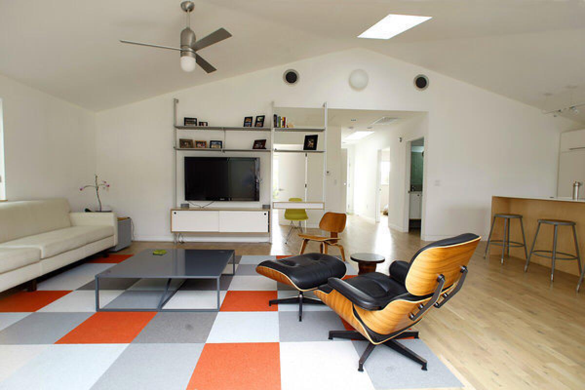
Going against prevailing wisdom about resale value, Borst went along with SweetŌĆÖs proposal to reconfigure the home with two bedrooms instead of three. The kitchen was moved from the front of the house to the back, so it connected to a relocated and enlarged living area that flowed onto a new deck.
ŌĆ£We decided to use the backyard deck as our dining room and the giant bar in the kitchen as informal dining,ŌĆØ Borst said. ŌĆ£In Southern California, it works perfectly.ŌĆØ
Sweet improved natural light and cross ventilation by deleting partition walls, adding a cathedral ceiling in the living area and installing operable skylights to each quadrant of the house. He made the master bedroom larger by forgoing a closet and building a long wardrobe instead. Clerestory windows above the cabinetry and the bathroom vanity allow light to pass through and make both spaces feel bigger.
In the kitchen, Sweet installed inexpensive white Ikea cabinets along with some upgrades: a custom peninsula, a Blanco sink and Emtek hardware. Sweet said he saved about $15,000 by using IKEAŌĆÖs Appl├źd cabinets, leaving money for other premium touches such as the Miele cooktop and counter made of Prima Decora, a Corian-like surface by Basix International. Windows in the kitchen look out to a fire pit, barbecue and meditation garden.
ŌĆ£I wanted it so that when you are standing at a work surface, you never have to face a wall,ŌĆØ Sweet said.
In the minimalist living area, Sweet created a TV and desk console using a prefab system by Rakks (commonly used in stores), which he combined with custom cabinets. The desk acts as a screen, further separating the master bedroom and living area.
Three outdoor rooms extend the indoor floor plan. The garage was pushed toward the alley behind the house, creating an L-shaped courtyard in back. Because the garage was so prominent, Sweet designed it to look like a modern shed with a sloped roof. He also painted the James Hardie fiber-cement plank fence along the alley in alternating tones of gray.
After five months of construction, Borst got what he wanted: a low-maintenance house that feels brighter and more open without growing in size. Small-space living isnŌĆÖt for everyone, he said, but it works for him and Torres.
ŌĆ£We do a lot of entertaining,ŌĆØ Borst said. ŌĆ£We keep the doors open to the patio and fire pit and can easily host a lot of people. Rob made sure every little thing had a functional purpose.ŌĆØ
Sweet said he prefers working on smaller homes.
ŌĆ£Americans are used to excess,ŌĆØ he said, noting how dense living has led to creative design in places such as Hong Kong and Tokyo.
ŌĆ£We are now starting to rethink living,ŌĆØ Sweet said, ŌĆ£and go for quality of space over quantity.ŌĆØ
Bookmark our blog or follow our coverage of home and garden via Facebook, Twitter and Pinterest.


