DIY queen Kristan CunninghamŌĆÖs rental, including a $1,000 kitchen makeover
By Debra Prinzing
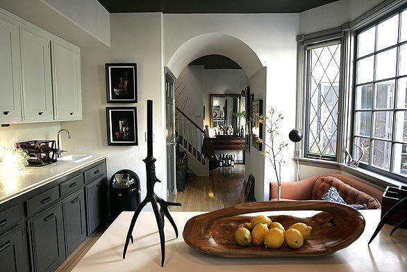
Kristan Cunningham, best known as one of the hosts of HGTVŌĆÖs ŌĆ£Design on a Dime,ŌĆØ has learned a thing or two about money-saving renovations. When the interior designer and her longtime boyfriend, Scott Jarrell, moved into a
For the complete story on CunninghamŌĆÖs renovation, click here.
To see a breakdown of this renovationŌĆÖs budget, click here.
And for CunninghamŌĆÖs tips on how to renovate cheaply, click here. (Christina House / For The Times)
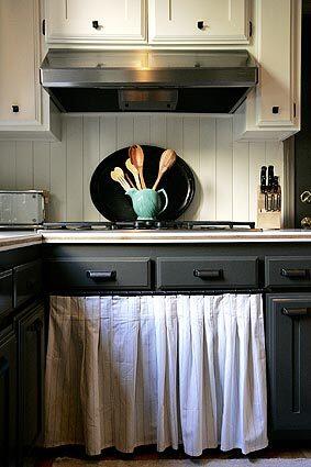
Cunningham describes their rental as a 1980s faux-French Normandy. ┬ōWe chose to keep everything simple, old and French-looking,┬ö she says. To give the dark, grainy oak cabinets a fresh, Shaker-style look, they attached 3┬╝-inch-wide strips of wood (mitered at the corners) to the front of each drawer and cupboard. The cupboards were sanded and then painted with several coats of semigloss in a palette of creamy white (for the upper cupboards), charcoal (for the lower cupboards) and French gray (for taller pantry storage and the wall oven cabinetry). Cunningham loaded up on matching library and bin pulls during a trip to Restoration Hardware┬Æs outlet store in Camarillo. To break up all the wood, she removed cupboard doors under the cooktop and stitched a set of tea towels into a pleated curtain to hide pots and pans. (Christina House / For The Times)
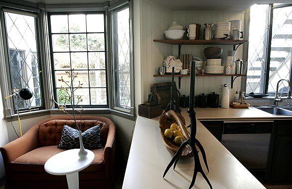
The bumpy drywall is now covered with precut pine V-groove board, creating a backsplash. ┬ōI wanted the look of wood at the cheapest price possible,┬ö Cunningham says. Even when painted with a white satin finish, the boards┬Æ knots and grooves are visible, suggesting the antiquated look she loves. Cunningham and Jarrell removed upper cabinets by the kitchen window, replacing them with two open shelves made from solid teak board and $4.99 antique bronze brackets from the clearance selection of Rejuvenation.com. A diminutive love seat, grabbed for a song at a Goodwill store and later reupholstered, fits in the kitchen┬Æs bay window, offering a perch at a plastic martini table, purchased from
For the complete story on Cunningham’s renovation, click here.
To see a breakdown of this renovation’s budget, click here.
And for Cunningham’s tips on how to renovate cheaply, click here. (Christina House / For The Times)
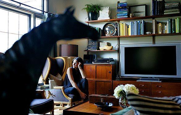
Cunningham, 32, downstairs in her
Advertisement
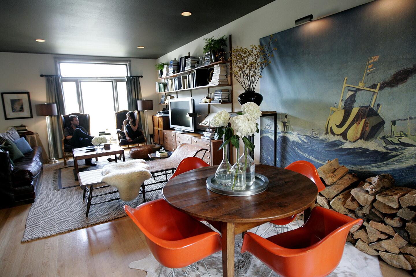
┬ōI┬Æm an honorary designer,┬ö says Jarrell, 32, who worked in marketing and promotion at Fox Television before joining Cunningham┬Æs projects as location manager. ┬ōBut in all honesty, I┬Æm the worst do-it-yourselfer on the planet. I┬Æm the planner, and Kristan is the doer.┬ö The couple is similar in one way, however. ┬ōWe always try to meet in the middle, and since Kristan┬Æs taste skews masculine, that makes it easy,┬ö Jarrell says. Here, the dining area and living room. (Christina House / For The Times)
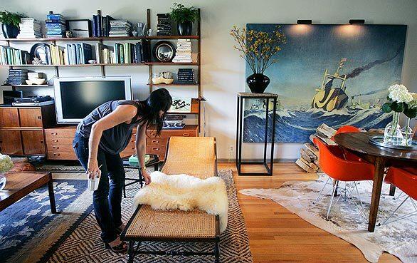
The couple wanted to make a dramatic statement in the dining area. They loved the bespoke murals from Surface View, a company that has the rights to reproduce artwork from the Victoria and Albert Museum and other British art institutions. A turn-of-the-century shipping scene from the National Maritime Museum caught their fancy. Printed on a 6-by-8-foot canvas and delivered in a tube, the print was easily mounted on a stretcher frame. At about $1,000, it was one of their most expensive purchases. (Christina House / For The Times)
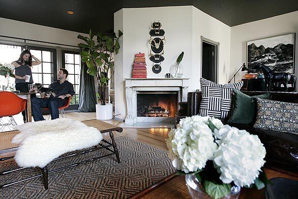
Cunningham and Jarrell, shown in their living room, attacked the 2,200-square-foot home like a ┬ōDesign on a Dime┬ö project. ┬ōWe knew we were going to be in this house for a couple of years,ŌĆØ Cunningham says. ŌĆ£But since it is a rental, Scott and I tried decorating it with low-cost design ideas.┬ö A vintage rug was too small to cover the living room floor, so Cunningham placed it atop a larger jute rug (under $300) from West Elm. (Christina House / For The Times)
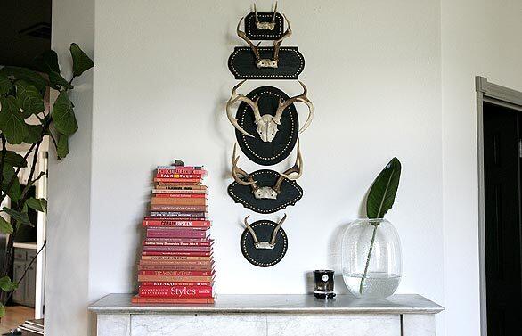
The mantel includes a different take on the old trophy heads. Throughout the living room, Cunningham placed stacks of books. She removed and stored the paper jackets, then created separate clusters of green, blue, yellow and white on the wall unit. ┬ōI stacked all my red books on the fireplace mantel,┬ö she says. ┬ōThey make a nice detail.┬ö (Christina House / For The Times)
Advertisement
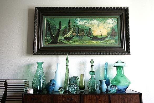
Playing with color: artwork, glass and books.
For the complete story on Cunningham’s renovation, click here.
To see a breakdown of this renovation’s budget, click here.
And for Cunningham’s tips on how to renovate cheaply, click here. (Christina House / For The Times)
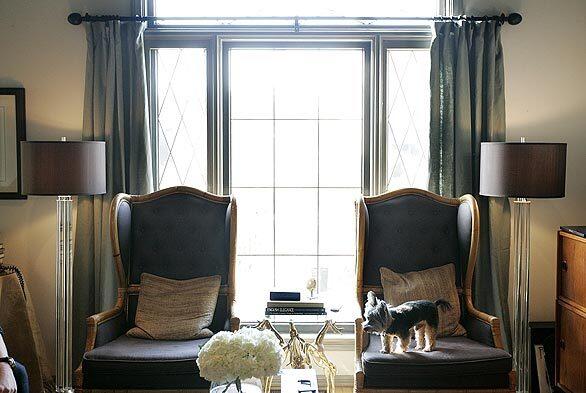
Cunningham and Jarrell experimented with contemporary design in their previous home, a 1988 design in Pasadena by the celebrated firm Buff & Hensman. They sold it in 2008 and considered a move to New York City in order to reduce Cunningham’s travel as a design correspondent for
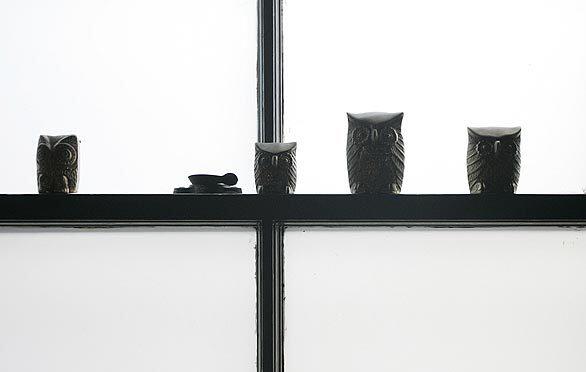
Owls roost in the window of a downstairs bathroom. (Christina House / For The Times)
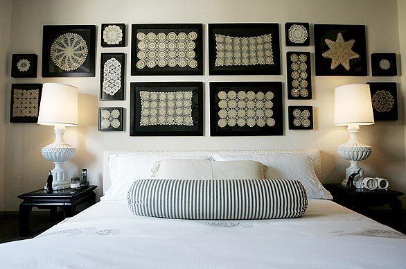
In the guest bedroom, hand-crocheted lace from CunninghamŌĆÖs grandmother and great-grandmother get a contemporary twist in plain black frames. (Christina House / For The Times)
Advertisement
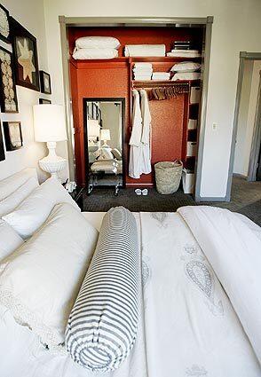
With the mirrored glass sliding doors removed, the guest closet is ┬ōlike the inside of a Hermes box,┬ö Cunningham says. (Christina House / For The Times)
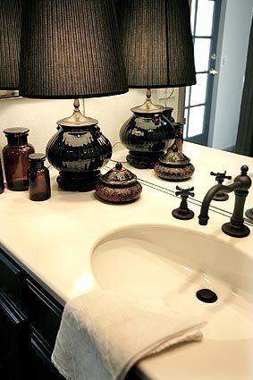
Bathroom cabinets got the same door treatment as in the kitchen. The counter is dressed up with a lamp and beautiful accessories.
For the complete story on Cunningham’s renovation, click here.
To see a breakdown of this renovation’s budget, click here.
And for Cunningham’s tips on how to renovate cheaply, click here. (Christina House / For The Times)

Cunningham with Floyd. ŌĆ£You either have the do-it-yourself spirit, or you donŌĆÖt,ŌĆØ the designer says. (Christina House / For The Times)
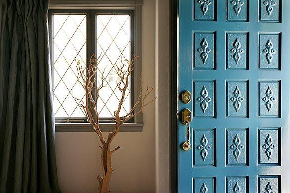
When all else fails, turn to paint. Cunningham and Jarrell put bold colors on the front door and inside that guest bedroom closet. They used dark colors on most of the ceilings, including the kitchen. ŌĆ£Dark ceilings help push out the walls and make any room seem larger,ŌĆØ she says. Want more? You can check out CunninghamŌĆÖs website or go to our Homes of The Times gallery for a peek inside more Southern California houses, condos and apartments.
For the complete story on Cunningham’s renovation, click here.
To see a breakdown of this renovation’s budget, click here.
And for Cunningham’s tips on how to renovate cheaply, click here. (Christina House / For The Times)


