Five days of ŌĆśHerŌĆÖ: Building a future to feel like the present
Spike Jonze and his team went to some lengths to create the future in ŌĆ£Her.ŌĆØ In the movie ŌĆö which has Joaquin PhoenixŌĆÖs soulful Theodore Twombly falling in love with an operating-system voiced by Scarlett Johansson ŌĆö the future feels both warm and austere, inviting and slightly disorienting. ItŌĆÖs a movie that, like so many films, looks at the future, but, thanks to its unmistakable vision, through an entirely unexpected lens.
In our ongoing Web series. we talk to the people who helped shape that vision. (You can read previous installments here.) Today, a conversation with production designer K.K. Barrett, the longtime Jonze collaborator who helped make the future world of ŌĆ£HerŌĆØ look so distinct.
Movies Now: In talking to [costume designer] Casey Storm yesterday, he was very clear that the governing principle was less about what was there than what was not. But thereŌĆÖs a spareness to the production design too; did you follow a similar philosophy?
PHOTOS: Movie scenes from ŌĆśHerŌĆÖ
K.K. Barrett: We did. We wanted to try to clean the room, the entire film, of anything that might be distracting or pondered on for the wrong reason. We didnŌĆÖt want to build a playground, to build set pieces, that are stronger than the characters themselves. We didnŌĆÖt want to get into future technology because that becomes a centerpiece of the movie instead of what really matters.
MN: ItŌĆÖs interesting. So many movies about the future do seem to be about the gizmos, a kind of James Bond fetish thing. But here most of the technology is so basic. The communication device looks like little more than a calculator.
KKB: We actually tried putting together something fancier; we played around with those ideas. And we kind of recoiled. Do we want something in the middle of the film that will be distracting, that will make people wonder how it works? And we realized we didnŌĆÖt. So we decided to go for something more tactile.
MN: From where did you draw inspiration then?
KKB: From places you wouldnŌĆÖt expect. We bought lighters and cigarette cases in this junk store, and then fountain pens and address books, and we modeled things after them. We wanted it to feel handcrafted. What feels better in your hand than a Zippo lighter? We wanted things to have that feel that way.
REVIEW: Spike JonzeŌĆÖs ŌĆśHerŌĆÖ shows loveŌĆÖs perils -- in any form
MN: Even the outdoor stuff had that vibe: It was just billboards, nothing flashy or hugely interactive or scanning your retina or something. Even the computer monitors were your basic computer monitors.
KKB: We spent a week hitting our heads against a sheet of glass, trying to wonder how much slicker these things will look in the future. But every time we went to the science it felt cold. So we decided to go much more basic. ItŌĆÖs all stuff you can more or less have right now. ItŌĆÖs not science-future ŌĆö itŌĆÖs science-present.
MN: But itŌĆÖs a movie set in the future. Were you concerned youŌĆÖd be doing a disservice to that setting by going so stripped-down?
KKB: Not really. We wanted everything to be very comfortable, and this was the way to do that. This is a story about a man fighting his own loneliness. We didnŌĆÖt want him fighting his world. We didnŌĆÖt want the world to be in opposition to him, or to an audience.
MN: The one tech change that was noticeable is the nearly utter lack of keyboards. People speak emails and have emails read to them. Images are manipulated by throwing them around a screen. Why did you make that exception?
KKB: IŌĆÖm always amused at how in science-fiction, shows like ŌĆ£Star Trek,ŌĆØ there are all these buttons and flashing lights. That never made sense to me. It seems to me like if you could you would just have direct communication with the computer. Also, a keyboard would have dated us. ItŌĆÖs like seeing cars in a period movie: You know itŌĆÖs clearly from the ŌĆś70s because thatŌĆÖs when cars looked like that.
MN: IŌĆÖm glad you mentioned cars. You certainly had a lot of trains in the transit scenes. But there are almost no shots of cars, except for one cab scene, which looks like cabs of today.
KKB: Part of the reason we avoided cars is because we wanted to avoid street scenes in general. ItŌĆÖs just too recognizably of an era, and then it would place it in a time, even a future time, which we didnŌĆÖt want. When you have cars then half the audience starts thinking about the great cars they might have. We wanted trains and elevated walkways, which allowed us to avoid that, and seemed right anyway. Plus in your car you already have another barrier from human contact that you donŌĆÖt have in public transit. And this movie is about human contact and connection.
MN: The movie certainly has that feel. But there are also a lot of looks at the cityscape, sweeping shots of a bright but dense urban place. How did you do that ŌĆö especially given that it was a blend of Shanghai and Los Angeles ŌĆö and why?
KKB: ItŌĆÖs nice to surround him with vistas even when heŌĆÖs home alone, which is why we gave Theodore this high-rise with a view. ItŌĆÖs Los Angeles; we just borrowed some buildings and planted them where theyŌĆÖre not. We curated them from Shanghai, and would say letŌĆÖs call this building the plaza and put it there, or this one the bar, and put it somewhere else. It needed to feel like a fun place, enjoyable on the surface, so that itŌĆÖs the human condition thatŌĆÖs the protagonist.
MN: ItŌĆÖs almost the opposite of that old clich├® ŌĆśthe city is a character.ŌĆÖ
KKB: Yes. Because when people say that, I think they mean the people have interactions with the city. And thatŌĆÖs not the case here. He floats through the city. HeŌĆÖs in a bubble, a bubble thatŌĆÖs nice but not a character in itself. This way the focus could be on him.
MN: Another thing you also didnŌĆÖt want, from talking to Casey, is the color blue. Talk about that one.
KKB: [Laughs] ItŌĆÖs always fun to set these rules, and then occasionally to break them. When Spike and I worked on ŌĆ£Where The Wild Things AreŌĆÖŌĆÖ we banned green, then we slipped some in. Hoyte [van Hoytema, the cinematographer] wanted to avoid blue, then we said ŌĆ£OK, letŌĆÖs do one scene with blue.ŌĆØ We didnŌĆÖt want it to seem too dystopian or foreboding. And there was so much blue sky we wanted to avoid it on the ground. We were all really enamored with red. If you look closely thereŌĆÖs a little bit of red in every frame. It just gave it all a warmer feeling. But these decisions are all a little whimsical.
MN: And yet thereŌĆÖs an underlying ideology to it all, it seems.
KKB: We bandied about a lot of terms. ItŌĆÖs not ŌĆ£the future,ŌĆØ itŌĆÖs ŌĆ£our future.ŌĆØ ItŌĆÖs not ŌĆ£science fiction,ŌĆØ itŌĆÖs ŌĆ£our story.ŌĆØ ŌĆ£ComfortŌĆØ was a word we used. These people are not lacking for comfort. Comfort was the underlying guide And we wanted to create not so much a world of the future but a world of this particular film, so that it would be timeless. ItŌĆÖs less about referencing anything specific and more about making it just slightly askew.
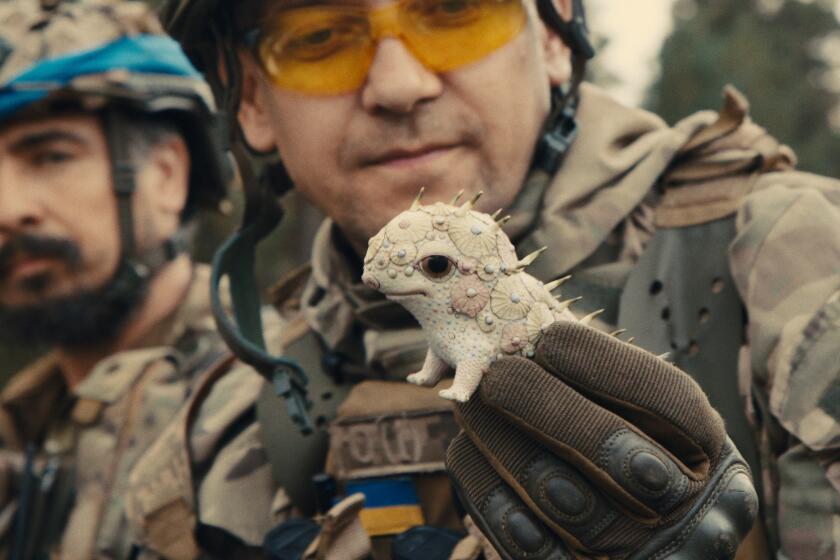
MN: Speaking of askew, I have to ask about the video game character Theodore interacts with. heŌĆÖs like some mix of the Pillsbury dough boy and Andrew Dice Clay. How did you come up with that one?
KKB: [Laughs] Spike had this drawing of an alien child, and then we had this idea of a dough boy with these minimal features, and then we found an animator to do it. And then he used a voice ŌĆö itŌĆÖs SpikeŌĆÖs voice, actually ŌĆö and we put it together that way. ItŌĆÖs probably more design than we have in anything else. But itŌĆÖs comedic so we thought itŌĆÖs OK. I mean, itŌĆÖs a sassy, foul-mouthed creature. We could give ourselves a little more license.
ALSO:
Five Days of ŌĆśHerŌĆÖ: How Spike Jonze created the future
Joaquin Phoenix and Spike Jonze connect to ŌĆśHerŌĆÖ
With voice-centric ŌĆśHer,ŌĆÖ Spike Jonze makes a statement
Follow me on Twitter at https://twitter.com/ZeitchikLAT
More to Read
Only good movies
Get the Indie Focus newsletter, Mark Olsen's weekly guide to the world of cinema.
You may occasionally receive promotional content from the Los Angeles Times.


