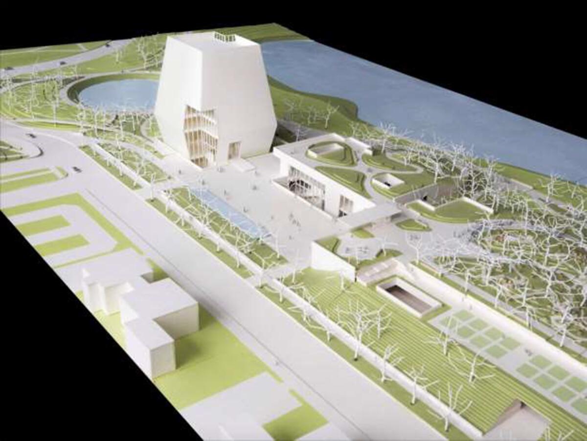
Column: Design for Obama library and museum off to surprisingly somber start
It would be easy enough to complain that the May 3 unveiling of a preliminary design for
No elevations or sections from the architects,
No drawings showing how the campus of three buildings in Jackson Park ŌĆö the tower, which will hold a museum, plus low-lying structures for a meeting hall and library ŌĆö will appear from the east, looking back toward the city.
And no matter. As is so often true in architecture, even this early look revealed plenty. A mere sketch ŌĆö and this plan remains essentially that, an architectural first draft ŌĆö can be surprisingly talkative.
So what does this one have to say?
Mainly that Williams and Tsien are aiming for something slightly different ŌĆö starker, more monolithic ŌĆö than theyŌĆÖve produced so far in a body of work that includes the Barnes Foundation in Philadelphia and the Reva and David Logan Center for the Arts at the University of Chicago. And that in doing so theyŌĆÖve landed just on the wrong side of the line dividing a sober design from a somber one. ThereŌĆÖs something not just tight-lipped but a bit sepulchral about the proposal.

There has always been a cautious streak in the work of Williams and Tsien, husband and wife architects who founded their firm in 1986. (They won this commission in an invited competition run by the Obama Foundation that featured six other finalists, including
In this design theyŌĆÖve traded those qualities for a sense of deep history and grounded strength. Certainly the tower will serve as a vertical marker for what will be known officially as the Obama Presidential Center and is expected to open in 2021. Because of its location in Jackson Park, designed by Frederick Law Olmsted, the tower will be all the more conspicuous. (IŌĆÖll have more to say about the urban-design elements of the plan, including its controversial use of public parkland, in a later column.)
Yet whatŌĆÖs most striking in the end about the tower is not its height but the way its profile ŌĆö growing widest in the middle and then tapering as it goes up ŌĆö makes it bottom-heavy, pulling it back to Earth. When you combine that unusual shape with the towerŌĆÖs skin of stone panels, the effect is distinctly primitivist, with hints of the way Mayan or Egyptian temples preside over wide empty plazas. The architects have compared the tower to a lantern, though it looks more like the truncated base of an obelisk.
This combination of rootedness and stripped-down form with an unapologetic interest in history links the design to work by talented younger architects like ChileŌĆÖs Pezo von Ellrichshausen and SwitzerlandŌĆÖs Christ & Gantenbein. ItŌĆÖs reminiscent of Marcel BreuerŌĆÖs 1966 Whitney Museum (nearly always a good touchstone) and Gio PontiŌĆÖs 1971 Denver Art Museum (ditto). The plaza at the center of the campus ŌĆö bounded on the north by the museum tower, the east by the forum building and the south by the library ŌĆö strikes an effective balance between enclosure and openness.
The design makes a clear effort to steer clear of classical references ŌĆö or any recognizably European motifs, for that matter.
The design makes a clear effort to steer clear of classical references ŌĆö or any recognizably European motifs, for that matter. This makes sense for a president who was born in Hawaii to a Kenyan father and Kansan mother and spent a good part of his childhood in Indonesia. ItŌĆÖs also a major departure from the Greek columns that formed the backdrop for ObamaŌĆÖs acceptance speech at the Democratic National Convention in 2008.
There is, finally, an unavoidable symbolism in the fact that the tower appears truncated: a suggestion of an unfinished or even abandoned larger project. The echoes of pre-Columbian ruins only add to this impression, as does the way the whole complex is drained of color.
After Williams and Tsien won the job last summer, I was among many critics who noted the similarities between the architects and the Obamas. Both couples are known for a deliberate and cerebral style, for working coolly above the fray.
But the Obamas are also energetic, naturally upbeat and, as first couples go, young. (Even after two terms, Barack Obama, at 55, is 15 years younger than its current occupant.) These qualities have become only more pronounced in their post-White House life.
At one point during the May 3 event, Obama smiled while pointing out where the barbecue grills might go, prompting chuckles from the audience.
ŌĆ£Why are you laughing?ŌĆØ he joked. ŌĆ£We donŌĆÖt have any folks who grill here? I thought this was the South Side of Chicago!ŌĆØ
He also said the museum would include some fashion displays.
ŌĆ£LetŌĆÖs face it ŌĆö we want to see MichelleŌĆÖs dresses,ŌĆØ he said. (Accurately.)
It was impossible not to notice a contrast between his buoyant mood (and the sense of broad-based community engagement he was trying to evoke) and the rather stern quality of the design he was introducing.
ThereŌĆÖs no requirement that the architecture of a presidential library perfectly match the personality of its client. But it shouldnŌĆÖt be at odds with that personality either. A little zeal in the next version of the proposal ŌĆö some clearer signs of energy and life ŌĆö would go a long way.
Building Type is Christopher HawthorneŌĆÖs weekly column on architecture and cities. Look for future installments every Thursday at latimes.com/arts.
Twitter: @HawthorneLAT
ALSO
Harvard's first online architecture course: Does it make the grade?
For the late L.A. architect Paul R. Williams, national honor overlaps with a bleak anniversary
The biggest entertainment stories
Get our big stories about Hollywood, film, television, music, arts, culture and more right in your inbox as soon as they publish.
You may occasionally receive promotional content from the Los Angeles Times.


